


Color is undeniably a crucial component for artists and painters. However, when it comes to working with color, there exists one aspect that consistently presents a notable challenge: understanding color value.
Artists frequently struggle to create compelling and captivating paintings when they lack a solid understanding of how to see and use values in color together. Without this understanding, one can often end up with a flat and uninteresting painting that lacks depth, dimension, and a realistic sense of light.
Therefore, in this article, we will delve into several color value chart examples that offer valuable insights into better comprehending values in color on a deeper level. So, let’s get started by looking even closer at what color values are!
Exploring the Essence of What Color Values Are
Color value is the relative brightness of a hue in comparison to other colors. Various terms are used to describe the scale of different values in color, such as light, medium, and dark, or high-key, mid-key, and low-key.
Value is crucial, in its ability to create a believable sense of light, form, volume, contrast, and an overall greater interest in your painting. Building strong values is fairly straight forward in black and white. However, once you add color into the mix then it becomes much more difficult!
Our eyes are often easily tricked by color. Some colors look lighter when they really are darker in value. Other colors may look darker in value than they really are. The way to be able to create strong values in your painting is to learn how to see strong values and color at the same time. Color value charts are a great tool that can help you achieve this goal.
Color Value Chart Examples
A color value chart is a presentation of colors arranged in order of their values, from lightest to darkest. While at the same time comparing them to different colors.

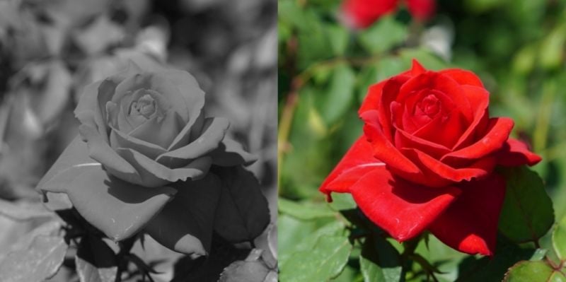
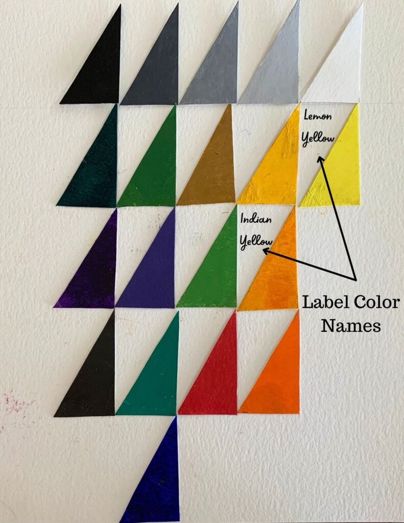
In the chart below we can see how each color on the palette above has a specific value. The values of each color are shown clearly in monochrome to the left of the colors. White is clearly the lightest value while burnt umber is the darkest.

There are various types of color value charts available, including grayscale value charts, color wheel value charts, and hue saturation value charts. Each of these charts is helpful in its unique way, depending on the artist’s painting style and preference.
Colors with the same values
Not every color has a different value. Many colors share the same value grouping. For example, in the chart below you can see how both ultramarine blue and pthalo green are in the same dark value grouping. Notice all of the other colors that are in the same column together. It can sometimes seem surprising!

Simplifying Values
The color chart above has quite a few values. Because it is good to simplify the values in your painting it is helpful to also make a color chart with just 5 values. This requires you to place values that are similar in value in the same value grouping.

How to make your own value color chart
It is very helpful to make value charts like the ones above for yourself. The process of figuring out what values colors are is a great learning experience. Use the colors on your palette or mix up some colors and figure out where they belong on the value chart scale.
There are quite a few different ways to create a value color chart. I decided to create mine by using triangle shapes as this allows me to label each color more easily. First, I created clear monochrome values using ivory black and white.

For the triangle shapes I cut out triangle pattern piece that I used for every triangle shape for the color value chart.

Understanding what is color value
I then organized my triangle color shapes on heavy white watercolor paper according to its value underneath the monochrome value triangles. You can label the colors by writing the color name to the left of each color.
Create a color value chart using any medium: watercolor, acrylic paints, soft pastels, or others!
Color Gradations Within Colors
I also recommend to create a color chart that shows a gradual lightening of each color. You can make color gradation charts with as few or as many colors as you want. Cut out strips of heavy watercolor paper each with evenly marked boxes.

Start by painting the pure color at the bottom and gradually add more white to each box as you move up.

Not all colors are equal in value
In the chart below you can see how no other hue is lighter in value than the lightest yellow. While no other hue is darker than ultramarine blue. Therefore The blue belongs at bottom of the value scale while the yellow is at the top.

The placement of colors beside their monochrome equivalents is easily discernible. This visual arrangement allows for clear identification and comparison.
Using tools to see values clearly
When working with your own value charts as shown in this article, it can be difficult to have certainty of the value of certain colors. However, visual tools can help you develop your eye to see values in color more clearly.
Your phone and other tools
See the black and white filter applied over the color version of your color values chart below. This aids in visualizing the correct grouping of colors by their respective values and identifying any necessary adjustments.

There are a number of other visual tools that can help you to see value more clearly. It is good to use all the tools at your disposal. They will help you to learn to see value more readily and easily when working in color. The more you train your eye the easier it will become to work with values in color.
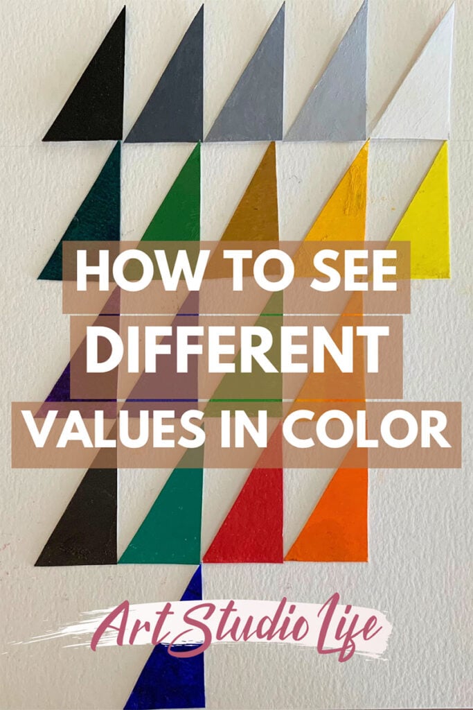
Want to remember this? Save How to See Values in Color to your favorite Pinterest board!


14 thoughts on “Understanding Color Value in Art: How to See Values in Color”
Thank you so much for this incredibly helpful guide and lesson! Dang! I was having trouble getting “lights” lighter and now I see why. This was great!
You are so welcome! Am glad to hear this was very helpful for you – thank you for sharing!
Hi Elisabeth, I found your article so interesting and you made colour so exciting. Many thanks,
Noreen
So glad to hear that Noreen, thank you for sharing!
This is just wonderful! I’ve read, re-read, made gey scales over and over again, but this just made a HUGE lightbulb go off for me! Thank you so much!
Are these the kinds of things you have in your color mixing course?
Thank you again!
Hello Pat, I am so thrilled to hear that this article helped a lot with understanding value and color! That is so wonderful. My color mixing course goes in depth with how color works so you will be able to mix absolutely any color you need. Therefore it also goes in depth with learning how to mix different values for any color. However, my painting with color course is more in depth in regards to applying color and value to a painting – and seeing value in color as relates to creating a painting. If you have more questions don’t hesitate to reach out to me at Elisabeth@artstudiolife.com
A BRILLIANT article Elizabeth, thank you so much.
You are so welcome Adele! Thank you for your kind words
Being color recognition challenged, I am very interested in color value and the idea that color value can help the artist assign colors to the palette with a planned purpose. But I need clarification. Specifically, I would think color VALUE would be represented by the degree to which a color presents as dark vs. light in a monochromatic tone scale. Yet, have stated that color value may defined as the relative brightness of a hue. As I understand art terminology, brightness is pretty closely synonymous to intensity or saturation. This seems to be a distinction that goes right to the heart of the matter. We all know there are several highly saturated, bright yellows (e.g., Hansa) that are very light (near white) in terms of a monochromatic (dark vs. light) value scale while there are other yellows that are less saturated (e.g., titanate yellow) with similar very light in monochromatic value. Are you saying that these two yellows have similar monochromatic value but different color value? If so, how is this consistent with the schema you have used to associate colors with one of 5 value groups, a schema that seems to relate to darkness vs. lightness rather than saturation?
Hello Jonathan, Apologies for the confusion. Color value has everything to do with how light or dark a color is in relation to a monochromatic tonal scale. I brought up brightness/ saturation levels of a color only to point out that when a color is brighter or more saturated it can sometimes look or appear lighter in value than it actually is – in this way color can trick our eyes. So its important to be aware of that. However, some colors could have different saturation levels but be similar in value. For example, cadmium red is darker in value than hansa yellow – if you mix white in with the red to get it to be the same tonal value as hansa yellow then it will not have the same saturation level as Hansa yellow does. This is because the Hansa yellow had no white added to diminish its brightness/ saturation level. While the cadmium red has a great deal of white added to it.
I do not use titanate yellow and it appears that the color varies quite a bit across different brands, but the same principle would hold true from what I explained with cadmium red/ hansa yellow. In this article I do not deal with grouping colors together in regards to just their saturation levels – it is ONLY in regards to their tonal/ monochromatic levels. this is what is by far the most important thing to consider when painting.
I hope that helps!
Thank you! You have explained Values very simply and made them easy to understand. Loved your approach.
You are very welcome! Glad this is helpful 🙂
Dear Elisabeth, thank you so much for this practical guide with regards to colors, still struggling a bit since there are so many fields to cover, however, your guide is helpful to get at least the values settled, thanks again and have a good evening
You are so welcome! Glad that this is helpful. Thank you for sharing.