The definition of tonal values in art is how light or dark something is on a scale of white to black. White is the lightest value and black the darkest.
Tonal value is one of the most important aspects to painting. It is the value structure of a work that allows us to be able to see light and dark in a painting. Value is even more important than color when it comes to learning how to paint. One can mix the most beautiful paint colors, but if the values are incorrect then the painting will not work. The opposite is also true. For example, if the colors are ‘incorrect’ but the values are then the painting will work.
Tonal value scale
Here is what is called a value scale for tonal values. It is a system to organize values ranging from white to black. As you can see #1 is white and #8 is black. The shades of grey that are in between make up most of the value shades in a drawing and or painting. It can be an extremely helpful tool for painters to identify light, middle tones and darks more easily.

High keyed and low keyed tonal values
Depending on how much black or white a value has it will appear lighter or darker in value. The tones toward the lighter end of the spectrum (those with more white in them) are termed ‘high keyed’ in value. Those values on the darker end of the spectrum (with more black than white in them) are termed as ‘low keyed’.

In the illustration above you can see a clear illustration of the high keyed values versus the low keyed values.
High keyed painting
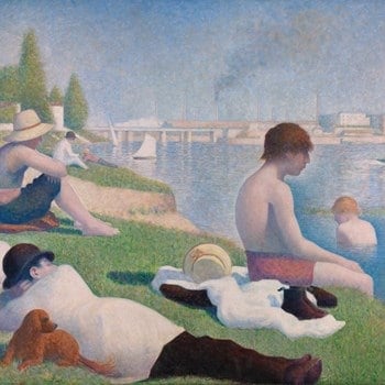
The Seurat painting above, Bathers at Asnieres, is an excellent example of a painting that is ‘high keyed’. Most of the values used in the work are from the ‘high keyed’ end of the value scale spectrum. However, there are of course some darker elements present such as the pants and hat of the lounging man. One will nearly always find at least some darker elements present in a high keyed work. Just as there are always light elements present in a low keyed work.
Low keyed painting

The painting above by Diego Velazquez can easily be considered a low keyed work. Most of the values present are from the low key end of the value scale. When you compare the Seurat painting against the Velazquez painting you can get a clear picture of what a high key work looks like compared to a low keyed work.
Understanding light
Now, we will go over how light and dark values apply to paintings and real life lighting situations. It is important to understand these principles as values are a central element to painting. Without a basic understanding of values you will not be able to capture a sense of light.
Light effects
Illustrated here is a diagram depicting the distribution of light and shadow and the different types of lights that are present. If you want to create a believable sense of light then you need to pay attention to these aspects of light and shadow.
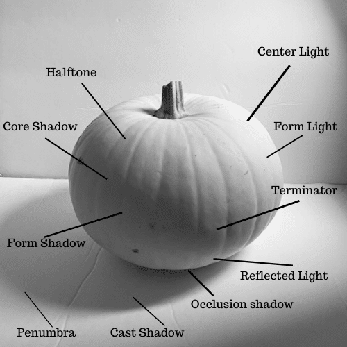
Halftone – Form light is divided into halftones that darken as the form turns away from the light surce
Core Shadow – As reflected light loses strength, it creates the core shadow
Form Shadow – This is the part in shadow
Penumbra – The softness around the shadow
Cast Shadow – This shadow is the terminator projected on the ground
Occlusion Shadows – Where two surfaces get close to each other, a dark shadow forms
Reflected Light – Light on the dark side of the form that is reflected onto the form by another surface
Terminator – this area divides form light and form shadow
Form Light – The area that receives direct light
Center Light – The area that faces most directly towards the light source
Light effects applied to painting

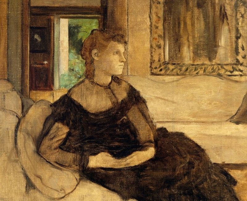
Here is an applied example of what the different aspects of light look like on a painting by Thomas Eakins. As an exercise you can look at paintings by the great masters and find where the halftones are, dark lights, center light, reflected lights etc.
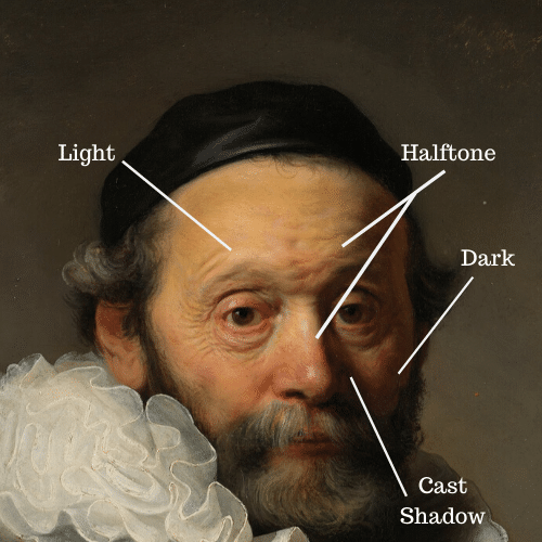
Here is another example of light distribution in Rembrandt’s ‘Portrait of Johannes Wtenbogaert’. You can see here an expert example of what halftones, light, dark and cast shadows look like in a master painting.
Thinking value first
It is important to think of value first when painting because without clear light and dark values your painting will not work, no matter how beautiful your colors are! It is much easier to create clear strong values when working with just one color. Once we start to add color to a painting value becomes much more difficult. Which is another reason why it is so important to think of value first and foremost when mixing colors.
So, what does it look like to think value first when painting? When mixing colors we first ask ourselves what kind of value we are working with before we even consider the color. For example, in the beginning stage of the egg carton painting below I could see that the outside portion of the carton was dark in value and therefore mixed together dark colors and first worked at getting the value right.
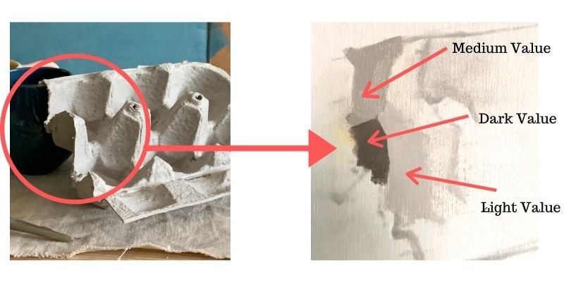
Once I had a dark value mixed up, I then concerned myself with getting the color right. I worked in the same manner for the light value area that is on the inside portion of the carton to the right, as well as the medium value area on top.
From the image above you can see that I start the painting in an area where the first three values (light, medium, and dark) are placed next to one another. With this method, you can easily tell right away if a value is not working well in your painting and fix it right away. Working in this manner also helps for you to think and paint with value in mind first and foremost.
Make a value study
The best way to learn about values is to take some artist charcoal or woodless graphite pencils and start to make some value sketches by yourself. Also, working on making monochromatic drawings is a great way to start understanding dark and light values. Once you add color into the mix it is much more difficult to figure out values!
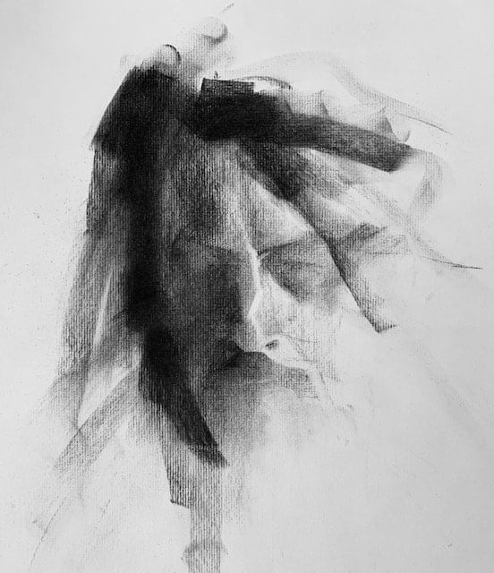
Here is a tonal portrait drawing I did of my brother. It is a simple brief drawing that captures the basic essential values. When you work on creating tonal drawings/ sketches try to simplify the values as much as you can.

Again, here is another example of a drawing that has simplified values. There are no more than 4 values present. Light value, light middle tone, dark middle tone and a dark value.
What is next in the study of values?
The study of light and dark is a huge topic and cannot not be fully explored in one article. Next up learn how to create drawings with light and shadow.
Want to remember this? Save this Tonal Values in Art Guide to your favorite Pinterest board!


18 thoughts on “Complete Guide to the Importance of Tonal Values in Art”
Hallo Elisabeth, ich habe durch Deina Ausführungen in meinem 90. Lebensjahr noch viel dazugelernt,
Danke! Es freut mich, das zu hören!
Hi Elisabeth! What materials did you use to create the portrait of your brother?
Thanks 🙂
Hi Glenda! I used bob’s soft vine charcoal and Strathmore 500 series charcoal paper, I also had a chamois on hand as well as a good eraser.
I find it difficult to transition from darks to lights with colour. Have you given any resources in this regard? Cheers Vel
Hi Vel! Yes transition from darks to lights with color can be hard! There are some tools that can help with that. Taking a photo of your subject and putting a black and white filter over it helps to clearly see the values without getting confused by the color. Also, using a transparent red sheet to look at your subject through also helps you to see value more clearly without getting confused by color. Simply squinting at your subject helps to simplify what you see which also makes the values more clear. Hope that helps! 🙂
very nice and very usefull artcle. Thank you very much
Helena (helena_saldanha@sapo.pt)
Hi Helena! Very glad this article was helpful for you!
I totally agree about the importance of values. Having started my art journey with graphite, I feel like I have a strong sense of values…until color is introduced😱. For example, is medium blue lighter or darker than pink? Is intensity of color the same thing as value? It’s the mid range values that confuse me. That’s why I usually choose subjects with strong lights and darks.
Hi Lisa, Yes color suddenly makes value much more difficult! When things are extra confusing it is sometimes helpful to take a photo of your subject and put a black and white filter over it on your phone – this helps to demistify what some of the values are in your subject. There are cases where medium blue could be lighter or darker than pink. It all depends on the value of the pink. It is important to also simplify and not let yourself get too hung up on small shifts in value. Squinting your eyes helps to see the big picture of what is happening with the values.
So glad to see this. Seeing values is such a great skill to have.
Glad this was helpful 🙂 Yes it is!
Jo,
Thanks for all the work you did on this informative information. It’s a great help.
Hi Jo, So glad to hear it is helpful!
Very helpful!
Thank you! Glad to hear this article is helpful.
Great article
Thank you!