

We often hear the phrase ‘the simpler, the better’, this could not be more true when it comes to creating tonal values in painting and drawing.
Tonal values refer to how light or dark something is and they are a key part of the visual language used by artists (to create contrast, depth, and atmosphere in their work). By simplifying what you see in terms of values. You can more easily capture clear tonal values in your painting or drawing.
Simplifying what you see is one of the most foundational and important things you can do for your painting and drawing. It is all about breaking down what you see into clear and simple light and dark values. This is also part of the process of learning how to develop your eye like an artist.
In general, when you simplify the values of what you observe. It makes the entire painting process much more approachable and your work improves enormously. This article will take you through the keys, to continually learning how to simplify how you see!
Why is simplifying values in painting so important?
The process of simplifying values isn’t something that is just recommended, rather it is absolutely necessary and essential. Believe it or not we are quite limited with our painting (and drawing) supplies. The range of values we are able to create is extremely small in comparison to all the values that exist in our world.
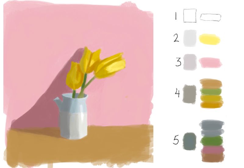
Range of values in paint vs in nature
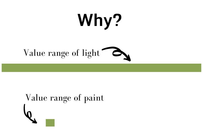
You can see in the diagram above how small the value range is that we are able to make with our painting and drawing supplies is in comparison to the astounding range of values that exist in our world. This makes sense when we just think of our sun – which is so bright that it can literally blind you. Compare this to white paint – which is the absolute lightest color available to us.

So this is THE reason why it is absolutely essential for us to simplify what we see. The more we train ourselves to create clear values, the better our work will be as a result.
Simplifying first with black and white
Simplifying first with black and white is the optimal way to begin training ourselves in how to accurately make values. It eliminates distracting colors that can make it more difficult for us to see what value range we are working with, and allows us to focus on creating clear gradations.
Color can trick the eye

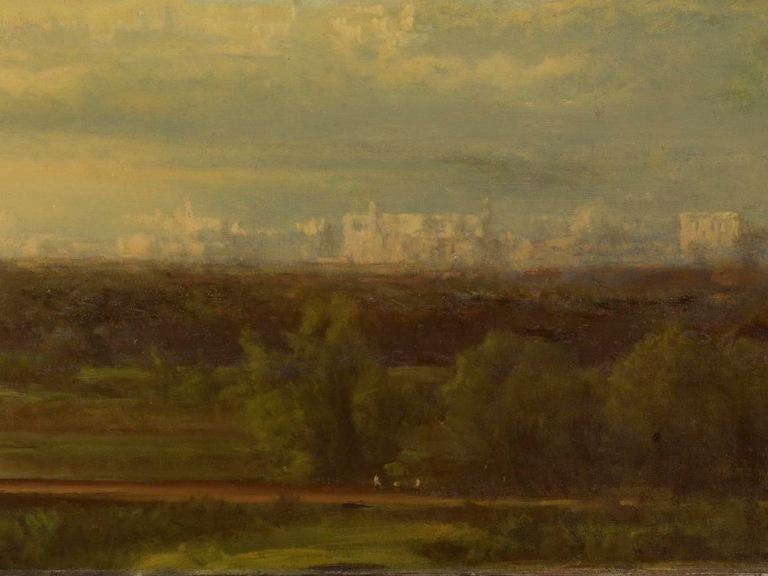
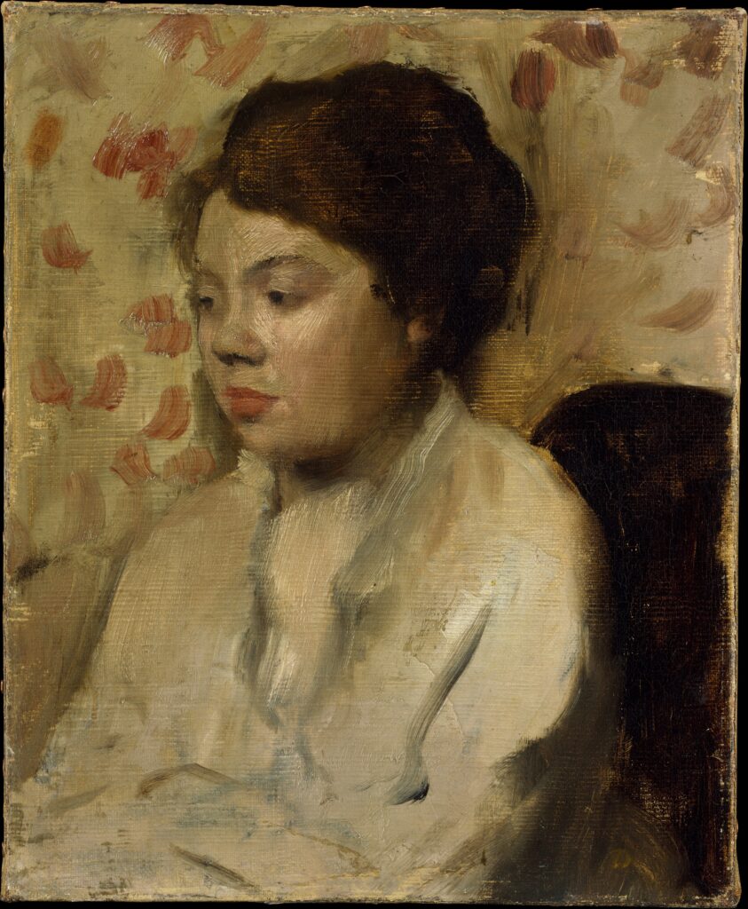
The reason this works so well is because black and white show values quite clearly. Color on the other hand can trick us – what might look lighter is actually darker in value and vise versa. An example of this is clearly show in the image above. So, by practicing first with black and white, we can train our eye to see values more clearly before engaging with color.
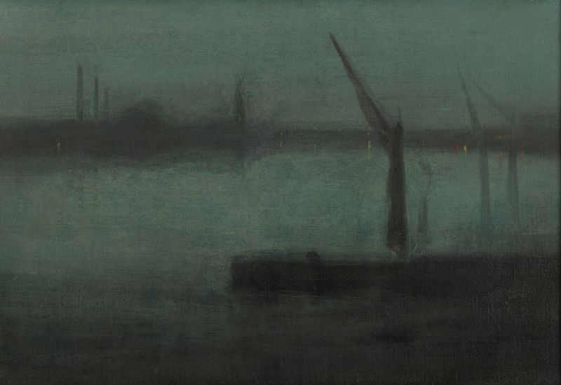
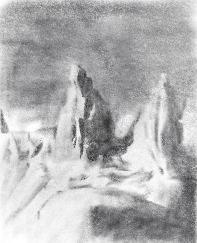
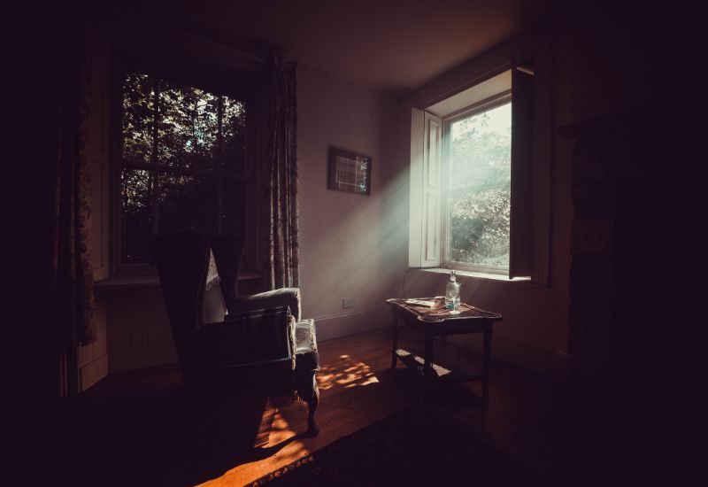
In the drawing below we see a value study of the subject matter above. It is recommended to always make monochrome studies of your subject matter as this helps you to establish strong and clear values in your painting.
Values extend beyond objects
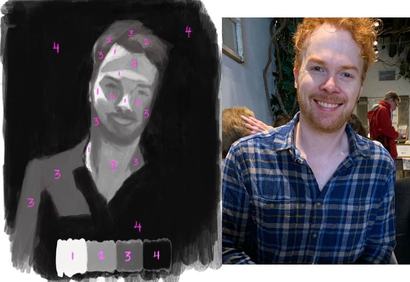
A very crucial part of simplifying is to constantly keep in mind that you cannot see objects isolated on their own. Values do not have boundaries – light and dark shapes extend beyond the edges of objects. Consider how the morning light might cover a large area of a room – extending beyond all the objects in its path.
In order to be able to simplify, it is very important for you to train your eyes to see values in this very same way.
Simplifying values in painting with color
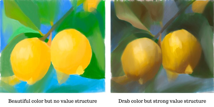
Once you are able to simplify values well in black and white, then you can start to work with color. When simplifying values with color, it is important to first consider its value before its color. It is much better to get the value right than to get its color! A painting might have beautiful colors but if its values are not correct then the painting will not work and won’t have a sense of light. However, even if a painting is made up of ugly colors, but correct values, the painting will hold and have a clear sense of light.
Value is more important than color
When painting with value in color, it is necessary to identify the lights and darks as you would a black and white painting. However, this can be more difficult to do when working with color, it is good to first limit the value range you will work in to make the process easier for yourself.
Visual tools help to see value more easily
Also, there are tools and techniques you can use that will help you to simplify values when working with color. The easiest is to squint your eyes. Ironically, this is one of the most effective ways to see values more clearly.
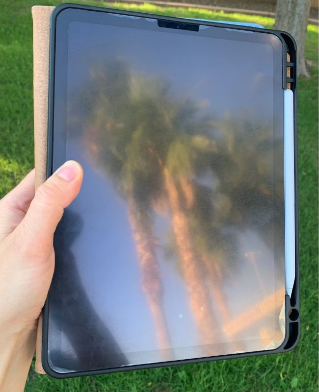
I also recommend to use your phone’s (or tablet) black screen as a black mirror. The reflection simplifies whatever you look at. This can help you visualize how to simplify the values in your own work.
Practice simplifying just by seeing
You can practice simplifying values in your environment by just studying what you see as Painting and drawing is very much about the study of seeing. In our daily lives we often find ourselves without a sketchbook or painting surface available; take the time to observe and appreciate the light and dark values in your environment. Find the basic values shapes in scenes of your everyday life, such as a chair against your patio, some fruit, or the pile of dishes on your counter.

Seeing values in everyday life
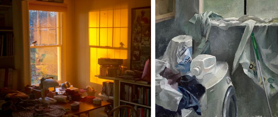
It is impactful to force yourself to find the basic value shapes that exist in everything you look at. This way we help ourselves to not get caught up in details but rather look for the basic essential values. This is especially true when you pay attention to more complex “busy” scenes, such as a messy desk or room. Not only does practicing simplifying values by looking help us in our visual artwork, but it also helps train our minds to pay attention and appreciate the subtle nuances of our environment. Simplifying values is an exercise that can be done anywhere and anytime.
The impact of simplifying values in your painting
The importance of simplifying cannot be overstated. When you take the time to simplify your values, it can bring a whole new level of depth to your work. Simplifying values forces us to think beyond surface details so that we capture the essence of what we are painting without cluttering it with too much information.

Our human eye tends to find detail in everything we see. When we train ourselves to simplify values in painting and limit the amount of information we use, it can free up our creativity. We can work with fewer values and achieve greater depth and variation in our artwork.
By limiting the number of values in a painting, we can better capture the essence of what we want to express. This simplification process not only makes our artwork look more compelling and stimulating but also helps us create something that truly captures an emotion or thought – it gets to the heart of the matter.


14 thoughts on “Mastering the Art of ‘How to Simplify’ Values in Your Painting”
Hello Elizabeth, I am enjoying your tutorials very much, as a learning artist. I had spoken, some years ago to a professional artist, who said, a good form of practice is to take a simple B&W image from a newspaper, turn it upside down, then arrange a range of shades in b/w, say 10 tones, brightest white, through graduated tones, to blackest black, paint it, then turn it right side up, & see how closely your painting represents the photo image.
So that you concentrate on shapes & tones, not distracted by what the image actually is.
Hi Frances, Very glad that you are enjoying my tutorials! Thank you for sharing – that can be a very good exercise to do. In general it is essential to train your eyes to see shapes and tones instead of ‘things’, and the methods that help you to see more that way are good!
I have kearn a lot with your guide, I just need a lot of time to understand as I not an English speaker.
I used to maje digital art, digital scrapbookin and preprint teatching at school. I am used to think about values when looking for colored motifs but is a new struggle to transfer ” feeling” to paintings without using the computer and may be I will some times, using gradient map will help to voluntary change the colours of reallity.
Thank you for sharing that Ana, am very glad to hear the guide has been helpful. It does take time to get used to using different tools and mediums as you mention with the struggle of not using a computer. However, the more you use it, the more natural it become for you and you will be able to express so much more!
I can’t wait to start working with black and white first. I love the look of monochrome painting. This will a great lesson to teach my students. I’m not a pro , I work with assistant living folks. I love your lessons.
Hi Wendy, So glad to hear that you will pass on this information to your students and that you enjoy my lessons. I agree that monochrome paintings can be incredibly lovely and beautiful and think your students will really enjoy the process!
Hi Elisabeth
I’ve thoroughly enjoyed your articles and am love your color mixing that I recently purchased.
Is there a way I can down load you articles to a PDF so I can print them or at least create a folder on my computer?
thanks Jane
Hi Jane,
I am so glad to hear that you have been enjoying my articles and color mixing! I don’t have a downloadable PDF version of my articles available at this time. However, you could copy down my articles into a document and print it out for your own personal use.
Excellent article. Thank you!
You are very welcome Rita!
Thanks for another excellent article. I have learned so much from you.
You are so welcome! Am very happy to hear that – thank you for sharing
Thanks so much for explaining so well the way to ‘look at’ a subject so that it is seen as elements of light and shade … changes the way one ‘sees’ a scene or object. I’ll be spending lots of time looking around me to see these elements in my environment before I attempt to draw them.
You are so welcome Ann, am very glad this was helpful for you! That is wonderful you will practice observing the light and dark values in your environment – this will develop your skills with values quite a lot.