


I have spoken before about using photos for painting versus real life. Personally, I much prefer working from life—the visual information you get is far superior. However, there are times when a photo reference is necessary. The question then becomes: how do we use photo references without becoming chained to them? How do we avoid feeling as though we have to copy them exactly because we are uncomfortable deviating from the visual source?
Why We Feel the Need to Copy
There have been times in the past when I used photographs as reference and felt a constant struggle with this. I felt as though I had to paint things exactly as they appeared in the photograph. Looking back, I realize much of this came from a place of insecurity. I was not yet comfortable enough with painting to interpret what I saw. Instead, I felt I had to reproduce it.
As my understanding of painting grew, however, something changed. I began to understand the language of painting—the building blocks that make it work. Once I understood those building blocks, I could recreate things on my own terms. I could still use a visual reference, but I no longer felt compelled to follow it exactly. Instead, I could use it as inspiration and information while building a painting according to my own vision.
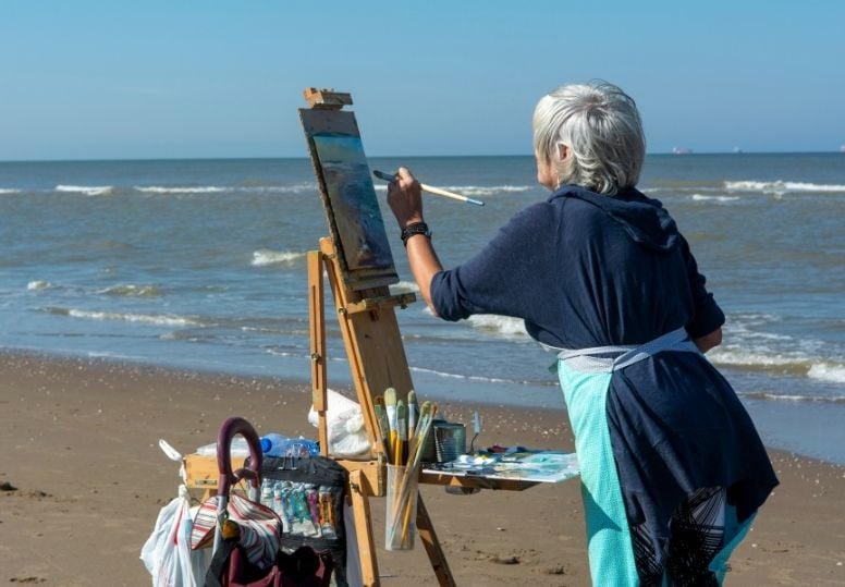
It is similar to learning how to cook. When you first begin, you feel the need to follow a recipe exactly. Every measurement matters, and any deviation feels risky. But as you gain experience, you begin to understand how ingredients work together. You become comfortable making substitutions, changing proportions, and experimenting. The recipe becomes a guide rather than a set of rigid instructions.
This approach is not only more enjoyable—it is also more artistically satisfying. Rather than creating what is dictated by the image in front of you, you create something according to your own vision. And we get there by understanding the fundamental building blocks of what we are looking at.
Painting is much the same.
Painting with a Photo Reference
Let’s look at an example.
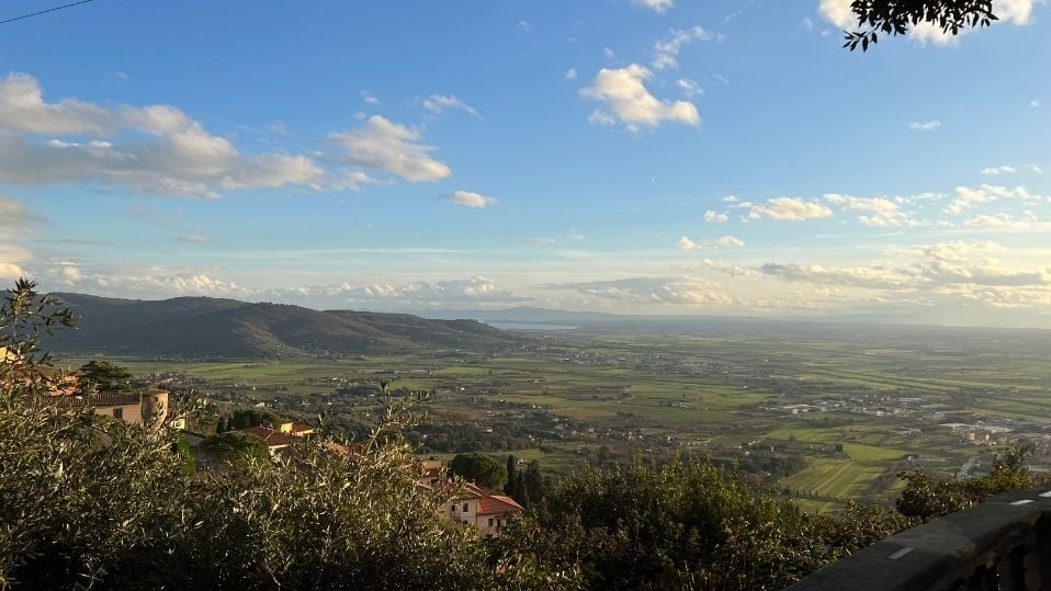
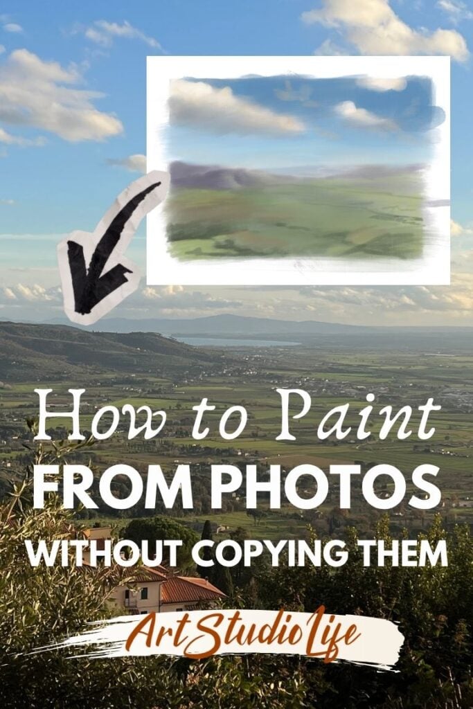
Above is a photograph of a view from Cortona, Italy, taken during a family trip a couple of years ago. If I wanted to use this photograph as inspiration for a painting, the first thing I would establish is which major elements I want to keep. This process begins with a sketch.
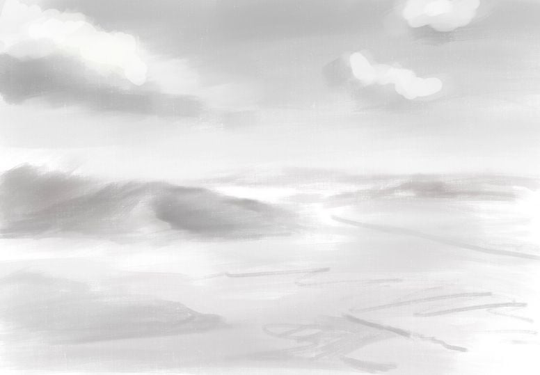
I decide what I want to use from the reference and what I want to ignore. I remove the buildings and branches in the immediate foreground on the left, as well as the ledge on the right. My focus is on the rolling hills to the left, the distant hills far beyond them, the expansive panoramic view, and the dramatic sky overhead.
Already, I am no longer copying the photograph. I am making decisions.
And that is really what painting is: a series of decisions. The more confident we become in making those decisions, the less dependent we become on the reference itself. Rather than asking what the photograph wants us to paint, we begin asking what the painting itself needs.
Building the Color Statement
After creating a basic monochrome sketch, I move on to a simple color study. This is very similar to what I might do if I were painting from life. I identify the large color relationships present in the scene, but I make them work for the painting rather than simply reproducing what I see.
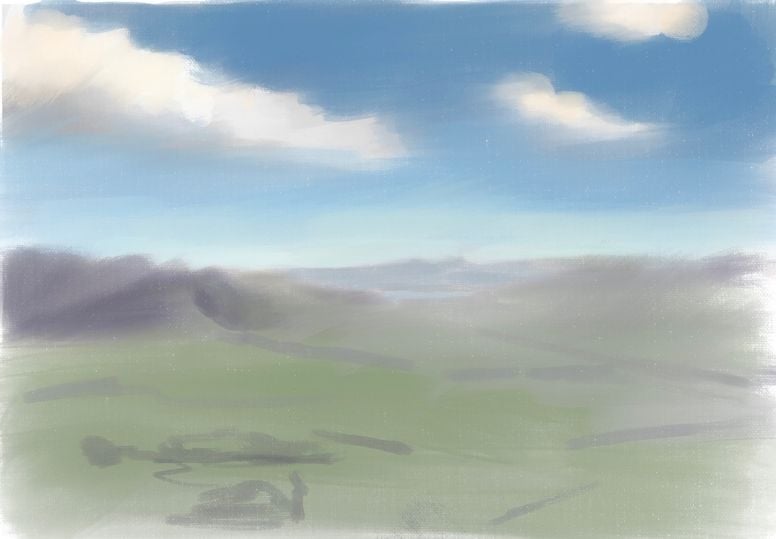
In other words, I am not serving the photograph—I am serving the painting.
I look for the major color statements and organize them in a way that strengthens the image. At the same time, I make sure these large color areas maintain clear value relationships so that the painting continues to convey a convincing sense of light.
This stage, when we are dealing with large and simple masses, is where we have the greatest freedom. Because we are working with broad shapes rather than details, it becomes much easier to think like a designer rather than a copyist.
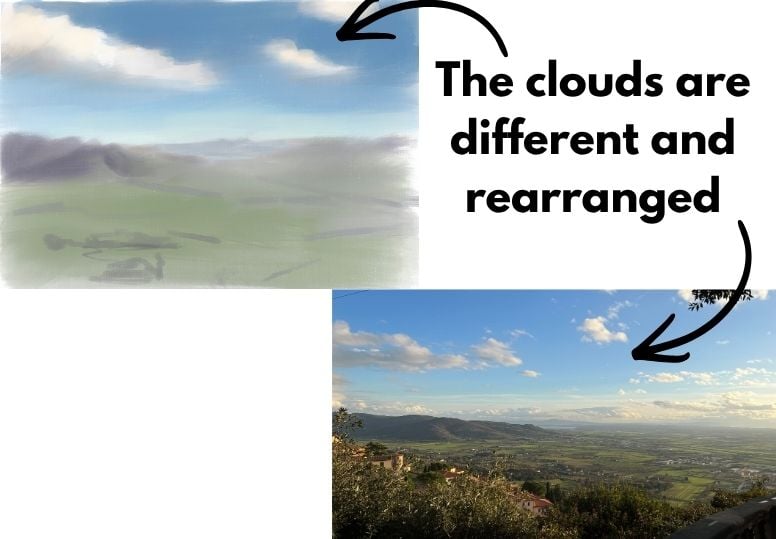
For example, I rearrange portions of the sky so that they better support the composition. I remove elements from the foreground that distract from the panoramic view. None of these decisions are based on accuracy—they are based on what strengthens the painting.
Using the Reference as Information
Once the large color masses are established, I can begin introducing greater specificity. Large shapes are broken down into smaller shapes. Broad color areas become more nuanced. At this point, I continue deciding what to take from the reference and what to leave behind.
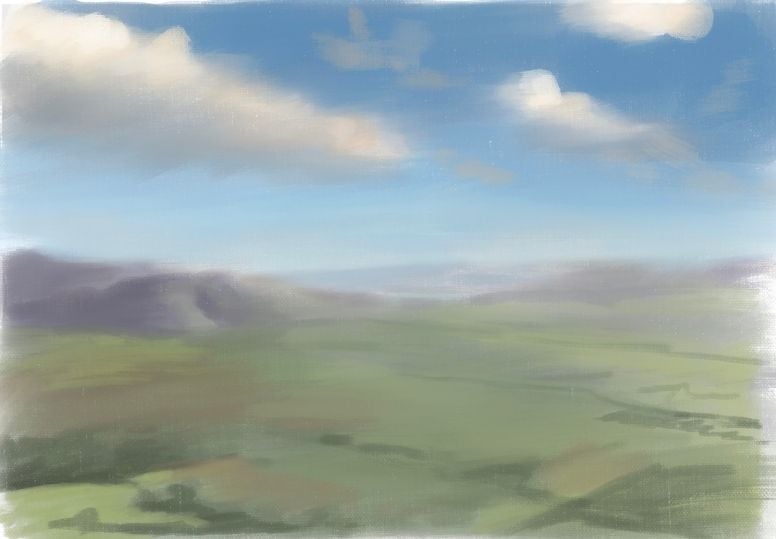
The photograph serves as a source of information, but it is no longer in control.
This is often where painters begin to slip back into copying mode. Details have a way of demanding attention, and it becomes tempting to reproduce everything we see. But not every detail contributes equally to a painting. Some details strengthen the image, while others merely describe it.
The challenge is learning to tell the difference.
The Difference Between Copying and Seeing
This is perhaps the biggest difference between copying a photo and truly seeing. When we copy, we attempt to reproduce everything equally. When we truly see, we understand which information matters and which does not. We begin to recognize patterns of value, color, edges, and shape. We understand how these elements contribute to the overall design of the painting.
As artists, our goal is not to recreate a photograph. A camera can already do that far better than we can. Our goal is to interpret what we see and organize it into a compelling visual statement.
The more we understand the fundamentals of painting, the less dependent we become on any particular reference. Whether working from life, from imagination, or from a photograph, we are no longer asking, “How do I copy this?” Instead, we are asking, “How can I use this information to create the strongest painting possible?”
That is the point at which a photograph stops being something to copy and becomes something to learn from.

32 thoughts on “The Difference Between Copying a Photo and Truly Seeing”
thank you so much, though i am wondering, as i love portraiture and mostly work from old photos that i took and love, not a sitter. if it is the same. I get quite stuck with the details of face, and buy the time that is right, i spoil it with paint… etc, perhaps you can show and example of building a portrait from a photo!! that would be amazing
Thank you for the suggestion! I would like to someday show that as it takes some understanding of how light works in real life. The camera doesn’t capture certain color temperature changes. So would love to show how one applies real life observational experience to working on a portrait from a photo.
Thank you Elizabeth for your wise and helpful words. I try to interpret what attracted me to the view but sometimes looking later at the photo I wonder what it was that made me take the photo in the first place so some notes these days I find helpful.
So glad this was helpful Christine 🙏. It would really be helpful to be able to add notes to photos…
Thank you for the article, last week I succedat to make some black pencil drawings in a park near me, and I make also some photos in order to continue at home on a small canvas with oils. I was struck by the fact that I was more convenient for me to simplify lines of composition and colour in the natural place than using the photos taken. In time I chose some photos in order to try to use them as start for “an artwork” very few succedat mostly because of my skill limitations in an uncontrolled way. This article makes clear some principles and your example of painting is helpful.
Yes! It is a bit more difficult to simplify from a photo than from real life – somehow. Very glad this article helped to clarify the process a little bit more.
You put into such clear words what i have been struggling with. Thank you, i will keep trying.
I have sent for your free color guide but not received it- it arrives as an email ?
So glad this article is helpful! And yes, the free color guide should come to your e-mail – it could be in your junk folder. I will resend it manually to you now to the e-mail you listed here – hopefully one way or the other you will get it 🙂 Let me know if you have any issues!
Always very informative and interesting articles that clarify and inspire.
Thank you for sharing your love passion and knowledge.
Much appreciated.
So glad this article is helpful! Thank you for sharing that 🙏
Great lesson Elizabeth, and very timely, tomorrow is our plein air day, so I will try to use your help in an area that I have continually struggled with. Too much detail. I used to be a draftsman where detail was essential. Thank you very much.
Cheers, John Moloney
So glad this is helpful john – thank you for sharing that!
En primer lugar felicitaciones por la generosidad en compartir todos tus conocimientos que toman tiempo y dedicación. Se aprende mucho con ellos y es motivante llevarlos a la practica. Gracias
You are so welcome! Very glad this is helpful 🙏
Nice article; well done. It is similar to what I tell my art group members: don’t try to repaint the photograph; it already exists, & you’re not going to make it look exactly the same as the photograph. Even if you COULD, why do that? Instead, make your painting into your INTERPRETATION or IMPRESSION of the photograph!
Yes, right on!
Thank you. I have been in the “must not change a thing mode” on many occasions “. It is difficult to let go of that, particulatly if you think you have taken a really good photo.
It is incredibly hard to let go of that. But the more one does it the easier it gets. Even starting in small doses helps a lot.
I continue to have “aha” moments when I read your articles. This one hit hard because it was right on point. I want to start another painting following your method, and try hsrd not to copy.
So very glad to hear that John! thank you for sharing that 🙏
One comment that has always stuck in my mind was ‘Don’t marry the photograph’. My teacher said this to the class many years ago, and it’s been my mantra ever since. A photograph should inspire, not cause you to perspire. Worse still, cause your art to expire. Great article as always Elisabeth
Great words of wisdom there, thank you for your kind words and for sharing Paul! 🙏
Hi thank you. Referencing photos of portrait pics must be same deal except that slavery to likeness. I think likeness is the most important goal
Yes! there is a greater degree of accuracy needed when it comes to drawing. Though I feel one also needs to bring ones knowledge of how color and light work in real life when working from a portrait photo. Cameras don’t fully accurately record color temperature – so a slavish dependance on the photo will end up with a more flat looking painting. So, in a way it is very important to apply ones own knowledge of how light and color work in real life to a portrait reference
Seems like you use both the photo and real life as a reference and do what the painting needs. If that is right why paint from life?
Personally I paint from real life 99% of the time. I sometimes use photos if I get a very specific commission that needs it. And I then apply my knowledge of how color and value work in real life to the work. Real life has much richer information to work from than a photograph. Photographs don’t accurately show color temperature, value etc. If one doesn’t have knowledge of how light and color work from the experience of working from life – then paintings done from photos can often turn out very flat.
Your article is spot on, Elizabeth! I struggle with value and color especially getting my darks dark enough! Putting more “thinking“ into your painting when using a photograph makes it more challenging!
Thank you Patti! Yes that is absolutely true – it makes the process much more engaging and interesting.
How would I apply this to a portrait photo reference without losing likeness?
Thats a good question. There are some things that we can take greater liberty with, and other things not as much. With a portrait, you have to be very precise with the measuring and drawing part of it – this cannot be compromised. However, you can change the color, background, add in or take away elements. You can be dead on accurate with your drawing while at the same time be very free with how you interpret the reference.
I much appreciate your articles and especially how you provide simple clear illustrations of the points you make.
Thank you so much for your kind words! Am so glad my articles are helpful 🙏