

Light and shadow is a central component to painting as it is what makes up the light and dark areas of a work. For example, let’s take a look at a self portrait by Rembrandt – a painting with strong light and dark contrast. You can see the left side of his face is illuminated by a stream of light.
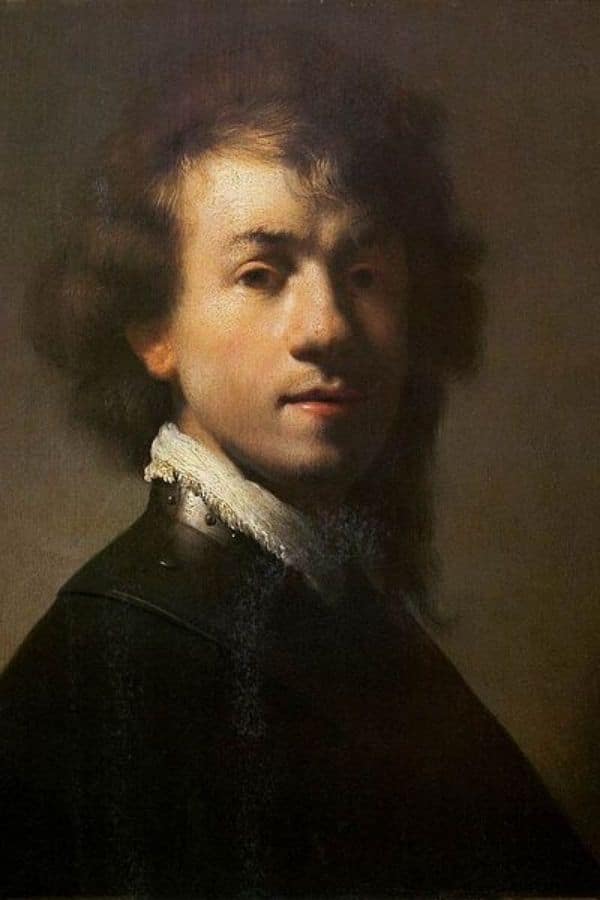
Therefore, the left area of Rembrandt’s face is regarded as being light in value. In contrast, if you look at the same Rembrandt painting the right side of his face – the shadow area – is considered to be dark in value. These two elements – light and shadow are the two basic elements that are required in painting.
Painting with color and light can be difficult. Just mastering light and shadow on its own is hard. However, when adding color into the mix it suddenly becomes much more difficult.
This chapter exists to help you with exactly that – to be able to establish strong values in your painting while also using color. Here I break down steps necessary to understand how color and value work together.
Value > Color
Value is the most important thing to learn as a painter and draftsman – I would even dare to say that it is more important than color. If a painting has beautiful color but lacks a value structure, then the painting will not be successful. However, if the colors in a painting are mismatched or unnatural, but has a value structure, then the painting will work and be successful. So, value is central to the success of a painting.
Fauvist paintings
Looking at paintings by the Fauvists is a good lesson in learning about the relationship between value and color. For those of you who do not know, the fauvists were a group of painters that valued strong colors over representational or more realistic ones.
Even though the colors that these painters would use are entirely different than what one would ever experience in real life – the paintings work and have clear light and dark values!
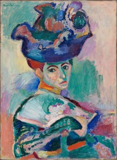
In the painting above by Henri Matisse we can see there are areas of light and dark values. The right side of her face is darker than the left. Her forehead shows a dark shadow presumably from her hat.
How does this work you ask? Well, every color has its own value. For example, yellow is lighter than a deep red, and blue is darker than a light pink. So, the fauvist painters use the colors in terms of their value structure. Sure, it is unnatural that the right side of the woman’s nose in the painting above is bright green. However, the green serves as a great shadow color as it is darker than the more illuminated areas of the portrait.
To understand how color and value work together even more let’s take a look at the…
Color wheel!
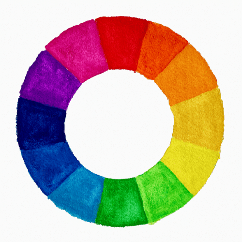
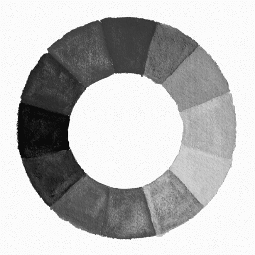
Above is a color wheel to the left and the exact same color wheel with a greyscale filter over it on the right. You can see the values of each color more clearly in the greyscale versions. Notice that the red on top is dark as is the blue on the middle left. The lightest color is the light yellow on the right.
So, you can see how different colors have different values. It is important to see a color first in terms of its value since it is the most important element in painting.
If you haven’t already get my FREE Color Mixing Guide for helpful color mixing instructions and techniques!
Always see value first
Now that we have established that different colors have different values we will talk about how to put that together in our painting!
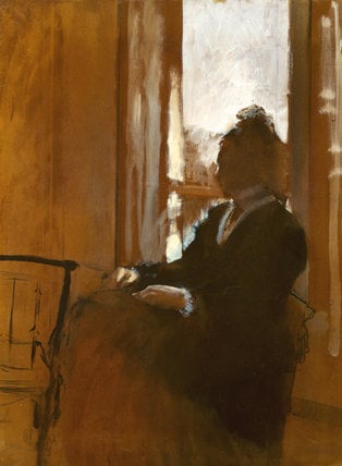
The above painting by Edgar Degas is a perfect example of what it means to put value first. Degas did not focus his attention on all the different colors present in the scene. Rather, he started by first making a clear distinction between light and dark values. The lightest part of the painting is the window. The darkest part of the piece is the darkened silhouette of the woman. When you establish a clear area of light and dark from the beginning the rest becomes much easier.
Start simple
Before even getting out your paints it can be a good idea to first create a small tonal value drawing. Creating a black and white drawing first can help you to figure out the light and shadow areas first before introducing color into the mix.
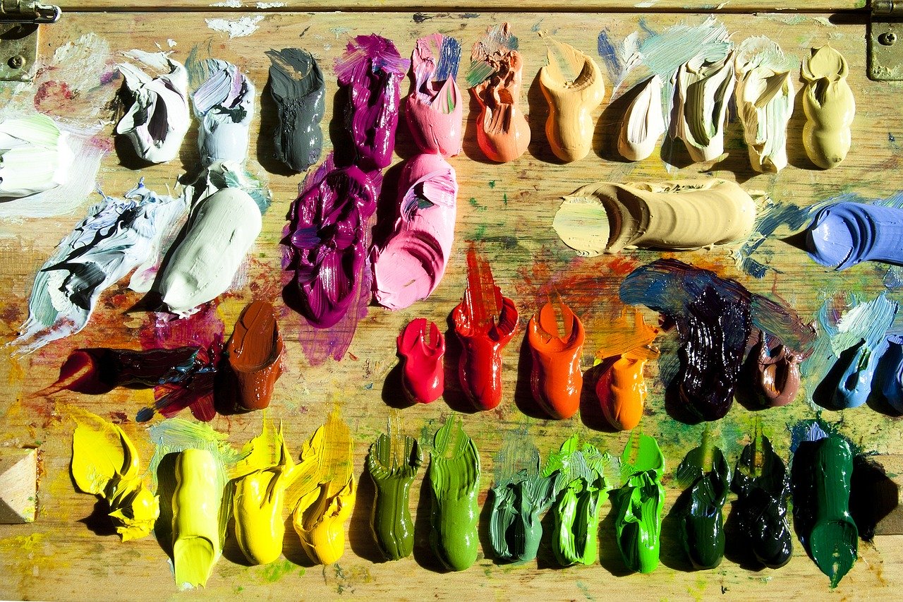
If you are still trying to get used to color I highly recommend starting with a limited palette. A limited palette simply means using less colors. However, you would still have all the colors you would need to create a painting that has a strong tonal structure. If you would like to try out using a limited palette, then a great place to start is getting yellow ochre, ultramarine blue, ivory black, burnt sienna and white. Using just these few colors will allow you to more easily focus on value while at the same time dealing with some color. As you become more accustomed to how to create a painting with a strong value structure then it is a good idea to transition to a fuller palette.
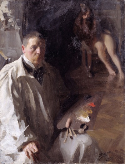
The above painting by Anders Zorn, is a great example of a painting done with a limited palette. It also has a clear value structure. Anders Zorn famously used a limited palette of four colors – vermillion, ivory black, yellow ochre, and flake white (lead white). A lot is possible with just a few colors!
Transitioning into a full color palette
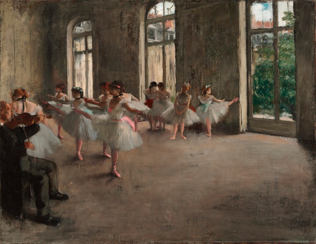
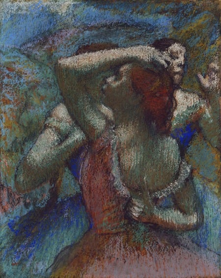
You do not need to wait until you feel that you have mastered painting with color and light before transitioning into a full color palette. So much of the learning comes through the doing. Plunging into the world of color can sometimes be the best thing you can do! Above and below are some great examples of pieces done with a full color palettes. Both are by the French artist Edgar Degas. Notice how clear the value structure in both pieces are. It is so clear because Degas simplified the light and dark values very well!
Always keep in mind to put value first. Whenever you first start a painting be intentional about putting down your dark, light and medium values so that you have a clear value structure from the very beginning. Continue to put an emphasis on light and dark values as you progress in your painting.
Video painting tutorial: How to Paint Light and Shadow
More resources
If you wish to delve further into the topic of light and shadow check out these related articles:


2 thoughts on “Painting With Color and Light – Color Shading Light & Shadow Techniques”
מעולה
תודה רבה
בהערכה
רותי כהן
שלום רותי,
אתם מוזמנים 🙂 תודה על העיסוק והקריאה!