


Landscape painting can be challenging! I remember one of my first outdoor painting ventures when learning to paint. At the time, I was in Italy with my school for the summer for an intensive landscape painting master class. It was a wondrous feeling being able to paint outside and study the landscape, not to mention be in Italy.
However, I was reallyyyy struggling and getting more and more discouraged by the day as none of my paintings were working out. It wasn’t a matter of me feeling simply dissatisfied with my work. I was entirely behind my peers and didn’t know how to move forward. It was embarassing to say the least.
Looking back, I wish that I understood then what I will share with you here. These are some simple but universal truths when it comes to landscape painting. I hope these will help you as much as they do me when out painting landscapes!
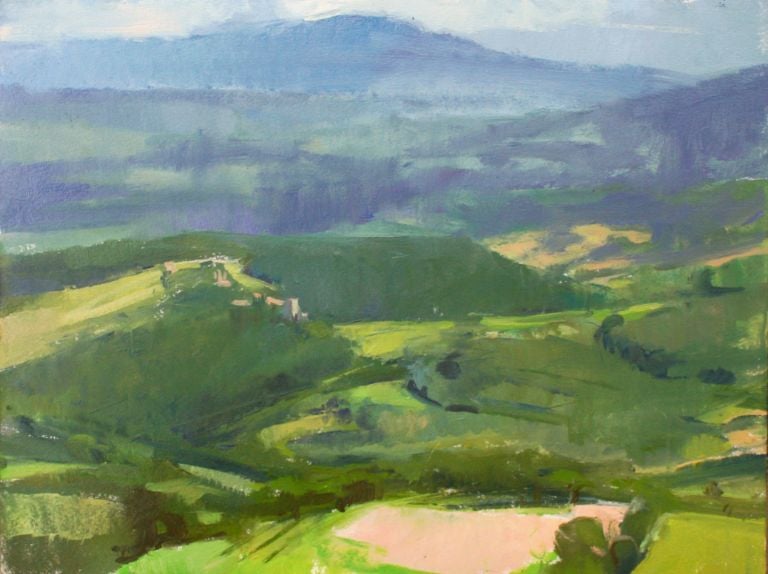
Things farther away are lighter in value

In the painting above of a view of the city of Florence you can see how the mountains/ hills in the background are quite light in value in comparison to the foreground area. This is essential when it comes to creating a believable sense of space in a painting. Light areas go back/ recede in space while darker areas come forward.
See it in nature
Next time you go outside for a walk or to paint, take a minute to notice how the areas that are far off in the distance are much lighter than what is in the middle ground or foreground. When you apply this to your work you will achieve a much greater sense of space. This is true for all kinds of painting, but is especially powerful in landscape painting. Because it is precisely this that helps to create a feeling of air and atmosphere in the painting.
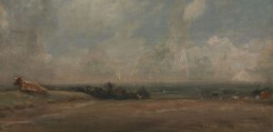
The Foreground tends to be Warmer in Temperature and the Background Cooler

In general, cooler colors always recede further back in space while warmer colors come forward. Applying these temperature changes and differences to your painting will help to create a greater sense of space. You can see this in action in the watercolor painting above by JMW Turner, you will notice that the foreground is primarily yellow/brown. This brown/yellow coloring becomes increasingly ‘bluish’ as it recedes to the mountains in the background. If you take a look at other landscape paintings you will also notice this.
You will create much more depth in your piece if you follow this rule of thumb. Like with everything though, there are some exceptions to this rule. The best thing you can do is to observe very closely what you are painting.
How to figure out color temperature

Always compare certain aspects of the landscape to one another. By doing this you are able to deduce what the temperature of something is. For example, if you compare a piece of the foreground of a landscape with some distant mountains – you will be able to deduce whether something is cool or warm. Temperature is relative. It is only when you put something in relation to something else that you can know if it is ‘warmer than’ or ‘cooler than’ something else.
Keep sharper edges towards the front and softer edges in the distance
Edges are one of the most important aspects that create interest in paintings. As a general rule of thumb, sharp edges move your eye to the foreground while soft edges make things recede. The above work by Elise Schweitzer is a wonderful example of sharp and soft edges present in a landscape painting.
Notice the sharp edges along the hedges in the front of the painting as well as the sharp edge of the hill in the middle ground. Then, look at how the colors in the background are quite soft in comparison. The brush strokes almost take on a ‘smudged’ appearance.
All of these varying degrees of edges help to create a sense of space in which the sharp edges of the foreground make us feel that space in front. While the soft edges in the background make us feel the vastness of space recede far back.
Make use of mixing complementary colors together (mute your colors!)

When painting landscapes it is easy to see and use a lot of the same colors. For example, when painting a green meadow there will be a lot of, well, green. This is one of the many reasons why painting out of doors sharpens your feeling for color and temperature. You must observe and compare different colors to one another – including different greens.
This is where learning to mute your colors and spending a lot of time mixing will come in handy. If the green you see is not very vibrant, make it less ‘green’ by adding red (the complementary color of green). If the green is not very vibrant but is somewhat cooler in temperature then add red to mute it but add some blue as well to make it cooler.
It is important to experiment when mixing your colors. Color mixing is very much an intuitive thing. There are certain principles, but beyond that you will mostly learn to mix colors entirely by just doing it. Check out the ‘color mixing guide’ for some of the principles.
Look at and study a lot of other landscape paintings
Like anything, studying excellent examples of those who came before you does wonders to the learning process. Go to museums and look at landscape paintings. Buy books of landscape artists you admire. Draw from them, paint from them. In fact, doing little studies of landscapes accelerates your learning process vastly more than simply looking at paintings.
When actively making a study of something, you inherently look deeper at the landscape you are copying. Therefore, you notice things you would not have noticed otherwise.
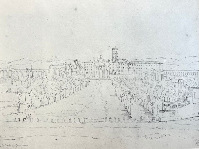
The above image is an example of such a study. It is a small 5 x 7 in oil on canvas sketch after Corot’s ‘Bridge at Narni’. I strongly recommend doing such studies either in paint, charcoal, or pencil. You will develop a strong sense of composition and value. As well as have a lot of fun in the process of making studies of great landscape paintings!
Leave a comment below if you enjoyed this article or have any questions. I will be more than happy to answer them.
Want to remember this? Save 5 Landscape Painting Tips to your favorite Pinterest board!


60 thoughts on “How to Make Landscape Painting Easy: Tips I Wish I Knew Sooner”
Thank you so much! I am a Very newbie painter. I was given gouache paint as a gift a yr ago.. had no idea what that was! Little by little I am learning how to paint. All these tips are vital for me! Right now I am particularly attracted to Edgar Payne’s beautiful landscapes and my teacher has had us do a number of studies on some of these works. I can use all the help I can find! So glad to have discovered you.
Thank you for your comment Anne! Also very glad you found my information and happy that it has been helping you. Wish you much joy as you continue the learning journey!
I am delighted with the new resources and your sharing of how to study them, in this new setting your teaching skills & ability to share your love of art and the joy of painting are served very well. I will happily expand my study of landscapes by the artists you suggest and expand my Corot Collection,,my first love,
Thank you Patricia! So glad that you enjoyed this article 🙂 And that you will expand your study of landscapes!
Thanks for the tips always helpful as are bulk of my paintings, dragging in at 2nd are still life’s. Ellen
Thank you Ellen! So glad these tips are helpful 🙂
OMG so happy you ask happy this question. I don’t know why but I’m so fascinated with drawing landscapes for some reason, but I’ll go with it . Love and love respect your artwork, very inspiring and thank you for blessing us with your amazing talent.
You are so welcome Christopher, and thank you for your kind words! Landscape drawing is amazing – glad you love it. Keep on doing them.
I learned so much with your painting tips. Thank you very much, Elisabeth.
So glad to hear that! You are very welcome 🙂
It caught my attention when you discussed how edges play an important role in paintings since sharp ones move your eye to the foreground while soft edges make things recede. Our latest project involves landscape painting, which is one of my weak points so I’m having a hard time starting. I’ll have to keep this in mind when I start painting once I find an art studio to rent soon.
Yes, keeping those edges in mind as you do some landscape painting will help a great deal to create spatial depth! Edges also add a great deal of interest to a painting. Wish you fun with the landscape painting project.
If you ever felt comfortable sharing a side by side of your early paintings (like your class in Italy) vs now and how you’ve improved, would be so beneficial for beginners like me. At any rate I love everything you post!
Thank you!
Dani
Hi Dani, That is a good idea! Glad to know that is something that would be helpful. I will keep that in mind for the future! 🙂 Happy to hear you enjoy the material on this website!
The article is great. It reminds me once again what to keep in mind when I paint landscapes. Thank you.
Hi Antonina – I am glad to hear that! Thank you for sharing 🙂
מעולה.תודה רבה להמחשה וההסבר
שנה טובה
רותי כהן
תודה רבה 🙂 גם לך! שמח מאוד שזה מועיל. תודה על השיתוף!
I’m terribly new at painting, have never had any lessons, and painted my first landscape last night from memory of a picture I had seen online somewhere. I didn’t sketch it out (and now totally see the value in that) and did pay attention to where light matches the land and trees (and where light hits) and I’m pleased with it, but other than sketching it out first next time, you’ve totally blown my mind with using cool hues for objects that are further and warmer as they are closer! I’ll definitely be doing those things next time, and perhaps I could share with you my painting somehow so I can get some constructive feedback.
Thank you for all your tips!!
Hi Micheline, I am so glad to hear that my tips were helpful to you! That is wonderful that you are getting into landscape painting. You are welcome to e-mail me your work if you would like to. You will also continue to find more and more resources for learning here on this website. Happy Painting!
Truly appreciate your tips, tutorials, and videos. Your advice is helping me in watercolor and with pastels. Thank you for sharing your knowledge in such a lovely way.
You are so welcome Michelle- I am very happy to hear that. Thanks for sharing 🙂
Thank you so much. I learned a great deal from your article as well as enjoying reading it. These pointers help immensely with my progression. Please keep them coming. Pete
So glad to hear that, thank you!
Thanks to you for this wonderful article; I signed up for your emails and have learned from every one of them! Very helpful and easy to understand!!!!
So happy to hear that! Thank you for sharing 🙂
Enjoy your courses and learn so much. I travel a lot and take loads of landscape pictures that I would like to paint.
Do you or have you considered a mini landscape course?
Thank you.
Hi Barbara, So glad you enjoy my courses! Thank you so much for sharing that. I have been considering making a landscape course as I really love landscape painting – may be something I announce in the future!
I love painting landscapes and at times they turn out amazing and then….I get stuck and can’t figure out what is wrong. It’s usually color and this article gave me some really good ideas. In fact, I love reading all your articles, you are amazing. Thanks
i totally enjoyed your lessons. i am now spending more time painting.
Hello Malini, I am so glad to hear that! Thank you!
I do enjoy your explanations i hope i can use them properly and thank you very much for your time
Thanks Elizabeth, For this information, it is very helpful.
Hello Edith, You are welcome! Good to hear from you, and glad that it is helpful 🙂
Loved this and found it very helpful as im a newbie to art thanks for sharing
This article has reinforced and explained the essential techniques of landscape painting which is easy to read and follow. Thanks for sharing this with us.
Thank you Warren! I am glad to hear that and that the techniques and tips are easy to follow.
Elizabeth,
I love your tips even if i am not in a landscape painting (you saw my small gallery already). Especially the tips about edges and temperature. It can be applied to the portrait painting or still life as well. Thank you!
I am so glad to hear that Roman, thank you for sharing! Yes, they absolutely can be applied to portrait and still life as well – they beauty of being able to translate painting fundamentals to whatever one is working on.
Elizabeth
Your explanation of the techniques are very helpful.
I really learned from reading it.
Hello America, Wonderful to hear from you! I am glad that you enjoyed reading it!
I am an amature at that, a beginner. Your tips have been highly informative. A landscape at a closer look, is something i would like to learn, not an object, not a field view but something more distincly visible. I look forward to your valuable info.
Thank you so much for sharing! I am very glad to hear that.
I love you ! The tutorial is so great !
Thank you so much Kamila! I am glad to hear that you enjoyed the tutorial!
Thank you Elisabeth for sending these articles. I plan to do some landscapes shortly and this was helpful!
The color mixing articles are also very good and are helping me to be more creative!
You are welcome Andrea! That is great that you plan to do some landscape painting soon. Am glad to hear that the color mixing articles have been helpful.
Thank you Frances,
Found your 5 suggestions very clear.
I am a landscape painter self taught. You might say I already follow these ideas without realizing, and you have put them in words clearly. Now I can be more conscience of what I am doing,
Hello Paul, Happy to hear that this article was helpful. Often it happens that way – that one does some things without realizing. Then after learning it, it becomes more clear and solidified. Happy Painting!
I do enjoy your explanations i hope i can use them properly and thank you very much for your time
You are welcome! Very glad to hear that they are helpful 🙂
Thank you for your clear explanation.
It helps me a lot.
Irene
Hello Irene,
I am glad to hear that it was helpful!
I’m very pleased with your articles as I learn from you, thanks for that..i want to learn this point: will i do the underpainting on canvas without giving values or will i do the sketching by using the earth colors in lights and darks? I’m too confused, I will be happy if you make it clear..
HI Sebla, I am glad to hear that the articles have been helpful for you! Very good question. You can create an underpainting without marking out values – this would be more of an imprimatura. You can also create values with just your one color that you use to make an underpainting by marking out where the darks are and using a rag to wipe away paint for where the lights are. However try to keep the paint very thin! You just want there to be a very thin ‘transparent’ layer.
I enjoy all your talks and lectures and like the way you relate them to actual Painters and their pictures. I think i shall have a go at copying the Corot bridge at Narni.
Thank you! I am glad that my articles come across that way – as I want them to foremost relate to painters. The bridge at Narni is an excellent painting to copy – so much to learn from that one!
Your articles are very impressive
You are very kind for saying so, thank you Frances!
Ohh yes I did enjoy and learned from this article. Thank you so much. Cant wait to get started.