


Understanding the significance of complementary colors is vital in color mixing and painting. It not only enhances your color mixing abilities but also enables you to create subtle color transitions in your art and painting.
In this article you’ll discover what complementary colors are and see them in action, through examples of paintings and color mixing diagrams. All of which will show you how you can intentionally apply fundamental color schemes in your work and how to create them on your color mixing palette! So, first off let’s look at what complementaries are.
What are Complementary Colors?
Complementary colors are pairs of colors that are opposite one another in the artists color wheel. Take a look at the color wheel below and you can see that blue and orange, red and green, as well as yellow and purple are all complementary color pairs because they are all directly opposite from one another on the color wheel.

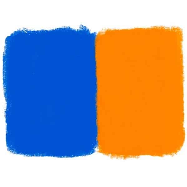
When you put complementary colors next to one another they create a very vibrant, high contrast relationship. Let’s take orange and blue for example: when placed next to each other, they create a very strong and intense color contrast because they are completely opposite colors.
How to Use Complementary Colors in a Painting
Complementary colors also create a very interesting and beautiful color contrasts in a painting. This is due to the fact that no matter what combination you use, they will always be different from one another.
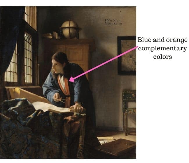
Using complementary colors can help make your painting more dynamic and stand out as can be seen in the Vermeer painting below. Notice how the blue and orange placed next to each other make that area of the painting stand out quite a bit.
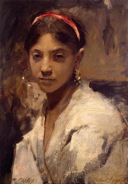
Complementary colors don’t have to strictly be placed side by side in a painting for them to have a strong effect. Take a look at the Sargent painting below ‘Head of a Capri Girl’. The background color is a muted greenish color, while the headband color is red and surrounded by the girls black hair. Despite this, the background color of the green helps to make the color of the headband even brighter than it would look otherwise since it is the opposite color of green.
Ways to Mix Complementary Colors
Now, when you mix two complementary colors together, they create a muted color. This is because when the two colors are mixed together, they create a grayed down or duller version of both colors. Essentially, complementary colors have the ability to cancel one another out. So, if I were to mix some blue into orange the orange would become less orange. The opposite is also true because if you mix orange into blue then the blue becomes less blue. This is true for all of the complementary color pairs.
Mixing blue and orange together
You can see an example below of mixing blue and orange together. Notice how the blue becomes muted when orange is mixed into it. Conversely, when you mix some blue into orange then you get a muted orange color.

Mixing the complementary colors red and green
You can also create muted shades by mixing together the complementary colors green and red. Whichever color you use more of (the dominate color) is the color your will define as muted. In other words, if you mix a little green into your red–it will produce a muted red and so on.
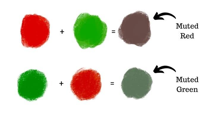
Mixing up muted green colors by mixing some red into green is an excellent tip for creating more realistic landscape paintings. Most green colors you will see in paintings are at least slightly muted!
Mixing the complementaries: purple and yellow
Now, we can see how mixing together the colors yellow and purple create equally useful muted colors.
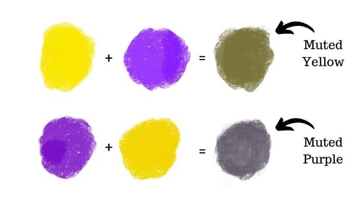
Remember that with all of these color mixtures you could make them more or less muted. For example, in the image above I could mix less purple into the yellow so that it would not turn out as muted. Or, I could simply mix in more yellow into my muted yellow to make it a little more yellowish. The same is true for the muted purple color.
Muting a color by mixing it with its complementary color creates richer colors. Learn how to put color mixing into practice – I also have this free color mixing guide available to help guide you further. In addition, this article will help you to learn why muted colors are so important to painting.
Ability to Create Muted Colors
The ability that complementary colors have to mute each other is the exact reason why they are so important and why you need to use them in your painting. Rarely do you use a color straight out of the tube, as they are far too saturated. By using complementary colors, you can mix together a color that is much more subtle and realistic.

The world is not made up of bright colors everywhere. Most of the colors we see are muted and toned down. Which is why we need to do this in our painting as well by mixing up muted colors. If we were to use primarily saturated colors all over our painting it would look rather uninteresting and nothing would stand out as everything is bright. However, if we use a lot of muted colors and make just a few areas saturated – then those saturated areas will make a statement and create a focal point in the painting.
Example of muted, complementary colors in painting
Take a look at the painting below. It is full of muted colors, but has a few areas that are more saturated….
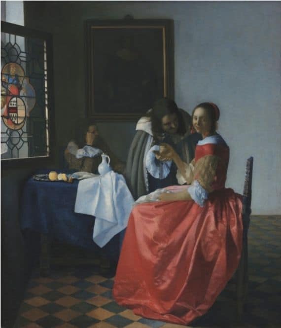
It is because of the muted colors that surround the painting that the bright colors (especially the dress) stand out so much and catch our eye. Vermeer utilized the power of complementary colors to mix his beautiful muted tones.
Different Complementary Color Pairs
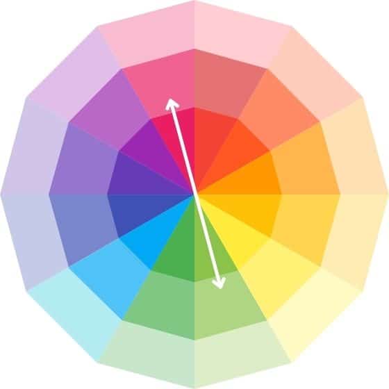
There are more complementary color pairs beyond just blue and orange, purple and yellow and green and red. Take a look at the color wheel below that shows all the multitude of complementary color pairs that are found between red, orange, yellow, green, blue and purple.

You can find more complementary color pairs by using the color wheel above. For example, we can see that a cool blue is directly opposite the orangey red – making them both complementary color pairs.
The image below outlines all of the complementary color pairs that are in between green, yellow, red, orange, blue and purple. The color wheel could be broken down into even more colors that would reveal more complementary color pairs.

However, you don’t want to have to make up a big color wheel in order to figure out all the possible complementary pairs for different colors. There is a way for you to figure it out by just looking at a simple color wheel! For example if you mix a blue that is a little closer to green than purple then the complementary color for it would be more of a reddish orange.
If you mix a yellow that is more of an orangey yellow then its complementary color isn’t going to be a straight purple like it is for a pure yellow. Rather, it will be more of a bluish purple since the yellow is close to being orange. You can use this logic with all colors!
What About the Complementary Colors to Pink?
You might be wondering what the complementary colors to pink are! We don’t see pink on the color wheel. However, pink really is just a light red. In the color wheel above you can see the colors lightened on the middle and outer rim of the color wheel. You can see that the complementary color to the pink is a lighter value green color which resembles a pistachio or wasabi green.

In general, when you are dealing with lighter value colors, the complementary colors will also be equally light in value.
Color Amounts for Mixing Complementary Colors
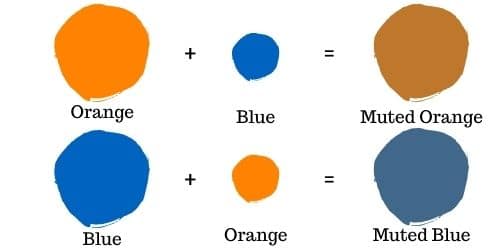
Remember that depending on what kind of muted color you want to create use a little more of that color. For example, if you want to mix a muted orange color, then mix a smaller amount of blue into a larger amount of orange. The opposite is also true. If you want to mix a muted blue, then mix a smaller amount of orange into a larger amount of blue. You can see this illustrated in the image below.
Consider color strength
However, you also need to consider the strength of your color. Some colors are stronger than others. Darker colors as well as cadmiums tend to be stronger paint colors. Using cadmium red, a vibrant and intense color, when mixed with a green hue you created, can swiftly overpower the green.
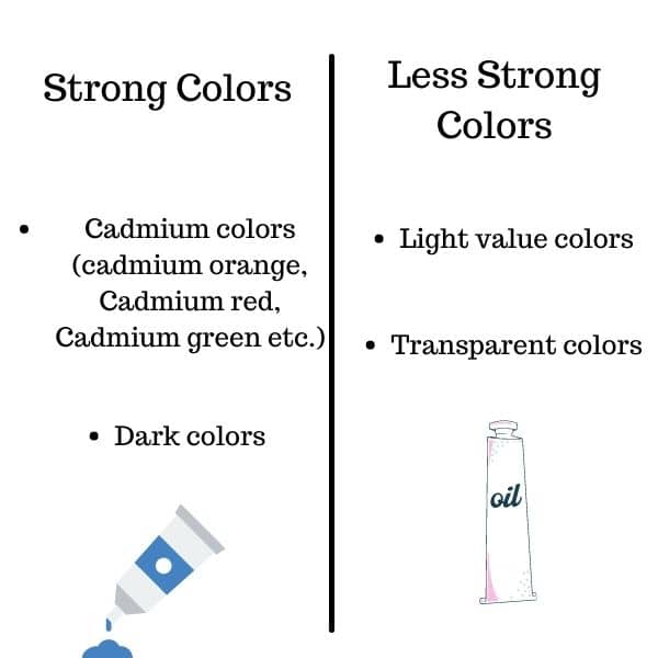
Now, mixing a dark purple into yellow may easily overwhelm the yellow as it is lighter in value. So just be aware of the colors you are using and use appropriate amounts. The more you experiment with complementary colors, the greater your confidence will grow in mixing different shades.
Examples of complementary color schemes in art
Complementary color schemes are frequently utilized in art. This is due to their exceptional ability of enhancing the visual appeal of a painting. All of the followings paintings by Degas and Cezanne each use a different complementary color scheme.
Yellow – purple complementary scheme

In this Degas painting we see a different kind of complementary color scheme – yellow and purple. The floor is a muted purple color, while the wall is yellow (including a yellow bow on the ballerina).
Having these two complementary colors makes the painting more dynamic by creating an intense color interaction. Our eye first goes to the area where the two complementary colors meet – the dancers. Again, you see here how the artist used complementary colors to guide the eye.
Red – green complementary scheme
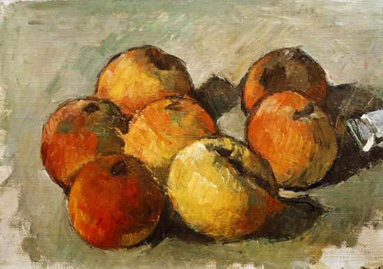
Last but not least we have a still life painting by Cezanne. The complementary color scheme used here is red and green. We have a painting that has a foreground and background that is mainly made up of green or light green. The apples range between deep red and orange.
In a complementary color scheme painting, you’ll never have a piece that is made up of solely 2 complementary colors . Rather, there will be a range – and most likely some other colors mixed in as well.
In the Cezanne still life, you can see how the red apples stand out against the green foreground and background! Another example of how complementary colors make certain areas stand out.
How to Start Mixing Colors on Your Own

Practice mixing up some muted colors yourself by using the complementary color pairs on your palette. The amounts you use for each color will greatly affect the kind of muted color you are able to create. So, start with a tiny bit of the complementary color and add more until you reach the desired muted tone. Play around with it and see what works best for the painting you are working on. When done correctly, this can be a very powerful tool in your painting arsenal!
A few color mixing resources that will help you practice mixing complementary colors:
Want to remember this? Save How to Use Complementary Colors to your favorite Pinterest board!


11 thoughts on “The Significance of Complementary Colors in Art and Color Mixing”
Your information on the color wheel was very educational. Thank you so much for your article.
I am glad to hear that – you are very welcome!
Really good lucid lesson on mixing complimentary colours
complete with colours.
So glad to hear that this was helpful! Thank you for sharing 🙂
Again you achieve a comprehensive and clear explanation of what is for me a difficult subject, Thank you. I’m colour blind, I see trees as green and their shadows as darker green. My wife says ‘can’t you see the reds or purples or browns?’ I have to learn this, I have to read the labels on the paint tubes, and it’s never successful. So your enlightening, detailed explanations are truly helpful.
Thank you for sharing that Neil. I am so glad this article was helpful. I admire your persistence in learning to use colors despite having color blindness!
Danke Elisabeth. Für mich ist dies eine gute Anweisung die ich sehr zu schätzen weiß.
Hallo Maria! Es freut mich sehr dass diese Informationen für Sie hilfreich sind! 🙂
hoi lieve Neil Sherry, de meeste bomen zijn groen en de schaduwen donker groen… de paarse en rode kleur gebruiken ze omdat ze het mooi vinden want het donker groen is bijna zwart dus saaie kleur…grtjs van ruud
That was a really helpful article.
Thank you.
Glad to hear that! You are very welcome 🙂