

Color is an immense and complex topic and belongs under the larger category of ‘the nature of light’. As color is light. However, I will not be going into scientific diagrams of light rays… Instead, I want to present color as concerns the artist. Most importantly, I want to show how to think when using color. There is no formula when it comes to color. Reality is far too complex for formulas.
There might be some pre prescribed rules that work in certain instances. Even with these however, it is important that the artist alway question him or herself if the ‘rules’ are true in a certain set of circumstances. Ask a question for every decision you make when it comes to color. I believe a painting is built on continually asking questions of what you are looking at while painting.
Anatomy of Color
There are three main components to color:
Hue:
Means the category of a color – for example whether it is red, purple, orange or blue
Chroma:
The intensity of a color, or how saturated it is. Typically colors straight out of the tube are considered high chroma colors. A cadmium yellow straight from the tube has a high chroma compared to a yellow that was mixed and muted.
Earth colors tend to have low chroma. Neutrals such as white, grays and black are zero on the chroma scale.
Value:
Value is the degree of darkness or lightness a color has. For example, black has a very dark value, while white a light value.
The Munsell Value Scale
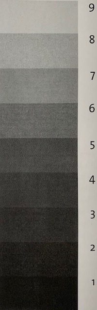
Albert H. Munsell created a color classification system in the early twentieth century. It is the most widely accepted system of color classification today. The value scale goes from one to ten. One being the darkest value and 10 the brightest. You will notice that 10 is excluded. That is because it is the brightest bright and is brighter than the white of the page. The Munsell system is good to use for clarity purposes when explaining value. So, refer to this scale when necessary.
Color Wheels
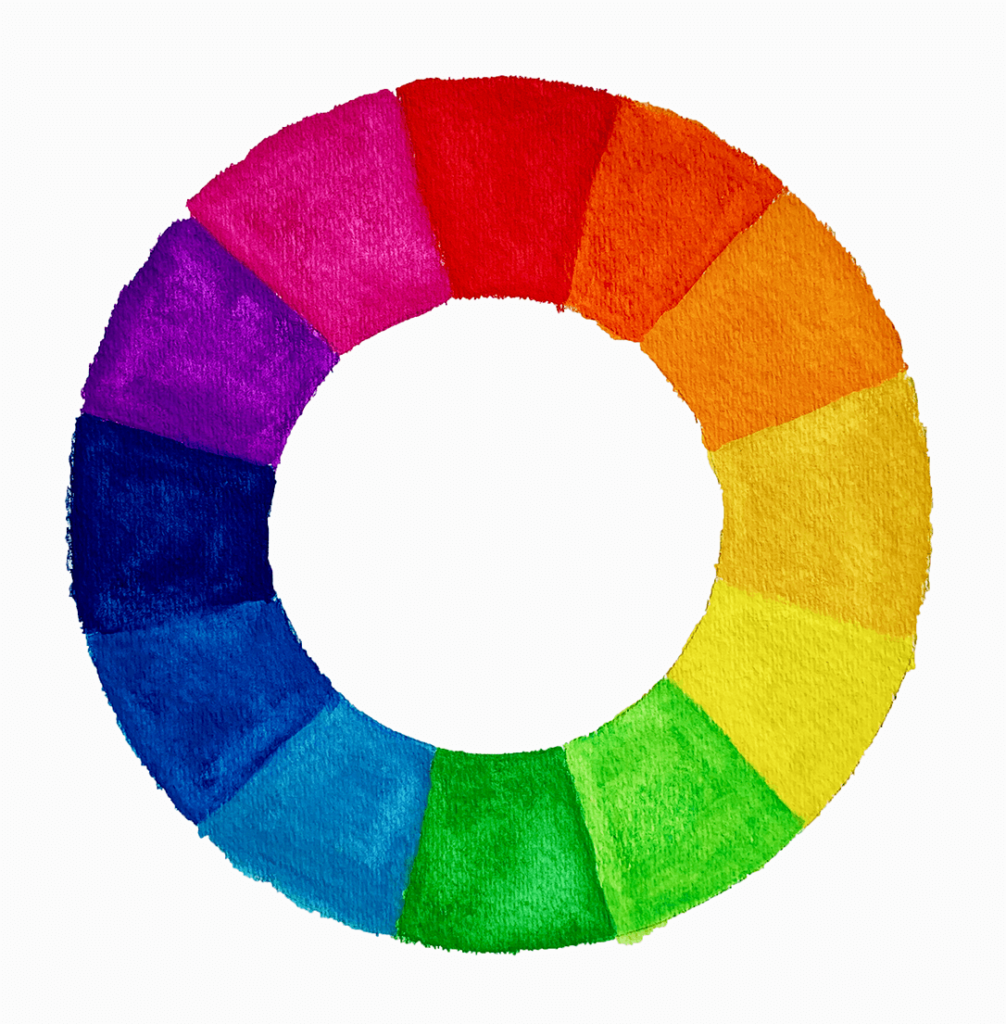
There are two basic different kinds of color wheels that are used by artists. The twelve color or ten color. The twelve color wheel is the most popular wheel used currently as an aid for color mixing (as seen in the one above). The ten color wheel is the one used in conjunction with the Munsell color system.
If you haven’t already – Grab my FREE Color Mixing Guide for help with color mixing techniques in your painting!
What its practical use is and how to mute color
The color wheel is very user friendly in that with it you can easily see the complementary colors of each color. For example, we notice directly below the red is its complementary color green. Across from the blue is its complementary orange. And so on and so forth. When mixing complementary colors with one another the colors are muted (or one can also say their ‘chromas’ are reduced). So, when I mix blue with orange, the orange will become less orange. The same happens if I mix orange to blue – the blue becomes less blue. The same holds true for all other complementary colors. When painting out in the landscape on a cloudy day, you will most likely be wanting to mute your greens – in such a scenario you would mix red with your green.
However… it is not quite as simple as it sounds
In theory, the rules of complementary colors are true. However, as you go about mixing complementary colors together you will quickly find out that the results you get may not be exactly what you expected. This is in part due to the fact that there is a drastic difference in the values between each color. Purple is far darker in value than yellow. Sometimes, differences in the pigment strengths of your colors can affect the outcome of your mixing. I sometimes get greens when I try to mix yellow with purple – this is of course due in part to purple having blue in it.
Improvise
When such instances come up you simply need to improvise in your mixing – which can be a lot of fun. So, if I am suddenly getting a green tinted yellow in my attempt to mix a muted yellow add a little red to it (as red mutes green). Maybe when the ‘green is gone’ then you can try to mix a little more purple to it to mute the yellow more. As you gain practice in mixing more colors you will get the hang of how some of your colors react to others and will know how to deal with any issues that arise. It will probably be different if you switch to different paint brands as the pigment amounts might be different for each.
Another way to mute color
There is another method to mute color (or lower chroma). It is one that I use sparingly as it does not always bring as rich of color results as the method outlined above. You can add a neutral color to the one you wish to mute. The neutral color you choose depends on what value you want your color to be. That is, if you wish your color to be darker and muted you can add a black to it or raw umber (brown). If you wish to keep it lighter, simply adding white will also mute a color.
White Balance
You probably think of white balance in context with a digital camera. However, our brains also include a ‘white balance’ function that is similar to that of cameras but vastly more advanced and complex. To keep it simple, our brains adjust our perception of the color temperature of light sources and then neutralize it to a certain degree as it registers in our mind. One example is that the ‘warm’ color of the sun is neutralized outdoors. When the sun’s light shines on surfaces, it is somewhat neutralized by the ‘cool’ color of the sky’s light also falling on those same surfaces.
Chroma, Form, and Light
If you want to create the illusion of three-dimensional reality on a flat surface, chroma, form and light are all important. Color is not evenly distributed across an object that has form. For example, if we are looking at a blue ball we would notice that the intensity of the color changes across the surface.
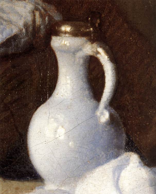
Learning from Vermeer
You will notice in the Vermeer detail of the jug how the color changes over the form of the jug. On the lower right side, the jug is not even white ‘looking’. Rather it appears as a purplish color – and much darker than what we think of as ‘white’. In the middle section the jug is a bluish color. As the eye moves further to the left side of the jug we see a warm white – though not as bright as the highlight seen on the middle of the jug.
Harder to read color in the shadows
It is safe to say that there is not as much light on the right side of the jug as on the left. Which is of course why the shadow is on the right side! As well, we can say that we cannot read color in the shadows as well as in the light. There is not enough light in the shadows to allow our eyes to read the ‘body color’ properly (which is why mixing shadow colors is quite difficult).
Chroma at fullest intensity in the middle tone
The color is at its ‘full chroma’ in the middle tone (the left part of the jug). It is there that we can see what color the jug is. In the highlight (the brightest part of the object), the chroma loses its intensity again. Light ‘eats’ color and therefore the color becomes less and less intense as more light is on it. That is why the ‘sweet spot’ for the color is in the middle tone – between the shadow and the brightest bright.
So, here is a blue jug!
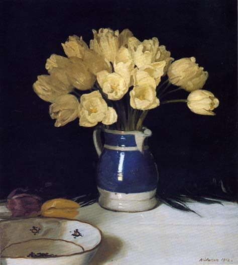
In this painting by Sir William Nicholson you can see the highlight along the jug where the light hits it. You will notice that this highlight strip does not look ‘blue’. This is because the light ‘ate up’ the blue chroma.
Study Nature
Keep these principles in mind as you paint. Above all, it is important that you study nature and observe what you are painting. When carefully observing your subject while keeping this principle in mind you will be able to have a clearer understanding of how to paint what you are looking at.
Reflected Lights
Imagine that you take an egg out of your refrigerator and place it on top of a blue tablecloth. The area of the egg touching the tablecloth will be blue. That reflection of blue onto the egg is called a reflected light. This can also be called a secondary light – as it is a weaker light than the primary light source.
One of the biggest influences of color on shadows is the color of the secondary light. It could be from a distant light source, or it could be light from the primary light source that has simply beamed off of nearby surfaces.
An example from Caravaggio
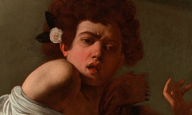
In this detail from Caravaggio you will notice that the shadow has a red reflected light. This could be so for a number of reasons. Maybe there was a red piece of fabric (or red wall?) not pictured in the painting that was giving off that red reflected right? Or perhaps the red is bouncing off of that reddish scarf the individual is wearing. Either way, it is not important why, but paying attention to reflected lights in your shadows is. Observe carefully when you are painting and observe what color your secondary light is – as Caravaggio clearly did in the painting above.
Relativity of Color
Color in context
As you will find with pretty much everything else in painting. Color is always relative as it is affected by what is near it. We always see something in context to what is around it. Something bright in a dark room will always appear very bright. If you place the same bright thing in a sun filled room it will suddenly not look as bright anymore.
When it comes to color, something that looks bright blue in an orange room will not look nearly as bright blue when placed around many bluish and green objects. So, context really matters.
That is all to say that while one set of colors might work for one painting in warm light. It probably will not work at all for the same set up in cool light. Every time you paint something the lighting and environment will be different and therefore require different colors. No simple answer can ever be given for what colors to use for a particular painting. No formula exists as it will always be different because of relativity. The best thing to do is to observe very closely what you are painting.
Orchestration and Color
As a painter, you get to decide how to orchestrate your colors in your painting – it can be likened to a composer writing music. You might find it helpful to think of neutral colors as ‘rests’ in your painting, and the highest chroma colors as the ‘bright big sounds’. Neutrals allow the highest chroma colors to be noticed and ‘shine’. Set up your painting in such a way that you have lower chroma colors leading up to the highest chroma color. Similarly as one might see how a symphony is constructed by building up to a dramatic climax by leading up to that climax with much less dramatic notes.
Key
You also have the ability to choose which key your painting is in. There are high key works, low key works and everything in between. High key means a work that was built using values at the upper end of the value scale. So, when looking at the Munsell value scale – anything from around number 5 – 10 could be considered high key. And anything from 5 – 1 could be considered to be ‘low key’.
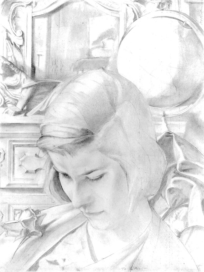
An example of a high key work is the following drawing by Edwin Dickinson. You will notice that there are no very dark values. Rather it is made up of lighter values up until the white of the page.
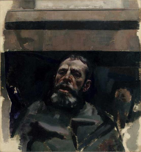
An example of a low key work is this painting also by Edwin Dickinson. You will notice that most of the painting is comprised of darker values. Even the lightest values are not very light when compared to a high key work.
When you start a painting you get to choose if you want to paint in a high key or low key manner (or in between). You can always switch between different keys on different works.
Conclusion
Thank you for reading! I hope this article was helpful for you! Comment below if you have any thoughts or questions.


9 thoughts on “Complete Guide On Color and the effect of light”
Thanks for all information of drawing.
You are very welcome!
Reading this again, sharing why I decided on the paper palette sheets instead of holding a pallet with my hand. I decided to use the bulletin board to save how I mixed colors for each painting. I now can study how I used Color, Hue & Chrome as I move from one example to another and develop my observation & insight.
There are vast differences in the strength of the pigment in the water soluble oil paints!
So good to hear from you Patricia! I have seen more and more people using paper palette sheets – they can be quite handy and make the process much easier. What a great method to make a documentation of the different colors you used in your work. It is important to record as you are doing – as in doing so it helps us to understand much better how to learn and move forward.
I found your article incredibly insightful. Having spent a lot of years focused on photography, and using photographs almost exclusively as painting references since, I’m truly appreciative of this content. It leaves me excited to employ this new perspective to my painting, even including the somewhat frustrating task, at times, of mixing colors. Thanks so much.
Hi Bud, Thank you so much for sharing that! Am very glad that this article is insightful for you, and that it makes you excited to bring this new perspective to your work. That is wonderful.
Your color guides are quite informative and have been very helpful to me in understanding more about color theory. Many thanks for sharing your knowledge.
I am so very glad to hear that – thank you for sharing Renato!
Pingback: Color Mixing with Oil Paints: all you need to know - Art Studio Life