

Harmony is often compared to musical consonance. In fact, the dictionary describes harmony as “the simultaneous combination of tones, especially when blended into chords pleasing to the ear”. Likewise, color harmony works in a very similar way in painting as well…
But, what is color harmony exactly? This article will give you a clear understanding of what color harmony is, along with examples of how to create it in your own paintings!
Color Harmony and Disharmony in Painting
What is color harmony in painting?
You can create harmony by juxtaposing colors that work well together.
Conversely, disharmony can be created by putting colors together that clash with one another…
You have probably experienced moments where you notice complete disharmony in the colors of a painting, an outfit, or even in an interior design. The experience can be a little jarring sometimes!
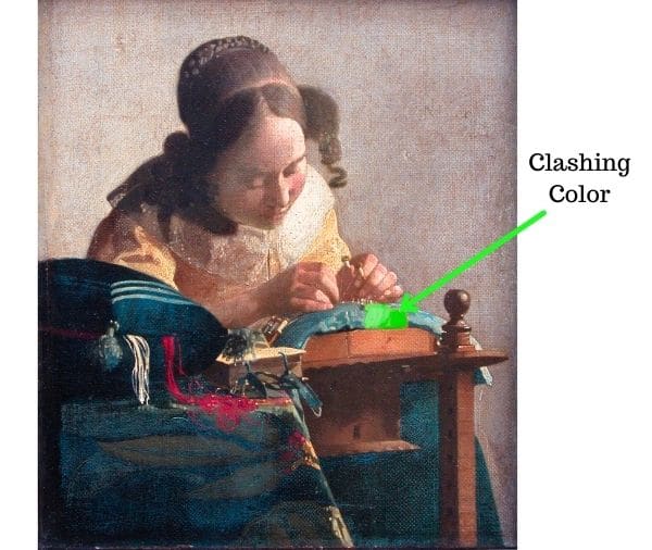
You can see a small digitally painted bright green layover on the Vermeer painting above. Notice how it completely clashes with the rest of the painting – this is color disharmony in action.
Simple Color Harmony
The easiest way to achieve harmony in colors is to only use shades of the same color. So, if we were to look at clothing as an example – an outfit with good color harmony would be wearing a light green top, with green pants, light green hat, light green socks and white shoes. Another example would be wearing a dark brown cardigan with a camel colored shirt, brown socks and shoes. These combinations would definitely be harmonious – but also boring!

True color harmony should be found in pairing different colors with one another – not merely working within one hue. This is done by working with different shades of several colors – of higher or lower values. You can get incredibly interesting and beautiful combinations of colors working in this manner – it will be much more exciting than just working with different shades of one color.
Exercise in Harmony and Color Relationships
So, the big question is how do we go about pairing colors together and knowing if they are harmonious?? Before we jump into that we need to understand that colors will act differently depending on what context they are in. For example, a yellowish red apple is going to look very different on a red background than it will against a green background.
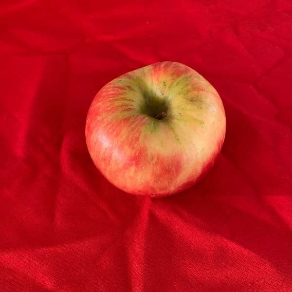
In the above image we have an apple against a bright red background. You will find the exact same apple pictured in the image below. However this time it is on top of a blue background.
When you compare these two images, you will notice that the red on the apple is more intense when placed on top of the blue background, then it is when on top of the red. This is because the red cloth in the above image is much brighter than the red that is on the apple.
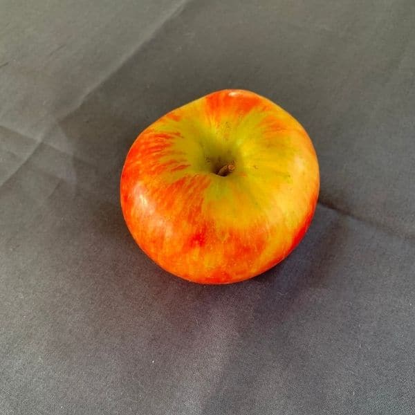
These images are a prime example, of how colors can look different depending on what color they are placed next to. We always need to take into consideration the colors that surround a particular color.
Color Harmony in Action
Next, let’s take a look at some color squares to understand color harmony better.
Color square exercise setup
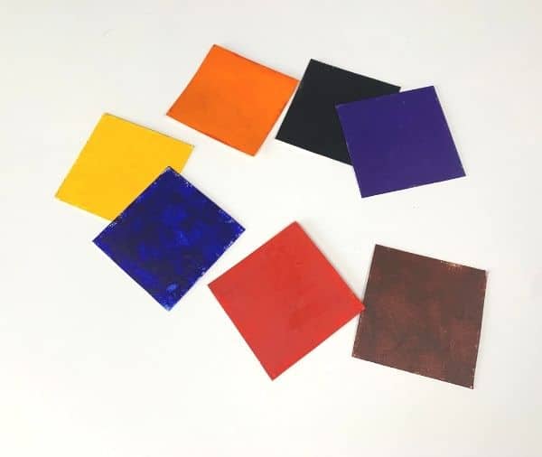
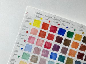
For this exercise I cut up 3 inch squares of regular drawing paper. I then painted each square with the appropriate color – cadmium yellow, cadmium red, ultramarine blue, burnt sienna, black, orange, and purple. You can do the exercise along with me by creating the same squares. Just use whatever you have – this will work for any medium! 🙂
How to arrange your color squares
Once you have all of your squares, arrange them in the following order: cadmium red, cadmium yellow, orange, burnt sienna, black, ultramarine blue, and purple.
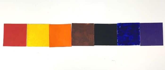
Look at the arrangement of colors in the above image. They are relatively pleasing to the eye! There is a certain kind of flow and harmony because of the order the colors are in. The warm colors flow well into the more color hues. There is a relationship between red and yellow as they are both warm in temperature – just as there is a relationship between yellow and orange and so on and so forth.
Alternate color arrangement example
Now, we will rearrange the color squares in a different order – cadmium red, black, yellow, purple, orange, ultramarine blue, and burnt sienna.
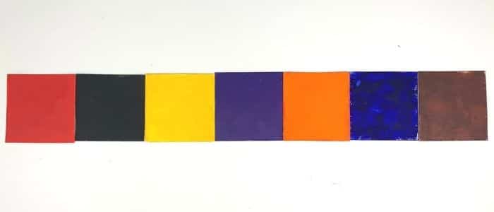
We can see that the order of colors really matters. Instead of them flowing well they appear to be jumping all over the place as they clash with one another. This is happening because the colors don’t have as close a relationship as they did in the previous order they were in. Creating good color harmony has a lot to do with paying attention to color relationships.
Examples of harmonious colors in Painting
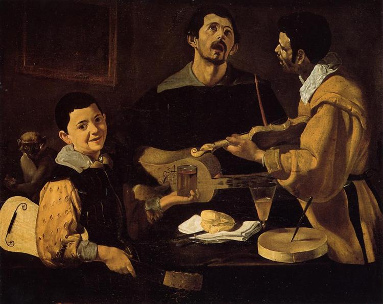
Let’s take a look at some paintings to see what color harmony looks like in application – so you can learn how to apply these lessons to your own work. The painting below by Edgar Degas titled “Four Dancers” beautifully combines cool and warm colors together. He arranges the colors in such a way so that they flow really well together.
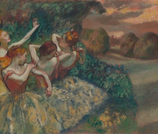
In the front section of the painting he contrasts cool and warm colors together to make the dancers stand out. The red of their hair and leotards is a great contrast against the green of the background. He took care to mix the orange/ red color in such a way so that it would not clash with the green color but rather complement it – also green and red are complementary colors which gives us some complementary color harmony!
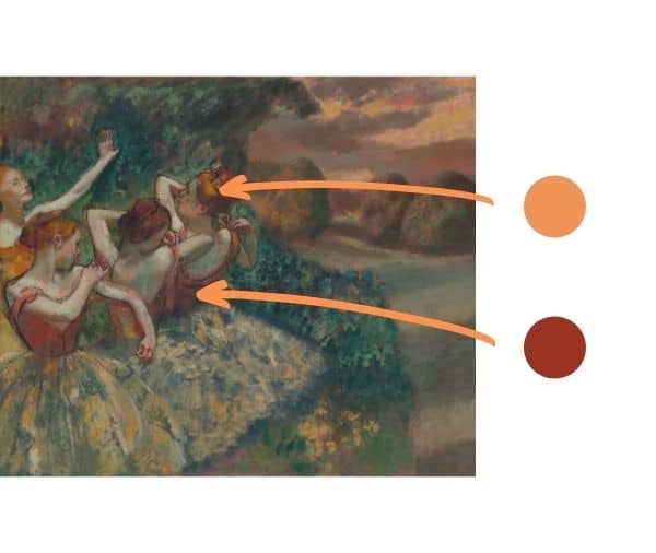
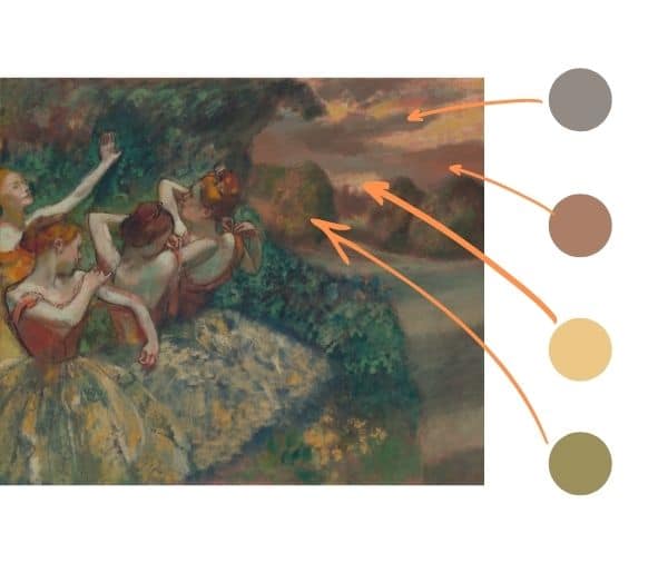
In the image below you can see how the colors found in the far background all harmonize very well together. They are fairly warm in temperature but some are cooler or warmer than others. Therefore, it creates for a very interesting but also harmonious combination of colors
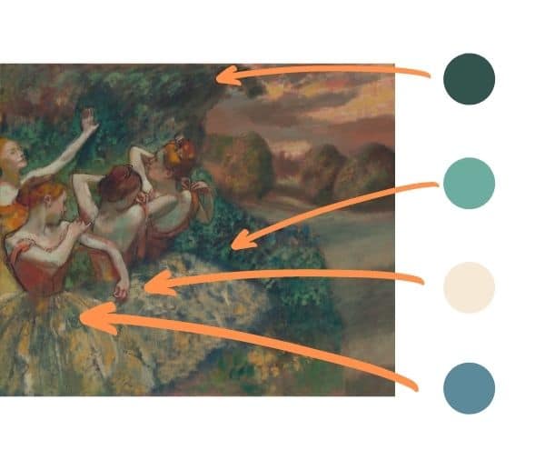
In the image below, we see the colors on the left side of the painting. You can see how the cooler colors in the painting harmonize well together. As already mentioned, the red from the dancer’s hair and leotards is not too bright but warm and bright enough to stand out and create a focal point for the painting.
We can see a very similar case happen in this other painting also by Edgar Degas. Only here we see lots of warm colors – beige, tan, and brown. However, there are areas where cooler colors pop up – such as the light green that is found in the center left part of the painting.
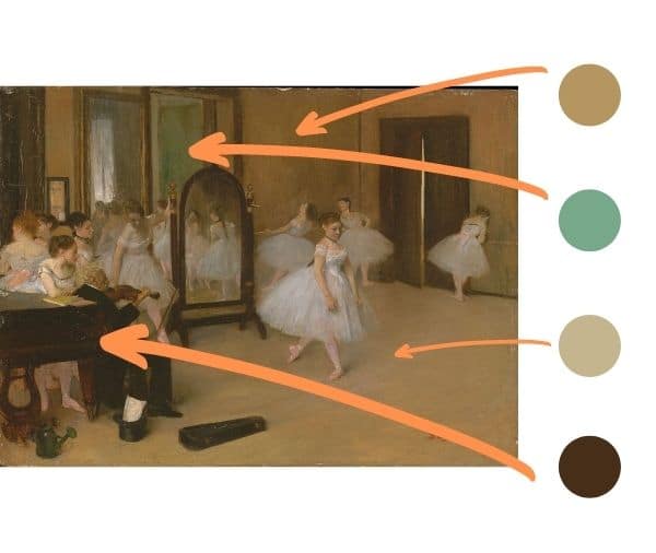
As stated earlier, you can achieve color harmony by just using different shades of the same color. However, it will turn out rather boring. Here, Edgar Degas did use the strategy of mixing up many similar colors. However, he also gave us some unexpected surprising colors, such as the green.
Though the green color stands out, he mixed it into a shade that fits in with the painting. These surprising, but also harmonious colors elevate the painting tremendously.
Using Muted and Saturated Colors in Harmony
In all of the paintings shown in this article you will notice there are a fair amount of muted colors. That is a big reason why there is good color harmony in the paintings. If there were very bright saturated colors in the paintings… Then they would detract and clash with the rest of the painting.
So, an important element to constructing good color harmony is finding a good balance between muted and saturated colors. This will help you to avoid discordant and random colors.
Color Harmony in Your Own Painting
The best way to get beautiful color harmony in your painting is to paint from observation a lot and learn how to see color relationships. Then you just need to interpret those color relationships by mixing the colors on your palette. With practice and effort you will be well on your way!
Additional Resources on Color Harmony
- Color Harmony Workbook – A Workbook and Guide to Creative Color Combinations
- Color Wheel – Color Mixing Guides: Color Wheel with Color sectors Showing Relationships Between Colors
- The Complete Color Harmony Book – Expert Color Information for Professional Results
Want to remember this? Save How to Create Color Harmony to your favorite Pinterest board!


4 thoughts on “What Color Harmony is and (Examples) How to Use it in Your Painting”
This morning’s read confirms my choices for contrasting the upper petals of my red tulip’s full life contrasted by the slow wilting of the lower petals being held up in place by the daffodils behind it.
A combination of life and impression of support as background.
I will make my squares while the tulip dries and then finalize the background!
So glad this article helped to confirm what you were seeing. That is always great to be able to corroborate real life observations with the science of color and light. Hope we get to see your painting of it!
I enjoyed reading this article. Thank you very much.
Glad to hear that Sandia – thank you for sharing!