


When you look at an incredible painting, what’s one of the first things you notice? Chances are, it’s the colors. Color combinations can elevate a piece of art from good to breathtaking, guiding the viewer’s eye and evoking a wide range of emotions. Understanding what makes the best combinations can transform your work and elevate your art.
This article will explore what color combinations are, give examples of strong combinations from art history, and provide you with practical ways to use them in your own art. Let’s get started by looking at how color combinations work!
How Do Color Combinations Work?
Color combinations are the deliberate choices of colors that an artist brings together in a painting. They set the tone of the piece and are central to its visual and emotional impact. When artists plan their color schemes and combinations, they think about the overall presence of dominant hues.

Take, for example, a painting filled with lush greens, calming blues, and stark whites. These colors might represent the peacefulness of nature. While other colors may appear in the piece, the green, blue, and white dominate, immediately influencing the mood and theme of the painting.
Whenever an artist starts a work, choosing color combinations is one of the most important decisions. It’s a creative process that involves both logic and intuition.
Examples of Great Color Combinations in Art
Art history is full of inspiring examples of artists who created stunning paintings by skillfully using complimentary and harmonious color combinations. Here are some highlights:
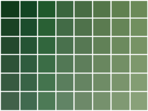
Color Combinations with Green

Sienese paintings from the Italian Renaissance often feature greens and pinks paired beautifully. These colors, though not typically complementary, work well together because of the soft yet striking contrast they create. The balance of these hues can be both soothing and vivid, depending on how they’re blended.
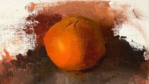
Blue and Orange Color Combinations

Dutch master Johannes Vermeer is renowned for his sophisticated use of color combinations. Look no further than The Milkmaid for an example of blue and orange working together in harmony. These complementary colors make each other pop, drawing the viewer’s eye to specific parts of the painting. The warmth of the orange contrasts sharply with the cool tranquility of the blue, creating both balance and vibrancy.
Earthy Tone Combinations in Impressionist Landscapes
Take a closer look at Impressionist works, such as Claude Monet’s Impression, Sunrise. You’ll often see earthy greens, muted yellows, and vibrant coral oranges. These colors mirror the artist’s natural inspiration, creating a sense of atmosphere and mood that feels alive.

These paintings prove that thoughtful combinations of colors can achieve balance, harmony, and emotional depth in a work of art.
How to Choose the Best Color Combinations
If you want to unlock the power of color combinations for your own artwork, start with the tried-and-true tools at your disposal. Here are a few methods to get started:
1. Use the Color Wheel
The color wheel is one of the best tools for understanding how colors work together. Through this visual guide, you can explore different types of combinations:

- Complementary Colors (opposite each other on the color wheel): Blue and orange, red and green, yellow and purple. These combinations are vibrant and full of contrast.
- Analogous Colors (next to each other): Blue, teal, and green. These are harmonious and soothing.
- Triadic Colors (evenly spaced): Red, blue, and yellow. These create a balanced yet visually striking effect.

The color wheel simplifies the process of selecting colors, making it easier for you to experiment. Of course you won’t pull the bright saturated colors directly from a color wheel, but rather mix up more complex colors for you to use.
Look at Master Paintings
One of the best ways to figure out really great color combinations is to look at good paintings. Dive into art history to uncover color combinations that really catch your eye. You will learn what you are drawn toward and specifically what types of color mixtures you love most. Very muted, bright, or a mix of both.

When you look at paintings of the past it gives you a glimpse into what stood the test of time. Ask yourself what is it about the color combinations that stands out to you? Look beyond surface-level hues and consider how warm, cool, muted, or vibrant the tones are.
How to Create Color Combinations in Your Own Work
Making the jump from observing other artists’ color choices to formulating your own can feel daunting, but it doesn’t have to be. The process is fun and allows for creativity at every turn.
Experiment with Color Strips
After you choose master paintings that you really love, do some color studies of them by making color strips. Paint 3 – 4 strips with the main colors that you see in the painting and glue them together on a piece of paper. You can decide how to arrange and order these strips. This is a way to very simply and clearly see what a color combination can look like.

You can also simply make color strips that you just like and play around by placing some of them together. This will guide you in being able to see which combinations work well together and which do not.
Narrow Down and Define
One of the best ways to work on figuring out color combinations for your own work is to put parameters down for yourself. When we put limits and constraints it helps us to narrow down what we are after. So, ask yourself what feeling do you want your painting to evoke? Bright yellows, peaceful blues, and muted greens offer completely different emotions. Defining the mood beforehand helps simplify the decision process when figuring out colors.
Breathing Life into Your Art

Great color combinations are the lifeblood of compelling paintings. From the classic contrasts of blue and orange to the soft harmonies of greens and pinks, thoughtfully chosen palettes can elevate your work, help you evoke emotions, and make your work unforgettable.
To get better at this, keep experimenting. Borrow from the masters, lean on tools like the color wheel, and most importantly, train your artist’s eye to see the possibilities in everyday life.


10 thoughts on “How to Use Color Combinations to Make Your Paintings Stand Out”
Very useful, Thank u!
Glad to hear that – you are welcome!
Love your articles and info. So glad I found your posts and subscribed.
Your manner of speaking is very pleasant and it is relaxing to listen and learn .
Thank you!!
Thank you so much for your kind words – I really appreciate it!
Thank for this thoughtful guide. Very helpful.
You’re very welcome Steph, glad to hear it!
Excellent article. Thank you so much!
So glad you enjoyed this one!
As usual. Excellent Comments. Thanks.
So glad this is helpful!