

Fine artists are visual poets. Every color choice has an impact on what the painting says. But what is a color story? And more importantly, how can you wield this element to elevate your work? Here we dive into this and unravel the intricacies involved in crafting compelling color narratives on canvas.
What is a Color Story?

At its core, a color story is the intentional narrative embedded in your artwork through the selection and arrangement of colors. It’s a visual thread that weaves through the elements of your piece, guiding the viewer’s eye and creating a visual experience. Each color is a character with its own personality, and the combination you choose sets the stage for the drama so to speak.
The Symphony of Color

An even more helpful way to view a color story is to think of music. Imagine your canvas as a symphony. Like the composer who carefully orchestrates each note to tell a larger story, you, as the artist, must compose your colors thoughtfully. Will your piece resonate with narrow values and muted colors, or will you use more bright and saturated colors? The decisions you make creates a specific kind of color harmony that impacts the color story you tell.
The Color Story’s Role in Art History
In examining the works of others, we can understand much better what a color story is. As well as how to craft our own color story. Let’s take a look at the following pieces to see how was used to construct a specific narrative.
Vermeer’s Color Story

In Vermeer’s ‘Girl with a Wineglass’, the central figure dons a dress of a deep raspberry red, a hue that dominates the painting. Every other color choice, helps to accentuate the bright red colors found on the dress. You can see how the other colors are more muted and fall more to the background. The result is not just a balanced image but a harmonious ode to this central color, guiding the viewer’s gaze with a gentle hand.
However, it is not just that the other colors are muted but we see lots of greenish tones – which is the complementary color of red. In general all the colors are a little cooler in nature – even the red is a more cooler form of its color. This helps to harmonize all the colors together and make the whole painting work well together
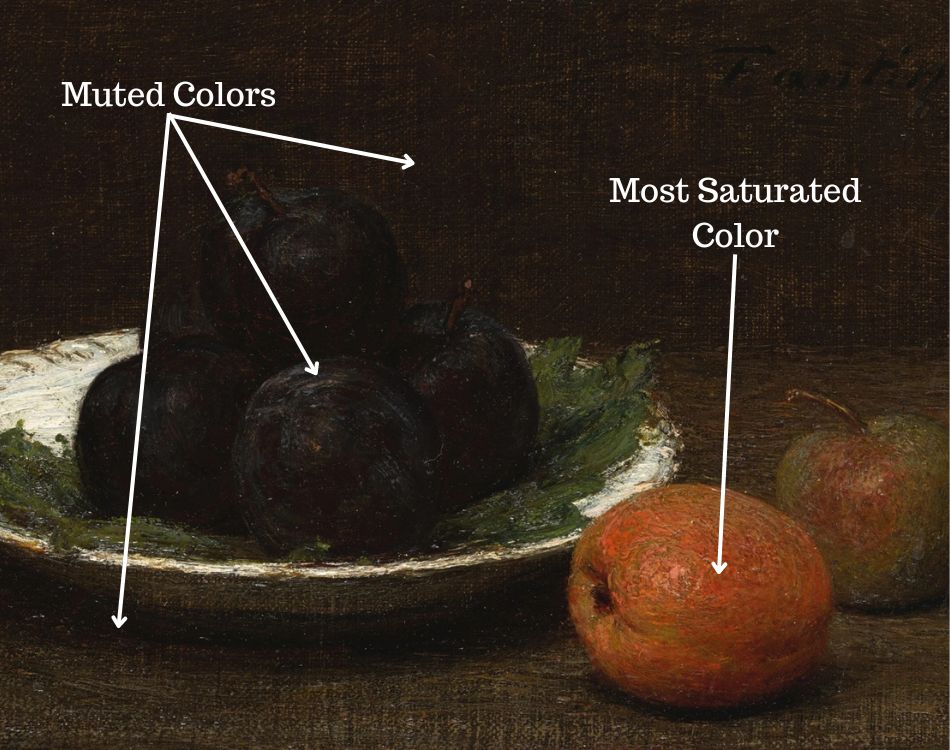
Distilled Colors of Morandi
Morandi is an absolute master at creating a very distinct color story. In the image below you can see one of his still life paintings. Below it are some color swatches that sum up the general color story present in his painting. You can see how the orange/reddish color stands out the most among all of the colors. All of the other colors help to support this color and harmonize with each other in different ways.

You can see how the purple grey color on the bottle blends so well into the warmer yellow like background. While the light whitish area of the front object stands out against that purple grey color. Each color has a different relationship to the one next to it. While at the same time they all harmonize together. They way in which they harmonize together makes up the color story.
How to Create a Color Story
So how do you incorporate your knowledge of color to create your own color stories? Building a compelling color story starts with a well-informed and open-minded approach to color in general. Here are some guiding principles to help you move forward in understanding how to create compelling color narratives.
Color Harmony: The Hero of Your Tale

We are all familiar with the sound of listening to an untrained person hitting random notes on the piano. Just as a song without harmony is merely noise, a painting that lacks color harmony will fail to resonate. Therefore, it is important for the colors in your painting to connect to one another in some way. Understand the various methods of achieving color harmony, from complementary to analogous schemes, and experiment with different combinations to observe their interplay. Pay attention to the dominant, secondary, and accent colors as they establish the rhythm of your piece.
Get Inspiration from Color in Nature

The best work happens when we get outside of our own selves to learn and seek inspiration. Look at how the colors in your environment are interacting with one another. Don’t pay attention to the objects, but just focus on the colors at hand. Observe and feel the harmony and tensions that exist between certain colors and color temperature transitions.
Find compelling colors

As you slow down and really look at what you are seeing you will become more and more aware of how certain color combinations will stand out to you and be incredibly compelling visually. It is precisely these visually compelling moments you want your painting to revolve around. Every other part of your painting will serve to support the main subject of your color story.
Finding the Main Color Note(s) and Supporting Colors

Every color in your painting is in conversation with the others. Think of your canvas as a dialogue, where each hue responds to the presence of its neighbors. A patch of red may appear vibrant against a sea of blue, while in the company of orange, it might need to assert its presence through intensity or tonal contrast.
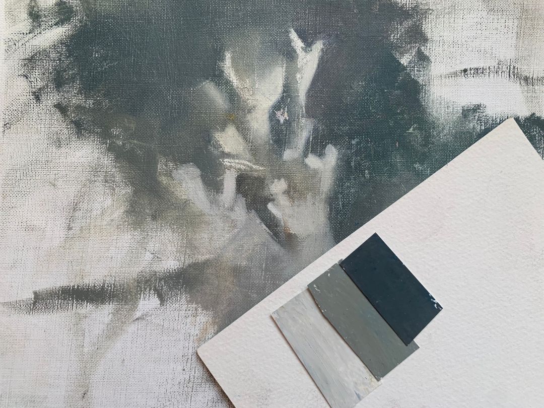
The role of muted colors in a color story

You want to make sure that your main color notes stand out against the other colors in your painting. This is where muted colors play a big role. Often, your main color subject will be one of the most saturated areas of color in your painting. Since all of the other colors are supporting characters, you don’t want them to stand out as much and will make them slightly more muted. Some colors will be more muted than others.
Supporting colors
In a story line there are some characters who are much more minor than others – we don’t notice them hardly at all. The same holds true for a painting. Some colors may go nearly undetected, but they serve an important role in supporting and making the main color notes visually compelling.
Practice Composing with Color

We often think of our composition in terms of what we are painting. If it is a portrait we think of where we will place our main subject. Or, if it is a landscape or still life we think of where we will place our tree or pitcher. However, It is so important to think of the abstract elements of your composition first. Such as your color story.

By putting color in the forefront of your priorities you are well on your way to creating much more compelling work. As it is through color, not objects, that painting communicates.
Play with the variations of a single color, from its faintest whisper to its boldest statement, and observe how it changes the mood and dimension of your work. Remember, less is sometimes more, and subtlety speaks volumes in a color story.
Want to remember this? Save the Art of Creating a Color Story to your favorite Pinterest board!


4 thoughts on “The Art of Creating a Color Story in Your Painting”
I have been painting forbears but this article is still so helpful. we can always learn something new. thank you
Thanks for sharing Lou Ann. Yes you are absolutely right. No matter how long we paint there is always something new to learn. Which is the exciting thing about painting (though sometimes frustrating as well) as there is so much to explore!
Elisabeth,
I don’t think I can express enough how inspirational your writings are. I began painting many years ago but for various reasons, put it in the closet so to speak for a very long time. I recently picked it up again and, like many beginning artists, I have read as much as I can and watched an enormous amount of video demonstrations. Your written and video material has by far touched me the most. Besides your art skills, you certainly have a talent for teaching. Thank you very much for putting yourself out there. You are deeply appreciated and can count me in as one of your followers for life.
Sincerely,
Dana
Dear Dana,
Thank you so much for your kind words and for sharing that Dana – I appreciate it enormously and am so glad that my teaching has not just been helpful but also inspirational. It means a lot lot to me. Thank you again 💙