


It goes without saying that flashy, loud bright colors often get noticed first and receive more attention over muted colors. It can be easy to overlook muted colors and their prime importance in painting as they they are much quieter and softer than their bright saturated counterparts.
There is a world of incredible beauty however, to be found in a muted colors palette. Which far surpasses what bright colors alone have to offer. If you find yourself using primarily bright color tones on your color palette or perhaps not really knowing what muted colors are, then this article is for you.
What are muted colors exactly?
Muted colors are: subtle colors, that are not bright or have been subdued, dulled or grayed. The opposite of a muted color is a bright, vivid, saturated color.
Compare the colors that you see in the sky on a cloudy day to the colors you see on a bright and sunny day. The tones of color found in the cloudy day are typically less bright, duller and more muted compared to those of the sunny day.
How to make muted colors

There are several ways to take a bright saturated color and make it into a more muted version:
- Mix a color with its complementary color to create a more muted color (for example, you can make a less saturated red by mixing it with green)
- White (this will also lighten the color)
- Brown or any earth tone color
My favorite method of creating a more muted color is to mix a color with its complementary color. This creates much richer colors than simply mixing brown or black into your color! For help with color mixing, I have this free color mixing guide to assist you with key color mixing techniques.

However, each method for how to make muted colors has different results. So, it is good to experiment when learning what muted colors are and not be afraid to “mess up”. As it all depends on what kind of color tone you need in a certain situation. The best way to create the perfect muted tones for your muted color palette, is to mix and experiment until you find what you need.
Why use muted colors in my painting?
I have a favorite quote by C.S. Lewis ‘Don’t use words too big for the subject. Don’t say ‘infinitely’ when you mean ‘very’; otherwise you’ll have no word left when you want to talk about something really infinite.’ Though C.S. Lewis was not a painter, this statement could not be more true when talking about color.
What a muted color palette is good for…
If you use bright colors everywhere in a painting, then nothing can really stand out or ‘pop’, as the entire painting will be one level – bright. Then perhaps the element that is supposed to be the central point of the painting, is washed out by its surrounding colors that have the same brightness level.
However, when you incorporate muted tones from a muted colors palette, you then have contrast for the bright color tones in your painting to stand out.
Take this as an example of the power of muted tones
Here we have an image full of bright saturated colors all competing for our attention – bright green, bright purple, bright yellow and finally bright red. They are all bright!

Now look at the image below. It is the exact same image as the one above except that all the bright color tones are substituted for muted colors – save for the yellow.

The yellow in the image above is exactly the same as the image that precedes it. However, we notice it so much more because it is not competing with a bunch of other bright colors. The image has more of an impact on us visually, as our attention is now focused.
Examples of muted colors in art
The above images are simply diagrams and not really art works! To fully understand the richness that muted colours in art provides, one must look at some real paintings.

Above is a muted colors example ‘Bouquet of Roses’ by Corot. Notice how your eyes are drawn to the red rose immediately. This happens because the color of the red rose is the richest most saturated color in the painting.
If the red rose was alone in the painting by itself, its color would probably not look very bright. However, because the rose is surrounded by muted colors, the rose shines!
We experience the painting in a much richer way because of the subtle build up of the muted colors palette. It is a delicate, harmonious balance of slight shifts in tones that are muted. Which in turn, helps to highlight the importance of muting colors in your art.
Another example using a muted color palette
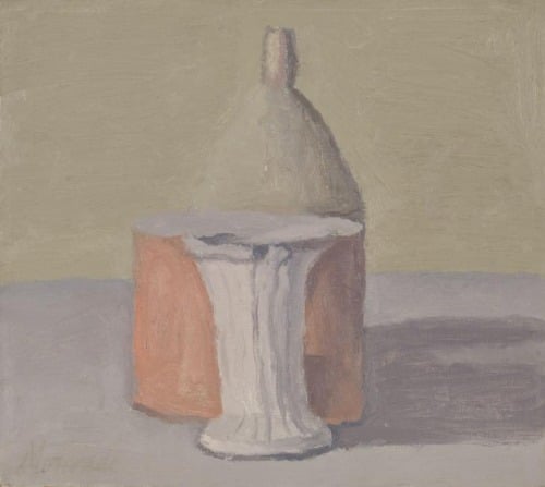
Giorgio Morandi is the master of tones and colors that are muted. Notice how the reddish object stands out so much to us in the painting because it is the most saturated color.
However, the reddish object is not a bright red. In fact, if we took it out of the painting and put it against something else it would probably look like a very muted red – and would not stand out at all. It is because of the muted tones that surround the object, that the object stands out.
If Morandi had painted a very bright saturated red in place of the muted reddish color that exists, it would ‘kill’ the painting and not have the powerful effect that it does have.
Subtlety is everything when muting colors
Subtlety helps give muted colors meaning. It is because of the subtlety in the painting, that we can see and feel all of the beautiful color harmonies happen. If there was a loud, bright red it would wash everything else out!

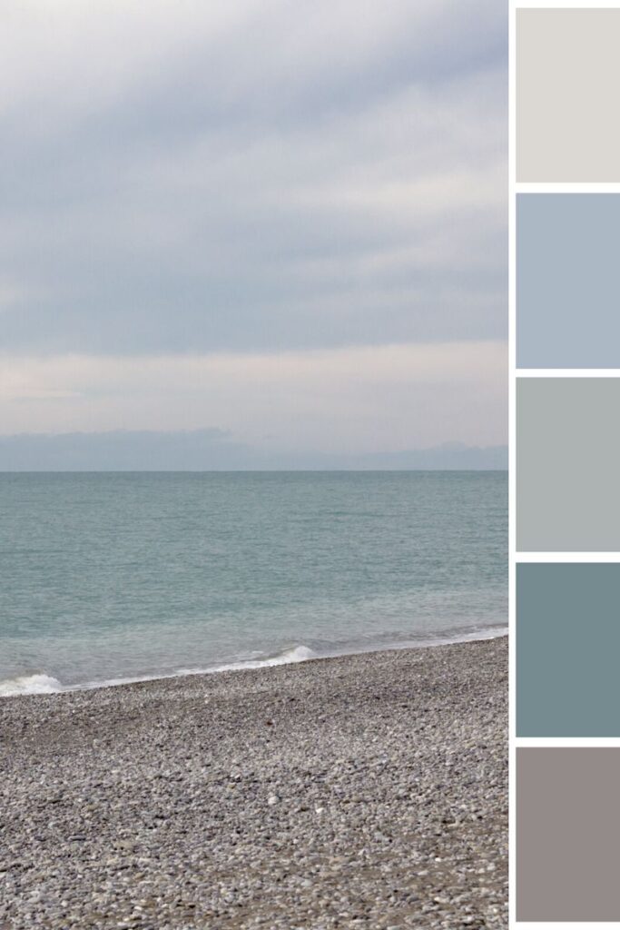
Here is a seascape painting that offers a good muted colors example.
Imagine if a loud rock band started playing during an adagio movement performed by a string quartet. The rock band would surely drown out the sound of the string quartet and we would never be able to hear beautiful and subtle harmonies.
How to begin using a muted colors palette
The best place to begin using a muted colors palette is to just start color mixing a lot more. Really try to not paint from photographs but rather paint from real life studies. You will not be able to see the richness of a color from a photograph. Also steer yourself away from color mixing formulas. Try instead to mix colors from what you see, and trust your eyes.
Be sure to grab my free color mixing guide that will help you learn the basics of color mixing. You will have everything you need to know in order to start mixing a muted color palette!


25 thoughts on “What Are Muted Colors & How to Use a Muted Colors Palette”
Thank you so veery much for your article. I often wondered why some of my paintings are unbelievably boring. I am now imagining those paintings with muted colors. I am hoping I can rescue them.
So glad this article was helpful! There is no better way to learn than reworking old paintings. This would be great to do!
Loved this artical on muted color. I am a self-taught artist, and could never figure out why my paintings had a cartoon like quality. Now i know why. Cant wait to try může colors im excited to try.
Thanks for sharing that Kathy! So glad this article was helpful. Muted colors are quite amazing in what they allow you to create in a painting.
Wonderful information! I’ve always loved cloudy days, waiting at
The traffic lights against a gray sky is mesmerizing. I’ve been teaching watercolor for 45 years and your descriptive article on muted colors is a great source of information. Can’t wait to introduce you to my students. Thankyou.
Carol
Thank you for your kind comment Carol – so honored that you will introduce my information to your students!
This is a great article and reminder to dull down colors. Bright out of the tube colors can be cartoon like. I will remember this info and move forward with mixing opposite colors until pleasing and natural looking.
So glad to hear that Donna. This will definitely help to make colors more natural looking!
Elizabeth I paint murals with wall paint. How do I get muted tones?
I also do acrylics but I use the 4 &8 oz tubes. How do I mural paint and mute since they can be 20’x8′ walls. Thank you Sue
Hi Sue, Mixing complementary colors together will help you to create muted colors. Orange and blue are complementary colors, green and red are also complementary pairs as are yellow and purple. Mixing orange into blue will make the blue more muted, and mixing blue into orange will make the orange more muted. The same is true for all other complementary colors. Here is an article that goes into greater detail with mixing muted colors.
Thank you so much, its really helpful article. Appreciate that you shared it 🙏
Hi Yusra, You are very welcome! I am glad this article was helpful for you 🙂
Thank you for a very informative article.I now understand the importance of muted colours & look forward to my next painting.
Am glad to hear this tutorial was helpful! Thank you for sharing.
How would you use watercolor pencils for the creation of a muted painting? Forgive my ignorance, I’m new to this! Thx!
Hi ALbe, To mix watercolor pencils and create muted colors you would create layers. For example, to create a muted purple you would put down a layer of purple and then gently lay down a layer of yellow on top of the purple. Watercolor pencils are quite fun to work with, good luck!
Hi Elisabeth. I’m enjoying your lessons. I mainly use acrylics. And trying out water colour. I suppose same rules apply whatever paint method?
Hi Kathryn,
I am happy to hear that you are enjoying the lessons! Yes, you are correct – color rules apply to all the different mediums. This is the beauty of learning the fundamentals of painting as they can be applied to all mediums!
Thank you for providing such valuable information.
Bev
Very good article and very helpful.
Am glad to hear that it was helpful! 🙂
תודה רבה אליזבת
אודה לקבל אתההסברלעירבוב צבעים.
איך צובעים פנים בצבעי שמן בשכבות? תודה יום יפה
רותי כהן.
Jonatanr@zahav.net.il
היי רותי! טוב מאוד לשמוע ממך. יש לי מדריך למתחילים של ערבוב צבעים בחינם שתוכלו לקבל בעת הרשמה למייל. יש לי כאן גם מאמר על ערבוב צבעים – https://artstudiolife.com/color-mixing-with-oil-paint/
מאמרים הרבה יותר מפורטים על צבעים שונים ניתן למצוא גם באתר. יש לי גם כמה מאמרים על ציור פורטרטים – https://artstudiolife.com/?s=portrait+painting
אני מקווה שזה עוזר!! ציור שמח 🙂
I enjoyed reading your muted colours article. inadvertently I have been using muted colours in my landscapes to make the foreground trees stand out . Makes for great paintings Thanks
Warren
Hello Warren,
Good to hear from you! I am glad to hear you enjoyed the muted colors article. Mixing up muted colors really is helpful for painting landscapes – that is great!