It is important to think of color values first while you’re painting. Doing so will help you to be able to create a believable sense of light in your paintings right from the start. One of the best ways you can achieve this, is by thinking in terms of color spots.
By breaking things down and learning how to use spots of color in your painting, it will completely revolutionize the way you see and paint. It allows you to stop seeing an object as an object and instead view it in terms of a collection of color spots coming together. Let’s get started by taking a look at the initial three values!
First Three Color Spots
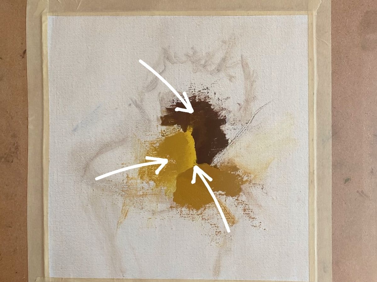
The next step is to figure out where a clear intersection of light and dark values are in your subject matter. It is best to start at a place where a light, medium and dark value are next to one another.
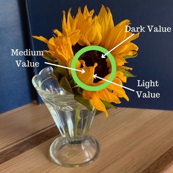
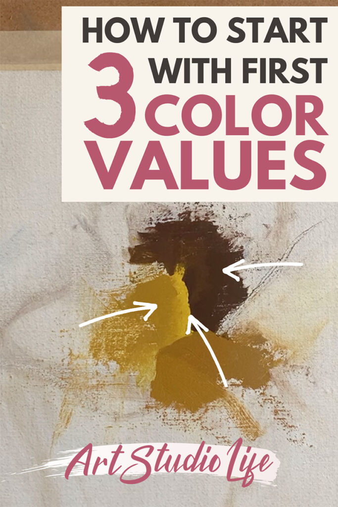
In the image above you can see how the light, medium and dark values we will paint first are all right next to one another. As a result there is great clarity in the sense of light present.
So, take a moment before you begin your painting to find an area in your subject matter where the three main values meet and intersect.
First light value color spot
You can start with either the dark, medium or light value. There isn’t a special order you need to go in, so you can choose whichever color value you wish to mix up first! In this example I start with the lightest value color that is on the right side of the petal.
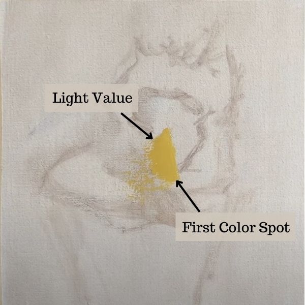
For the light value yellow I mix some cadmium yellow, lemon yellow, white and provence violet bluish (light purple) together. The light purple helps to mute the color a little bit. While the white, lightens the color and makes it lighter in value.
Second medium value color spot
Again, you don’t need to go in any special order in regards to whether you mix up a dark, light, or medium value first or last. It is good to do what seems to be the best order in a given situation.
In the example below you can see the second color spot that is a medium value placed to the left of the light value color spot.
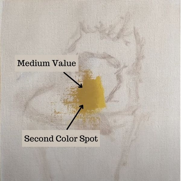
To get the medium value color I mix together cadmium yellow medium, white and dioxazine purple. The purple used for this mixture is a bit darker than what I used for my lighter value yellow color. If you want to darken a yellow color more, then a darker purple is helpful.
Third dark value color spot
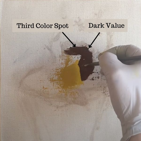
Last but not least we get to our third color spot – which is the darkest value out of the three. It also happens to be an entirely different kind of color as it is part of the dark center of the sunflower that is brown.
You can see above, how all three color values are next to one another. As a result we have a sense of light in the painting right from the beginning!
Building up more color values
Once you have your first three color spots you can begin to build around them with more color spots.
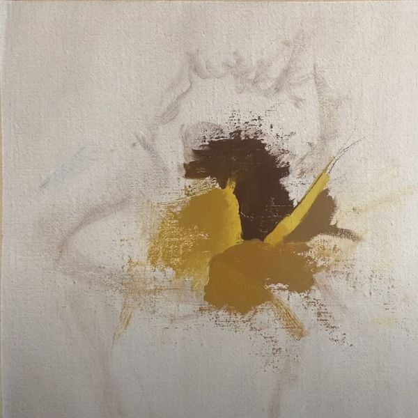
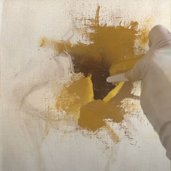
In both the image above and below you can see how the emphasis is placed on value as the painting develops so that it retains a clear sense of light.
Also, notice in the painting below how the palette knife is used to soften the edges between the dark brown part of the sunflower and the shadowed yellow petals behind it.
Changing and fixing color spots and color values
Don’t ever feel badly if you find yourself needing to change or adjust a color. This is a perfectly normal thing to do – and is encouraged! Even professionals who have been painting for decades need to continually fix and remix a color along the way.
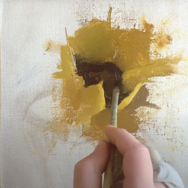
Above, you can see how I darken the outer rim of the brown center portion of the flower. The color value was not dark enough before, so I mix something up that is more suitable.
Bringing the painting to a close with color spots
As you progress with your painting you want to continue to simplify and think in terms of spots of color. Simply build around what you already have painted. If you find a color that needs to be adjusted – then go ahead and fix it right away. It is much better to fix a color that needs to be changed than to add a new one.
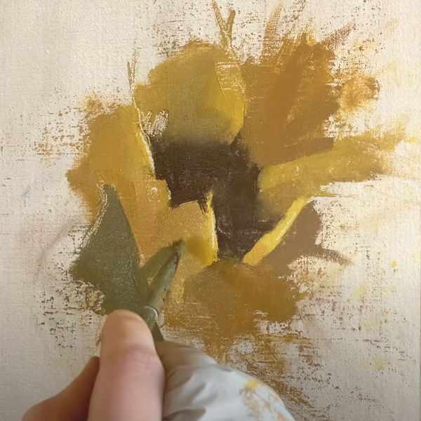
You can watch the full video demonstration below of how to do all of this!
It will show you how to start a painting with three color spot values that represent a strong intersection of light, medium and dark values in the painting subject. You will then see how to continue working your way through the painting (from these foundational color values) to truly achieve a realistic sense of light!
Hit the play button directly below, to see how to start your painting with 3 color values!
If you want to go further with the subject from the painting demonstration in the video guide above. You can follow along with the full sunflower painting tutorial, here.
Love to hear from you about your success or struggles with creating a realistic sense of light in your paintings in the comments below!



20 thoughts on “How to Begin Your Painting Starting with it’s First 3 Color Values”
Hi Elisabeth, I am your newest fan and glad to have discovered your art blog. Thank you for this short but very informative tutorial. To tell you the truth, I was a bit skeptical of “3 color value” method in the beginning of the video but was surprised to watch the sunflower pop up in its full glory at the end. Bravo! I am going to try this method for landscape painting though not quite sure how I would apply this methodology for landscape. One question I have is about what kind of painting support you are using? It doesn’t look like canvas but seems to handle the brush and palette knife very well.
Thank you again,
Omar
Hello Omar, You are very welcome! I am glad that this tutorial was helpful for you. Yes, it is true it seems a little odd at first using three values in the beginning – but it really does come together at the end. I typically use oil primed linen – but I mount my linen onto board so that I have a hard surface to work on that works well with scraping the surface with a palette knife. If you want some guidance on how to use this three color way of working with a landscape here are some helpful tutorials:
https://artstudiolife.com/winter-landscape-painting/
This is a cloud painting video demonstration but you can definitely apply the way value is used to a regular landscape painting
https://www.youtube.com/watch?v=c1wqbwo2CB8&t=129s
You really come up with ideas that I find clear and very helpful. I am evaluating who to take courses for this year and I would love to look at your offerings. Your teaching of color mixing has been the best I have seen yet.
Hi Brenda, Thank you for your kind words! I very much appreciate it and am so glad that the information here has been helpful for you! If you would like more information about courses offered don’t hesitate to reach out! My e-mail is elisabeth@artstudiolife.com
I am Mohammad from Iran Ms. Larson Kohler: You have explained the content beautifully and in the best way, you are an energetic and excellent artist. Thank you for sharing art education and enjoying the art of painting. Long live Elizabeth Larson Kohler, the popular artist, always be successful and happy.❤️
Hello Mohammad, Thank you so much for your kind words. Am very glad to hear that the information on this website has been very helpful for you! Thank you for sharing that. I wish you much luck in your painting journey.
This tutorial was such an enlightening example & explanation of “3 color values. Loved the use of paint & palette knife! I am fairly “new” to oil painting and love your advice & tips! Thank you 😊
Hi Angela, So glad this tutorial was helpful for you! Thank you for sharing 🙂
Thank you for the informative tutorial on painting with 3 colour spots. I felt the palette knife blending was new to me. I use acrylics and water colour. I may need to use a medium to give the paint the flexibility of oils to use this technique.
You are so welcome! Am glad that this was helpful for you. Yes, there are a few different mediums out there you can use with acrylics to make them stay wet longer so that you can blend them more with a palette knife.
Thank you for the reminder , it is how i start most portraits and landscapes, finding the place to start is sometimes difficult and this feature helps solve the problem. Regards Warren
You are welcome Warren! Yes, finding the place to start can sometimes be difficult. Am glad to hear this method is helpful.
My goodness at first I didn’t think that I will see a sunflower here. I am so surprized! It looks very difficult but the endresult is beautiful. Well done!
Thank you! Yes – when thinking and working in terms of color spots the painting often doesn’t ‘look like anything’ in the beginning but then (hopefully most of the time!) it comes together beautifully in the end because the values and colors are orchestrated well together.
Dear Elisabeth,
thank you again for the very interesting video.
Can I use the 3 colorspot way for a the paintings, also for landscapes?
A also very good trick is to use your paletknife to softenup sharp edges.
Sending you a lot of creative greetings from the Netherlands.
Hi Frits,
Yes! You definitely can use the same method for landscape paintings! When starting a landscape painting with 3 color spots it is usually helpful to think of them as ‘bands of color’ due to the nature of landscapes!
Glad you enjoyed the palette knife trick – it is enormously useful!
אליזבת יקרה
קראתי בעיון רב את ההדרגה לציור פרח חמניות בשימוש ב3 צבעים ולקבל את הצבע המאיר
ההדרכה וההדגשה בשימוש הצבעים המתאימים מסייעת בערבוב צבעים להשיג את הצבע המתאים
הדרכה מעולה
אנסה לצייר את הפרח ולהגיע לצבאים המתאימים בהערכה רבה
באהבה
רותי כהן
שלום רותי יקרה,
אני מאוד שמח שזה עזר לך! החל מכתמי צבע קטנים יותר של שלושת הערכים העיקריים (ערך בהיר, ערך כהה וערך בינוני) עושה הבדל עצום. זה מאפשר לך להשוות בקלות רבה יותר צבעים וערכים אחד עם השני מההתחלה. מחכה לראות איך העבודה שלך מתפתחת! איחולים חמים, אליזבת
Thank you for your tutorial on values, I always enjoy your insights on technique, composition and color mixing.
You are so welcome – am glad that it is helpful!