


Visual hierarchy is not something that is talked about very often in painting instruction—but it has a really large impact on how a painting is experienced.
Whether a viewer realizes it or not, their eye is always being guided. It goes somewhere first, then moves through the painting in a particular order, and eventually comes to rest. The visual hierarchy you establish is what determines where the eye goes, when it goes there, and how long it stays.
In simple terms, visual hierarchy is the system of emphasis within a painting. It’s how you communicate what matters most—and what matters less—purely through visual means.
There are several ways to build a visual hierarchy in your work. In this article, we’ll walk through the most important ones and look at how they function together.
Value: The Primary Driver of Attention
Value is the strongest and most immediate tool for establishing visual hierarchy.
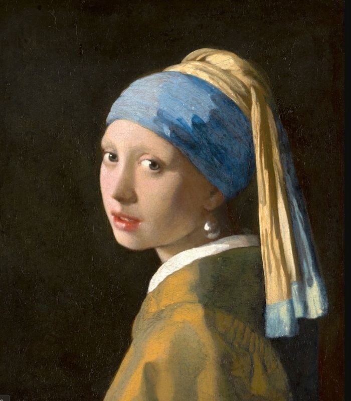
The area of your painting with the greatest degree of contrast will attract the viewer’s eye first. High contrast—light against dark, dark against light—creates visual tension, and the eye is naturally drawn to it.
Conversely, areas with very little contrast tend to recede. These are the places the eye moves to later, or passes through more quietly.
This is why value structure is so critical early on. Even before color, detail, or subject matter becomes clear, value alone can determine whether a painting reads clearly—or feels scattered and confusing.
When you simplify a painting into just a few value shapes, you are essentially deciding its visual hierarchy.
Color: Saturation as a Point of Emphasis
Color plays a powerful—but secondary—role in visual hierarchy.
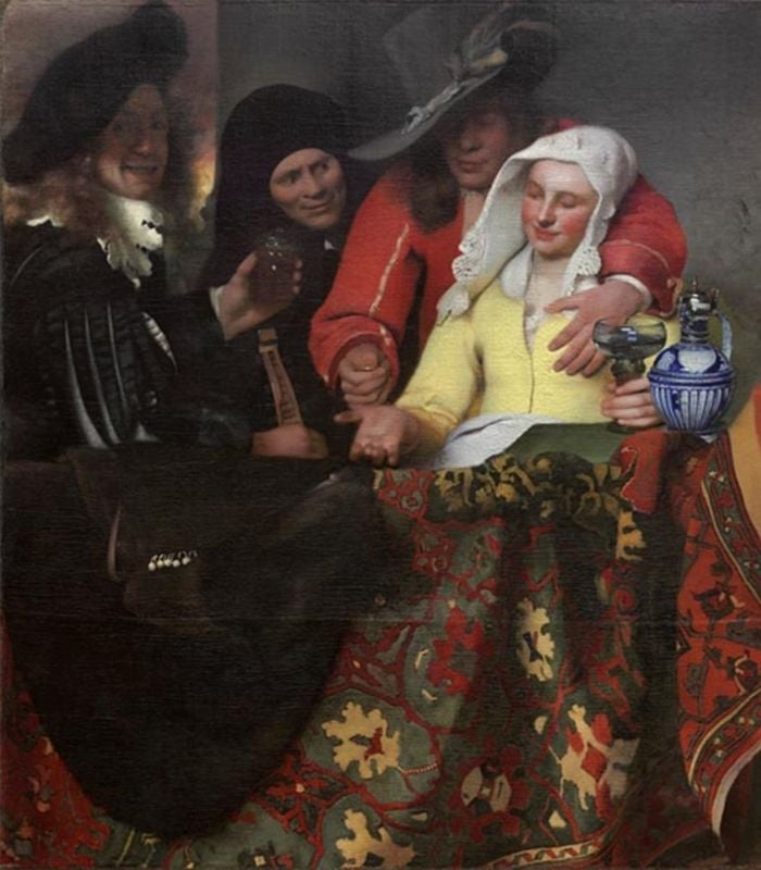
Areas with the greatest saturation or chroma will naturally pull the viewer’s attention forward. Even a relatively small passage of strong color can become dominant if it is surrounded by more muted tones.
On the other hand, neutralized or grayed colors tend to sit back. They create space, atmosphere, and support for the more active areas of the painting.
What’s important to understand is that color hierarchy is always relative. A moderately saturated color can feel very strong if everything else is subdued—and overpowering if everything else is competing with it.
Thoughtful painters use saturation selectively, allowing color to reinforce the value structure rather than compete with it.
Edges: Clarity Versus Softness
Edges are closely tied to value, but they deserve their own attention.
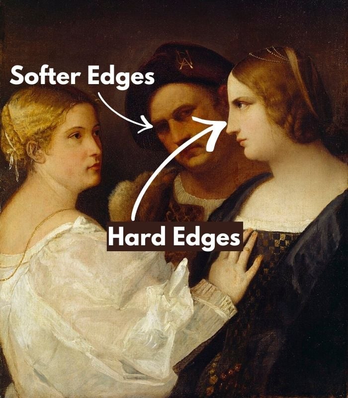
A sharp edge occurs when two contrasting values meet abruptly. These crisp transitions signal clarity and importance, and the eye is drawn to them immediately.
Softer edges—where values transition gradually—are quieter. They allow forms to turn gently and help the eye move through a painting without stopping.
If everything in a painting has hard edges, nothing stands out. If everything is soft, the painting lacks focus. A strong visual hierarchy relies on a careful balance between the two.
Edges are one of the most subtle yet effective ways to control emphasis without adding more contrast or color.
Visual Hierarchy is Always Relative
One of the most important things to understand about visual hierarchy is that it never exists in isolation.
How it functions depends entirely on the context of the painting.
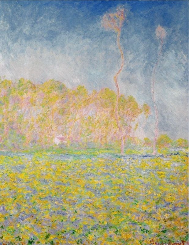
Some paintings are built on strong, dramatic value contrasts. Others are intentionally soft, atmospheric, and restrained. In a high-contrast painting, the hierarchy may be bold and obvious. In a low-contrast painting, the hierarchy may be quieter—but it is still there.
Role of color harmony in visual hierarchy
This is why you must always judge an area in relation to what surrounds it. An edge is only sharp compared to other edges. A color is only saturated compared to other colors. A value is only light or dark relative to its neighbors.
Visual hierarchy is not about applying rules—it’s about making relationships clear. It is also about keeping the color harmony working in your painting. You can’t have bright pink in a painting made up of mostly subdued colors.
Painting with Intention
When visual hierarchy is working well, the viewer doesn’t feel manipulated or confused. The painting feels natural, readable, and satisfying to look at.
As a painter, your job is not to make everything equally interesting—but to decide what deserves the most attention, and what exists to support it.
When you begin thinking in terms of hierarchy—rather than isolated passages—you start painting with greater clarity and purpose. And over time, this way of seeing becomes instinctive.
Want to remember this? Save the importance of visual hierarchy to your favorite Pinterest board!


8 thoughts on “Understanding Visual Hierarchy in Painting (and Why It Matters)”
Thank you Elisabeth. Your explanations are so clear and helpful. So often I look at one of my “efforts” and can’t work out what is wrong with it, or it takes me forever to work it out. When I eventually feel satisfied with it I never know quite why! These notes are a wonderful checklist of guidelines.
Julia
So glad to hear that this post helps to sort through what is and isn’t working in a painting. Thank you so much for sharing!
Hello Elizabeth. I would like you to know that I really love your classes. Don’t sign up for more cause I’m very busy. I’m still working on one I bought from you three years ago. But do know I admire your work and learn a lot from you. Keep up the good work.
Thank you so much for your kind words Yolanda – I really appreciate it! Glad that you are working through the course – do not hesitate to send me your work from the course if you would like feedback 🙂
Congratulations and many thanks for this lesson . Concise, clear, didactic and useful.
Alex (Toronto)
You are so welcome!
This is good. Thank you. I often forget this and paint away, wondering why things are not working.
Very glad to hear this is helpful. Thank you for your kind words