

Basics of oil painting fundamentals and core elements
This is meant to be a helpful overview of the fundamentals of oil painting. If you are a beginner to oil painting these are the core elements to focus on as you learn to paint. However, even if you are not new to painting these are concepts and fundamentals that will be revisited continually. They are core fundamentals that make painting what it is.
Light and shadow
One of the most important fundamentals of oil painting is light and shadow. We can refer to this as value or tonal value. Tonal value is even more important than color. If your color is beautiful but your values are not right then your painting will not work. However, if your colors are bad but your values are right on, then your painting will work! So, focusing more on tonal value than color is a good idea when first learning how to paint. Once you get value down, you will be one step closer to creating a more realistic painting.
Simplifying values
Just as in writing, you ideally want to express what you need to in as few words as possible, the same is true in painting. It is absolutely impossible to replicate in paint exactly what you see in real life – that is not what painting is about anyway. You want to be able to put down in paint what you see as simply as possible. This is much easier said than done!
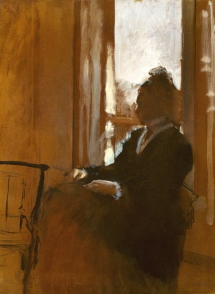
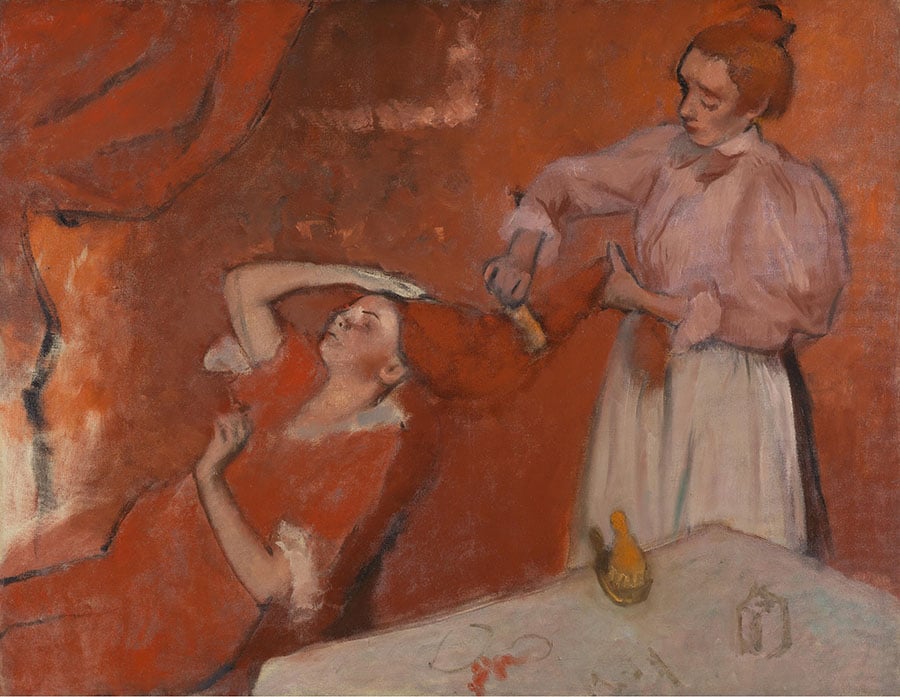
The Degas painting above of a woman sitting against a window is an exquisite example of simplification. Degas here was able to unify the similar values together – showing where the lights are, the darks, and that which is in between the two. When a work is simplified as the one above by Degas the impact of the piece is much more powerful to the viewer. The essence of the subject is brought to the forefront for the viewer to experience.
Three core values
One thing that is very helpful when it comes to learning to simplify is breaking down what you see into three distinct values and forcing yourself to work within that range. Three values could be divided into the brightest bright value, medium value, and dark value. Thinking in terms of just this range will jump start your ability to simplify. It can be helpful to start out using charcoal and paper to figure out value structures before getting out your paint. Doing so lets you figure out the complexity of value without needing to deal with color on top of everything else.
A demo illustrating how to create something using only three values will be coming up soon – so stay tuned!
Color and its use in the fundamentals of oil painting
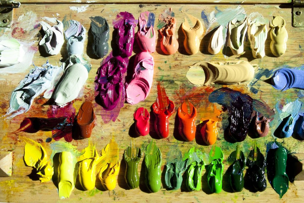
Color is another big fundamental element when it comes to fundamentals of oil painting. It is a packed topic and can be overwhelming when first learning how to paint with colors. However, breaking it down into easier to understand components can help.
If you haven’t already – Grab my FREE Color Mixing Guide for help with color mixing techniques in your painting!
Hue
Means the category of a color – for example whether it is red, purple, orange or blue
Chroma
The intensity of a color, or how saturated it is. Typically colors straight out of an oil paint tube is considered a high chroma color. A cadmium yellow straight from the tube has a high chroma compared to a yellow that is mixed and muted.
Earth colors tend to have low chroma compared to brighter colors such as yellows, reds and blues etc. Neutrals such as white, grays and black are zero on the chroma scale.
Value / Tonal value
Tonal value is the degree of darkness or lightness a color has. For a stark example, black has a very dark value, while white has a very light value.
Color temperature
The relative warmth or coolness of a color. For example, with red and blue next to one another red would be considered a warm color and blue a cool color. However, color temperature in painting gets a bit more complicated than that…
Color temperature in greater detail
Like so much else in painting, color temperature is always relative. With warm and cool colors, you cannot always say a color is simply warm or cool. Rather, a color is ‘warmer than’ or ‘cooler than’. The color temperature depends on what the color is next to and what is around it. Green is warmer than blue, but green is also cooler than red. So, I cannot always just say that green is warm – as whether it is warm or cool depends on what it is next to.
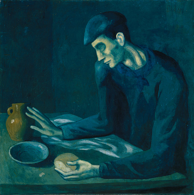
You can see in the Picasso painting (from his ‘blue’ period) it is a predominantly cool painting. The warmest color in the painting is probably the jug that the person’s hand is leaning against. If we took the color of the jug and placed it into the Degas painting below, it would suddenly look much cooler. So, as you can see, color temperature is a very relative thing!
Line and geometry in the fundamentals of oil painting
Finally, the last (but definitely not the least) aspect of painting fundamentals is line/geometry in painting. You might think of drawing when one mentions lines. You are right! Line is a huge part of drawing, but drawing and painting go hand in hand. You are constantly ‘drawing’ as you are painting. Drawing means to create the form of whatever it is that you are creating. This involves figuring out the geometry and spatial qualities of your piece.
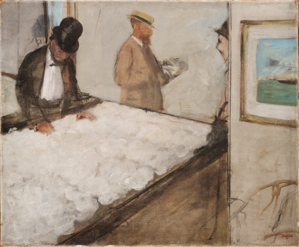
You will notice the use of line in the Degas piece above ‘Cotton Merchants’. Even though it is a painting, drawing plays an important role in how to sketch out a painting and creating the dimensions and geometries of the piece.
Further resources
I hope this article was helpful to you! If you have any thoughts or questions leave a comment below
Want to remember this? Save the Fundamental Basics of Oil Painting to your favorite Pinterest board!


6 thoughts on “Fundamental Basics of Oil Painting for Beginners”
I’m trying to decide which tones of blue & brown to use from the second tonal/temp study.
I have chosen Cobra’s Prussian Blue for”cool” & raw sienna for warm:Cobra is darker than W&N.
Should I order a VanDyk Brown? I assume 3 colors means literally “out of the tube” not mixed on the pallet?
Thats a good question Patricia! I think that will work well to use Prussian blue for a cool color and raw siena for a warm. I don’t think you will need van dyke brown. You can use raw siena and prussian blue to mix intermediate temperature colors. Unless you are having difficulty creating darker values – then the van dyke brown will help you with that. It is still most important to focus on creating clear values. Look forward to seeing what you create Patricia!!
Yes It is clear and to the point.
Glad to hear that, thank you!
This is like a wonderful gift. I’ve learned and will use the gift to better my painting….wonderful. I also appreciate how clear and to the point you made this.
Thank you,
SuZanne
Thank you SuZanne! I am really glad to hear that this was helpful for you 🙂