

Do colors ever make you feel warmer or cooler? Sure they do! If you step into a room filled with yellows and oranges you are certain to start feeling warmer. Conversely, if you stepped into a room filled with blues you would start to feel much cooler. In this way from the relationship of warm and cool colors, we get a sense of color temperature by a visual means vs color temperature in the physical metric of hot and cold.
In this post I will give a thorough overview of what warm and cool colors are. What key things you need to know when looking at warm colors vs cool colors. And finally, how you can use both warm colors and cool colors to greatly improve your painting!
What are warm and cool colors?
Warm colors are made up of colors such as reds, oranges and yellows. While cool colors consist of blue, purple and greens and the shades off of those that are cooler in color temperature. Let’s take a look at the color wheel chart below.
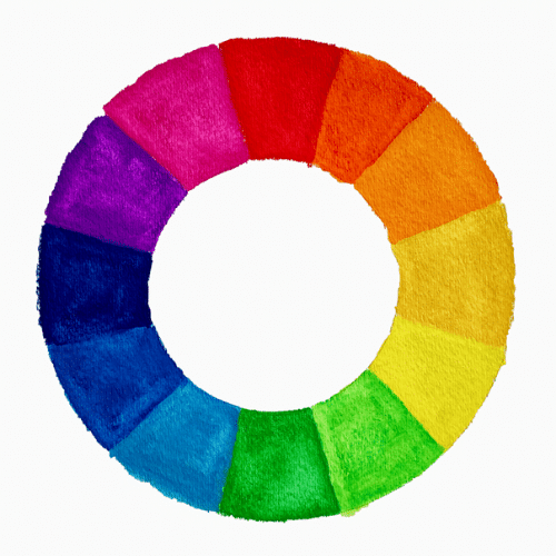
You will notice that most of the colors on the left side of the color wheel are cool colors, while most of the colors on the right are warm colors. The result of this color circle depiction, gives us the sense of a thermometer to gauge the color temperature of warm vs cool colors.
Relativity of warm and cool colors
Now one cannot always say that every blue is always a cool color and every red is a warm color. There is a lot of relativity when it comes to color temperature. For example there can be warm blues, cool reds and warm greens.
A cool color such as blue can be made warmer be getting mixed with a warm color such as red. While a warm color such as yellow can be made cooler by being mixed with a cool green.

For example, take a look at the color chart above. You will see yellow, red, blue and green. Each color has a cool and warm version. A warm yellow is made by getting mixed with a little red, while a cool red is made by getting mixed with some blue. If you’re using oil paints, here’s a color mixing guide, that will help you with creating different shades of color.
So, although some colors are typically warm colors and others cool colors. Within each color family there can be versions of warm and cool colors. There are different warm and cool blues just like there are warm and cool reds.
Never think of color temperature as absolute
From the example above you will see that one can never think of color in absolute terms because colors do not exist by themselves. Rather they are always next to a color. You can only identify the temperature of a color if you have a color to compare it to. I would not be able to call a yellow a ‘cool yellow’ if it were not next to a ‘warm yellow’.
It is not helpful to simply state that blue is a cool color. Certainly if blue is next to red as in the example below we can safely say that the blue is cooler than red.

However, if you place a blue next to another blue are they both the same temperature?

If you think of color in relative terms then you will come to see that the first blue is cooler than the second blue. The second blue has some red mixed in it. One can disregard color relativity and simply consider all blues to be cool and all reds to be warm. However, your range of possibilities for using temperature in your painting increases dramatically when you start to think of color and temperature in relative terms.
Also, you will be much more attune to subtle contrasts in temperature within a color. Rather than just contrasting a warm color like red with a cool color like blue you will be able to create subtle contrasts within the blues and reds. When paying attention to subtle temperature shifts in your painting you can start to see some stunning color relationships happen. All great painters were masters at color relativity. You can be a master at it too if you train your eye to notice which colors are cooler or warmer next to each other.
The importance of color temperature in art
Color temperature plays a much bigger roll in painting than just make one feel ‘cool’ or ‘warm’.
When you are able to control color temperature in your painting you can:
- Create a sense of depth (especially in landscape painting)
- Show dimensionality in your objects
- Integrate a sense of color and light in your painting and a feeling of sunlight
- Present a specific mood
- Create separation and or define relationships between objects and parts of the same subject
Color temperature and the illusion of space
Warm and cool colors play a big role when it comes to creating an illusion of space in your painting. Cool colors tend to recede in space while warm colors advance or come forward. This concept, is one of the great landscape painting tips.
For example, let’s say you are looking out at a field and far off in the distance you can see mountains. You will notice that what is far away is much cooler than the part of the field that is close to you. Off in the distance the field is much cooler in color and the mountains (which are furthest) are coolest of all.
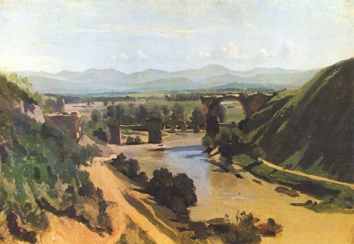
Above is a painting by Corot that illustrates color temperature, as well as spatial concept quite well. If you look off into the distance of the painting you will see that the colors are rather cool in comparison to the rest of the painting. The mountains are a bluish color.
On the other hand, the foreground of the painting consists of warm colors such as; a yellowish red on the left and a yellowish beige on the far right. In addition the colors that make the color green here, which are in the foreground, are quite warm as well.
If you apply these key temperature and spatial concepts to your paintings. Whether they are landscapes, still life paintings or completely abstract, it will give your work a sense of space.
The illusion of form with the help of color temperature
Just like warm and cool colors can influence the sense of space in your painting, they can also help create an illusion of form. Warm colors tend to expand while cool colors appear to contract. Sometimes, a drawing can be correct but the proportions can still look a little off. If this is ever the case, try to fix the color temperature. Carefully observe what you are painting and fix your painting (or drawing) accordingly – warm up the areas that seems too small and cool down the areas that seem too big.
Examples of warm and cool colors in art

Above is an example of warm and cool colors at play in a painting by Peter Paul Rubens. The lips have the warmest color out of them all – a deep rich red. The next warmest color is the red orange color of the girls cheek. A color that is cooler than either of the aforementioned colors is the cool yellow pink of the forehead. The coolest color of them all is the highlight that is on the upper part of the forehead.
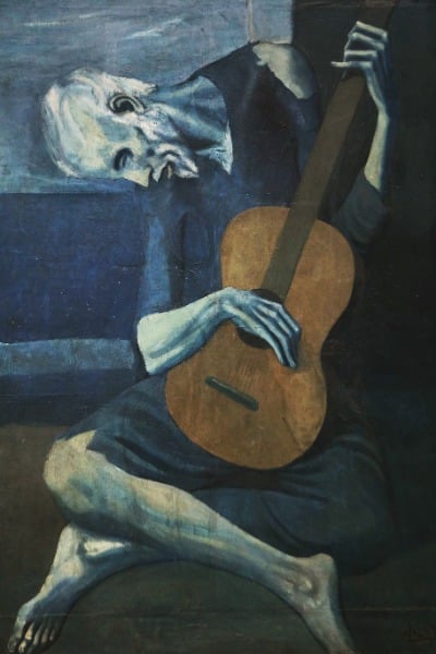
Here is an entirely different painting from the one by Rubens above. It is for the most part a cool colored painting as it consists of many different shades of blue. The work demonstrates how you can make something stand out easily with temperature. The guitar at the center of the painting is the warmest part of the painting and jumps out at you immediately. If the guitar were blue, it would not stand out nearly as much as it actually does. So, this piece demonstrates the power of contrasting different color temperatures against one another.
Examples found in nature
As you have seen through the painting examples above – it’s not so much a matter of warm colors vs cool colors. Rather, understanding what they are and how to recognize them in nature/your painting subjects. So that you can use them to create a sense of color harmony in your work.
Summary of warm vs cool colors
Here is a recap of what we discussed in this article:
- The temperature of a color is NOT absolute. Blue is not always a cool color and red is not always a warm color.
- The color temperature of your paint is always relative and needs to be determined in relation to what it is next to/ surrounded by.
- Using warm and cool colors can help create space and dimension in your painting which is especially useful in landscape painting.
- Warm and cool colors can be used to create illusion of form.
- When paying attention to subtle temperature changes within a color (for example find warm and cool reds) you can achieve stunning subtleties in your work.


10 thoughts on “How to Best Use Warm and Cool Colors in Your Art (and Painting in 2023)”
So very helpful to a beginner like myself.
Thank you Elisabeth !
So glad to hear that Cathy! Thank you for sharing
Hi Elisabeth,
this article was really helpful and interesting for me. thank you for all of these worthy articles . I wish I could download that on my desktop as a pdf file. is there any way for that?
Hi Nahid, Thank you for your kind comment – am glad that the article was helpful for you! At this time I do not have a downloadable PDF version for this article. However, I might do so in the future! 🙂
Can you please help me to understand why the first blue above is warmer than the brighter blue on the right side? The right side blue is mixed with red. The “warmer” blue appears to have a touch of yellow mixed in probably a cool yellow. Or it could be a cool blue green? Is pure blue cool? What about pure red? and pure yellow? Thank you!
Good question Danelle. I am assuming that you are referring to the image with the two different blue colors side by side. The blue on the right is warmer than the blue on the left because it is closer to purple. Whenever a blue looks more purpleish than another blue it will be ‘warmer’ in temperature. Red is the ultimate warm color – and purple is closer to red than yellow is. So, therefore a purpleish blue is warmer than a yellowish blue. I hope that helps!
Thanks heaps for passing on this information. It made me curious watchingg the Zoom session yesterday and cleared up some areas I was not sure of.
Thanks again and I look forward to the next session.
regards Warren Petherbridge
Hello Warren, you are so welcome! Am glad to hear that this article helped to clarify some areas of uncertainty.
In more secure times I am engaged with teaching the fundamentals of painting, however, at present this is not possible due to the virus restrictions and apart from the rather unsatisfactory zoom meeting, any useful observations and tips are most helpful to share with my aging club members. Art Studio life is Extremely useful to share with my friends.
For my own needs, and being aware as a professional artist, any reminder of first principles when it comes to colour choice and the process needed to achieve what is desired, is never old news. I am a UK Guild of Railway Artist, approaching my eightieth birthday who still has to slow and maybe stop when mixing Oil paint in order to achieve the result required. My Paintings can be viewed at jc@railwayarts.com. Many thanks for your fine website.
John Cowley GRA
Hello John, Thank you for sharing your work. I looked it up – very beautiful paintings! You have a lovely sense of atmosphere in your work. I am very happy to hear that the Art Studio Life website has been helpful to share with friends – thank you for sharing it! Elisabeth