

For this fruit still life painting tutorial, I have chosen to paint a quince sitting on top of a napkin for added background color and texture. I hope to help demonstrate, along with step by step example photos, tips that will help with your fruit still life painting techniques.
I have been enamored with the quince fruit ever since seeing Antonio Lopez Garcia’s paintings of a quince. Their shapes are entirely unpredictable and irregular and they have an oddity about them that is visually interesting.
I had the pleasure of running into a quince tree at a farm in my area recently. After being told that I was welcome to pick from the quince tree, I gleefully plucked one. The very next day I started making a painting sketch of the quince for this fruit still life painting tutorial. It was thrilling getting to study the intriguing shapes of this fruit. For this tutorial I will be using the quince fruit as an example but you can the fruit of your choosing for your still life painting. The techniques I cover here will help you in crafting your fruit still life paintings in greater detail.
This article will go through the step by step process of how to create a fruit still life painting. As painting is visual I believe people learn best by seeing how paintings are constructed. I hope these step by step fruit still life painting techniques prove helpful for you, let’s get into it!
Create a fruit still life painting sketch
The first thing you want to do is to create a painting sketch. This will be a general ‘drawing’ of what you will be painting and the starting point for your fruit still life painting.
For the painting sketch, I like to create a more neutral color. I typically mix a small amount of burnt umber and ultramarine together and dilute it with terpenoid. I then use a smaller brush and make a rough drawing of what I will be painting. Do not worry about being completely accurate with this drawing – it is meant to be more of a general guide. You will be correcting the drawing and placement of things as you work with color later on.
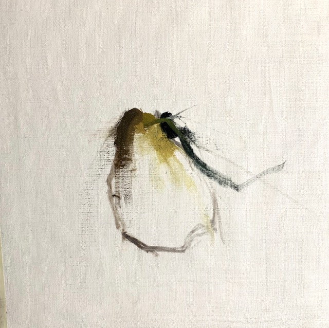
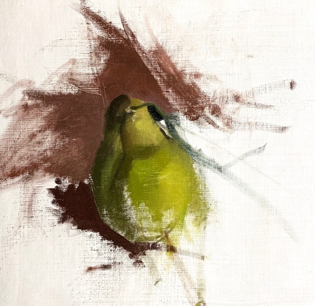
Get a sense of light from the start – the first spots of color
It is important when you first start a painting to get a sense of light right from the beginning. You do this by finding and establishing contrast. As you see in the first image I placed three colors next to one another. To the far right is a dark brownish yellow. Next to that is a medium value yellow color. To the far right is dark green, the darkest possible value. With the two darker values on either side of the light yellow there is a sense of light.
So, when starting your fruit still life painting try to find a spot where there is an intersection of light and dark. That is, an area where you have a light value, medium value and then dark value next to one another in one place.
In the image above, you will notice that the background is started. It is important to paint the background and object together at the same time. The background is as much part of the painting as the object. When painting them together you will be able to read the color relationships easier to make the object and background be in ‘unison’.
A list of the colors mixed so far
Here is a list of the colors used to mix in the painting stages above.
For yellow colors:
Brown/yellow shades:
Dark green colors:
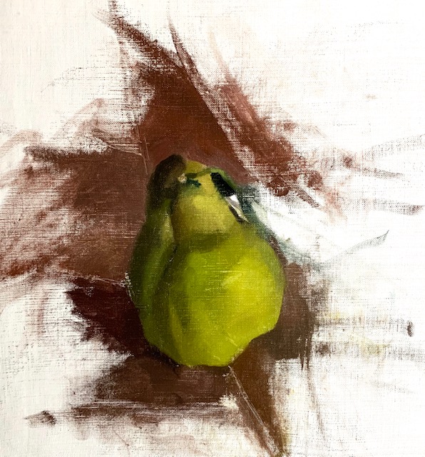
Think tonally with your fruit still life painting
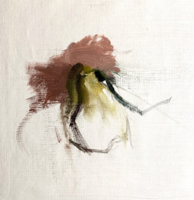
In the image above you can see that the painting was developed further with some darker tones. I pay most attention to the tonal (dark and light) structure of what I am painting – as this is most important.
You will also notice that I further developed the right side of the quince which also has the brightest and lightest color spot with slightly darker tones around it. I used about three different tones. A bright tone (which is the brightest area of the quince) in the middle as already mentioned. The left of the bright area is darker than the brightest bright, and to the right of the bright yellow patch you will notice it is just slightly darker than the color to the left of the bright yellow. It is these subtle tonal shifts that give the quince a sense of form.
You can see the background is worked on at the same time as the rest of the painting in the image above. The base area of the pink napkin that the quince is sitting on is darker as it is a shadow from the quince.
Colors mixed for the tonal stage above
Yellow – Cadmium yellow, veronese green, alizarin crimson, cadmium orange, provence violet bluish
Pink – alizarin crimson, cadmium red, pthalo green, cadmium green, cadmium green light, cadmium orange
Green – veronese green, cadmium yellow, cadmium lemon, alizarin crimson
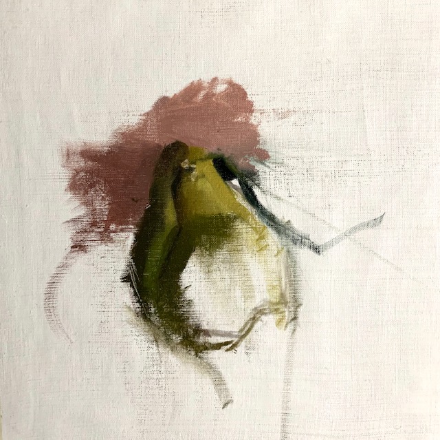
Finding shadow shapes in fruit still life
Now, the fruit still life is starting to take more form. I looked for the shadow shapes along the quince as well as the shapes that form on the pink napkin. Then I observed the subtle changes in the pink background and painted the shifts that occur from dark to light. Sometimes using my palette knife to scrape out areas that are lighter (then go back into the area later with lighter paint). While then re-enforcing other areas that need to be darker with a darker paint mixture.
Also, I paid attention to the varying different edges. Notice the sharp edges along the bottom and the softer edges along the left side of the quince. Edges in art and painting are one of the most important aspects of a painting, as they help make a painting more interesting.
Colors mixed for creating shadows
Dark yellow – cadmium yellow, cadmium lemon, yellow ochre, cadmium orange, veronese green, provence violet bluish, dioxazine purple, white
Green – cadmium green, cadmium red, alizarin crimson, cadmium orange, veronese green, white
Yellow – Cadmium yellow, cadmium lemon, veronese green, provence violet bluish, white
Pink – alizarin crimson, cadmium red, cadmium green, pthalo green, white, veronese green
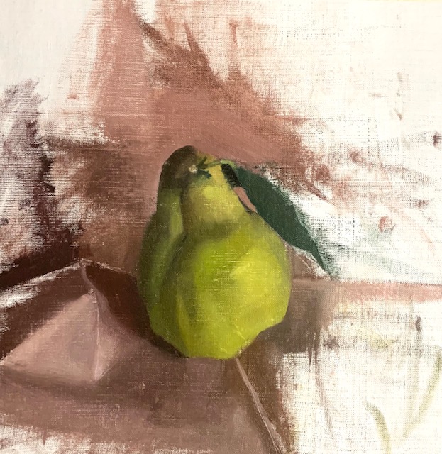
Painting the leaf of the still life
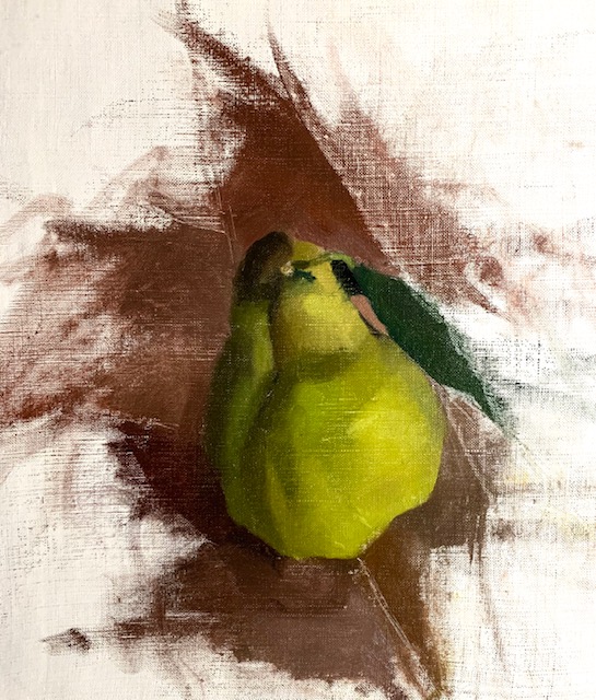
I observed the precise shape of the leaf and painted its edges and curvatures. Again, this was an important opportunity to pay close attention to the edges, as is one of the tips that help make your painting more realistic.
Also, I needed to readjust part of the pink background right behind the top of the quince. I moved the napkin slightly which made more light fall on it, thus making it lighter. So, you will notice a slight readjustment.
Colors mixed for the leaf of the fruit still life painting
Green – pthalo green, alizarin crimson, provence violet bluish
Pink – alizarin crimson, cadmium red, veronese green, cadmium green, pthalo green, white
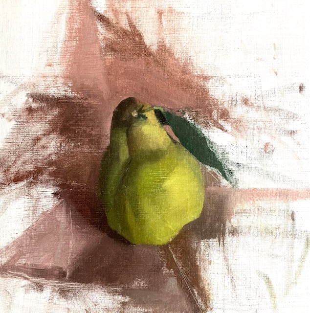
Finding value shapes in the napkin
I looked for the geometry in the napkin trying to find the value shapes. I tried to find the shapes of the light and the shadow shapes. At the same time I pay attention to the edges – as there is a great variance of sharp and soft edges throughout the pink background.
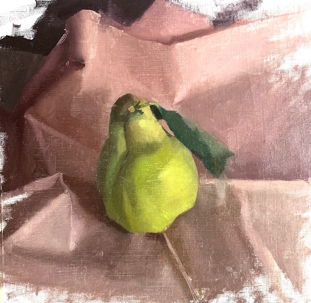
I would sometimes use the flat side of my palette knife to smooth some edge out. This is evident on the left side of the painting where the darker edges of the napkin meet dark colors to the left. Low contrasting values produce soft edges while high contrast edges produce sharper edges.
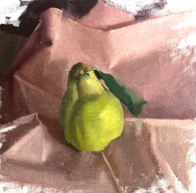
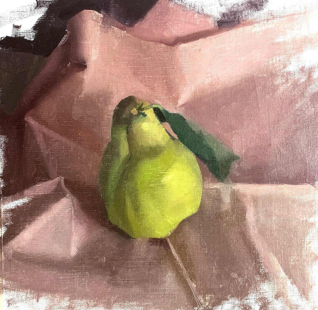
Completed fruit still life painting
And voila! Here is our completed fruit still life painting of a quince! I hope this tutorial was helpful for you! If you have any questions please leave a comment below. I am happy to answer any questions you might have!
To learn more about mixing colors with oil paints – get this FREE Color Mixing Guide!Want to remember this? Save Fruit Still Life Tutorial to your favorite Pinterest board!


2 thoughts on “How to Paint Fruit Still Life (Step by Step) Painting Tutorial”
Didn’t realize I could add your guidance to my Pinterest page. I thought it would cause copy write problems.
I don’t like wasting in on the “commercials” when I try to print out pages for my notebook so I’ve been writing by hand.
Oh yes, you can save anything you would like on Pinterest 🙂 Wow, I am impressed that you have been writing the information out by hand! In a way that is also a great way to solidify the information more. I am sure your notes look beautiful after seeing the notes you took on the Velazquez painting!