A practical guide to color mixing
One of the most important things you can learn when painting is how to mix colors. There is more to painting than just applying paint to canvas. After all, it is color that makes up your painting!
It can seem a little daunting at first dealing with so many colors. However with patience, practice and constant experimentation you will get a feel for it.
Learning to mix will save you money on not needing to buy unnecessary paint colors as you will know how to mix them yourself! Also, you will get greater richness in your painting if you work on creating subtle color transitions. Just using colors straight from the tube will result in work that is oversaturated and unnatural looking.
Color Wheel
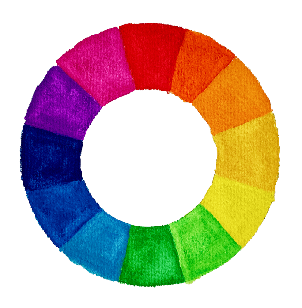
First of all let’s take a look at the color wheel (pictured below) and learn some basic color theory before delving into mixing oil paints. Use the color wheel and definitions below for reference if needed as you move through this article. If you want, you can make your own color wheel using watercolor pencils like I did. Or buy a lovely one already made!
Complementary colors
At the top of the color wheel you will notice red – directly below it at the bottom is green. Green and red are both what is called complementary colors. Now, lets look at the third color to the right of the red – orange. Opposite of orange is blue as blue is the complementary of orange and vise versa.
Analogous colors
Colors that are beside one another on the color wheel. For example blue, light blue
Triadic
Three colors that form a perfect triangle on the wheel. An example would be red – blue- yellow.
Now on to the color mixing part…
If you haven’t already – Grab my FREE Color Mixing Guide for help with color mixing techniques in your painting!
Understanding the primary colors
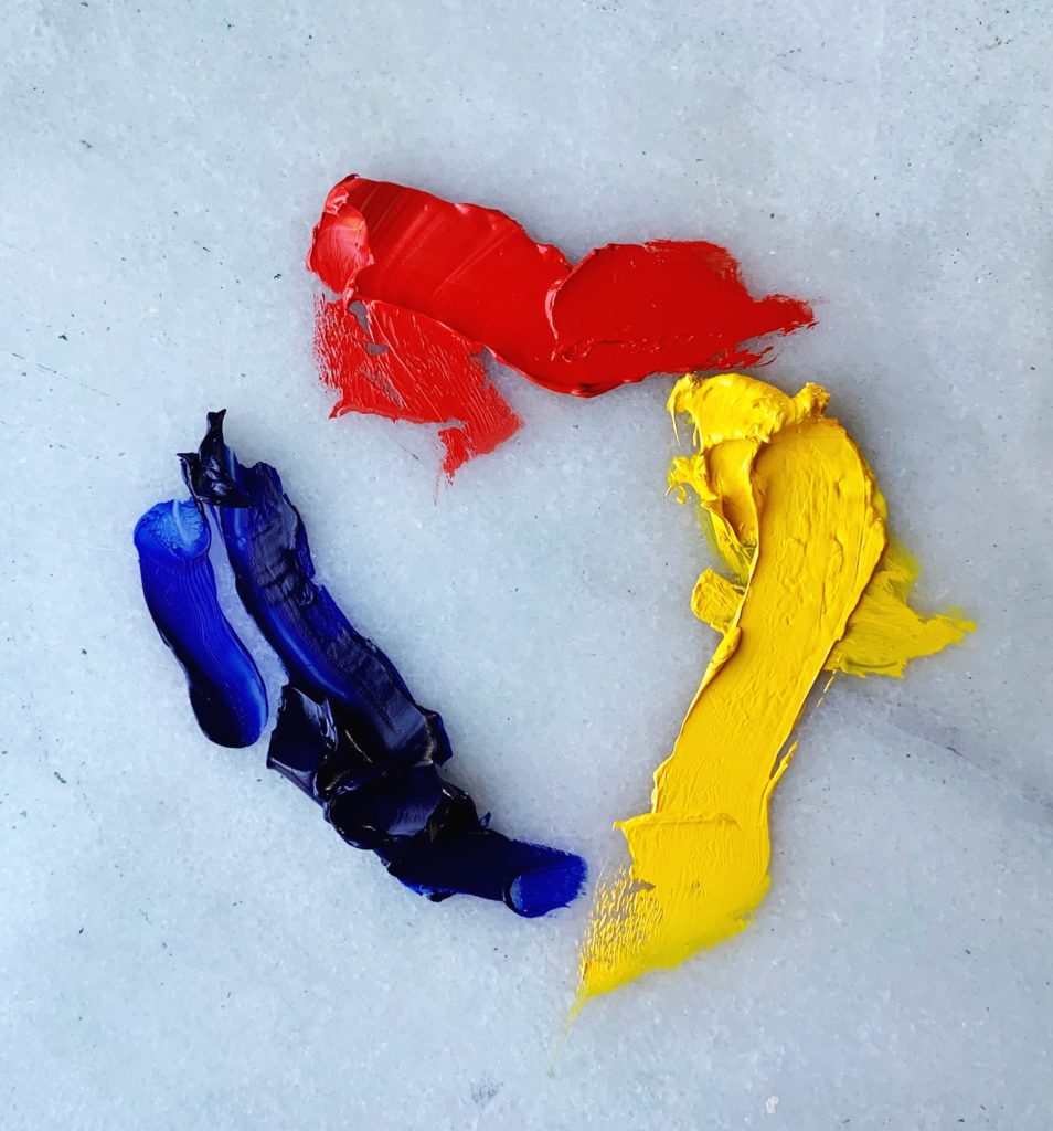
First off, the primary colors: yellow, blue and red are important because all other colors stem from just these three. These colors cannot be made from other colors – thus they are considered ‘parent’ colors.
Color mixing secondary colors
Secondary colors: green, orange and purple, are mixed from primary colors. The following, are the color combinations of primary colors mixed together to create secondary colors:
- Yellow + Blue = Green
- Yellow + Red = Orange
- Blue + Red = Purple
How to mix tertiary colors
When a primary and secondary color are mixed together a tertiary color is created. Like with secondary colors you must use equal parts of each to successfully mix a tertiary color. You can always notice a tertiary color by its name, as it is listed with its primary color first:
Examples of tertiary colors:
- Blue Green
- Blue Violet
- Yellow Green
- Red violet
- Red Orange
- Yellow Orange
Mixing what colors make brown
If you wish to know how to make the color brown, you will need to mix a tertiary color with a primary color. However, it is important that you mix the tertiary color with the primary color that is not already a part of the tertiary color’s mix. For example, if you made a red orange mixture for your tertiary color, red is the primary color. So in order to make the color brown in this instance, you would need to choose either blue or yellow to mix with the red orange tertiary color.
Complementary colors
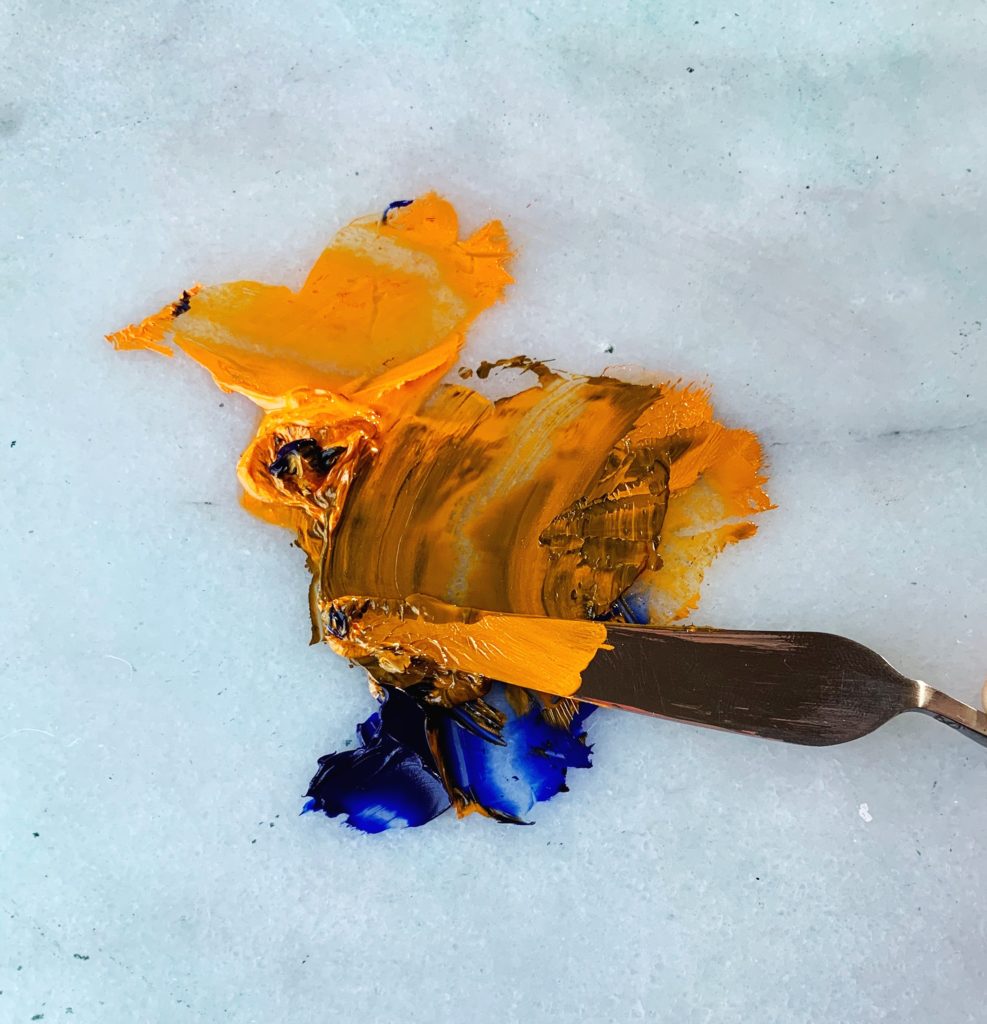
One of the most important concepts to keep in mind are complementary colors. These are the colors that are opposite from each other on the color wheel. So, for example, when looking at the wheel you notice that red is at the top – opposite the red is green at the bottom of the wheel. Thus, green is the complementary color of red and vise versa. The same holds true for blue and orange and purple and yellow (as well as all other colors in between!).
Why are complementary colors important for?
Knowing this simple fact will serve you greatly when it comes to mixing colors. When you pour your orange out of the tube it is a very saturated color and will not do you much good when you are trying to get a hue that is more ‘true to life’. So, what do you do? This is where complementary colors come in. As blue is the opposite of orange, when you add some blue to orange it will make the orange less orange – therefore creating a more muted color. Or if you would rather have a more muted blue you would just add some orange to the blue. The same of course holds true for all the other complimentary colors.
You could technically add a brown (burnt umber) to these colors to mute them, but this creates very uninteresting colors and will not help you in the long run. Working on mixing the opposites to colors helps you create beautiful and dynamic colors. You will grow exponentially more in your color mixing than if you would just add brown to colors.
How to make black color
You can make the color black with nearly any combination of two deep, dark colors. Which will produce a black color mixture as long as one is cool and the other warm. For example, Ultramarine blue and burnt umber is a good mixture for a black – blue being the cool and burnt umber the warm.
Pthalo green and alizarin crimson mixed together, also make a strong black color. I use these two colors for black color mixing the most often as it is such a deep and rich color. Pthalo green is an extremely strong color – you just need to make sure that the green does not overpower. You could also get a blue black by mixing pthalo blue with cadmium red light – it will depend on you how cool or warm you will want it to be.
Color mixing all the rest of the colors
So far we have barely skimmed the surface! I believe most of what one learns from mixing colors comes from experience. The best thing you can do for yourself in the process of learning to paint is simply to mix a LOT. All the time. Be experimental with color and mix combinations that you would not ordinarily think of – the results may surprise you. Think of it like cooking and adding spices – a little bit of this, then a little bit of that…
What I find accelerates the learning process is to watch an experienced painter work and see how they mix colors. For myself, this helped me to get outside of my own head and think of more unusual color combinations. The result was that my ability to make compelling color combinations on the canvas increased exponentially.
Most importantly, be patient with yourself as you learn. Looking at paintings of the old masters and doing master copies from these is also an excellent way in learning to mix.
Items I recommend
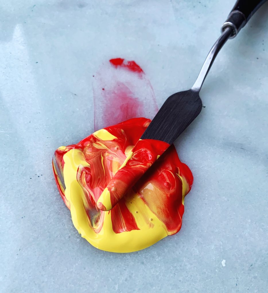
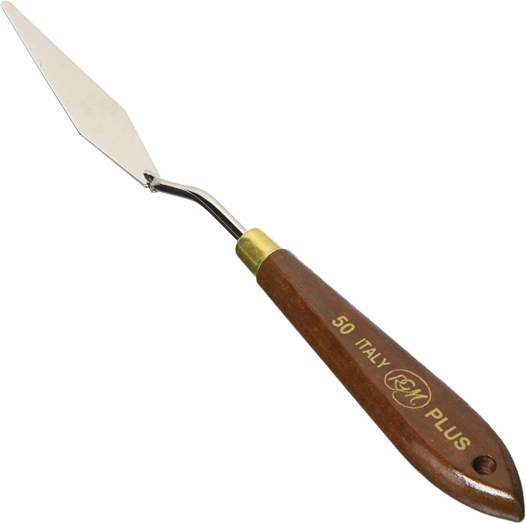
A good palette knife is indispensable when it comes to mixing larger quantities of oil paint
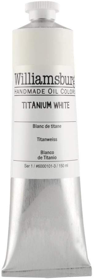
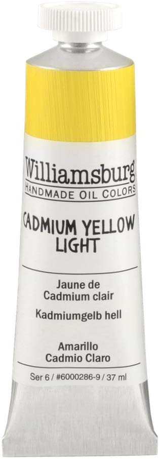
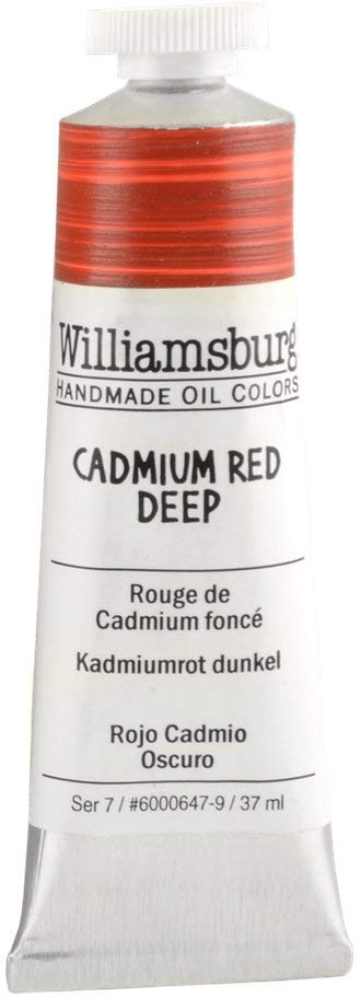
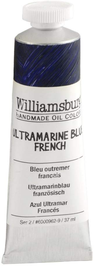
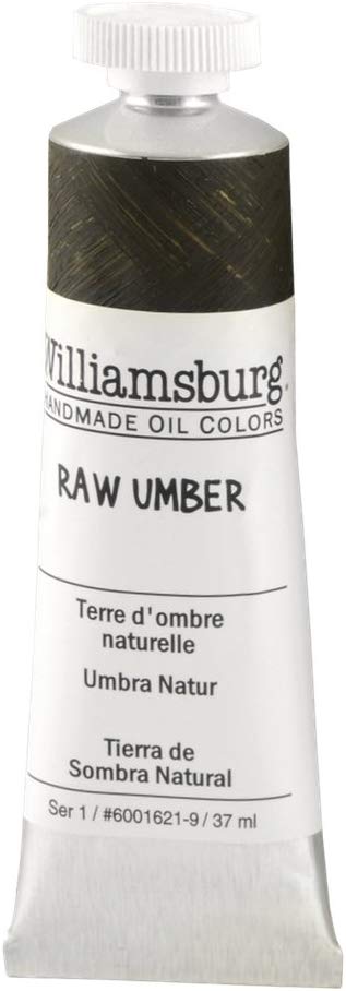
Williamsburg oil paints are excellent paints. They can be a pricier than some other brands, but are worth it. It is important to invest in good paint.
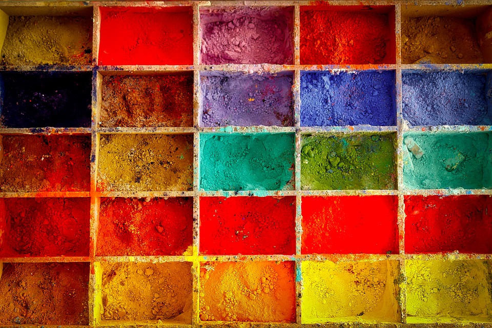
All these colors below make a limited color palette – all you will need to start mixing colors and painting right away. Read the necessary oil paints for beginners guide for more info on what colors you need to start painting.
If you want to learn more…
Check out Necessary Oil Paint Colors for Beginners to find out which colors you need to start painting.
Or
If you would like to learn more about how color works and the effect light has on color, Color and the effect of light is a must read.
Want to remember this? Save Color Mixing with Oil Paints to your favorite Pinterest board!





16 thoughts on “Color Mixing with Oil Paints: All You Need to Know”
Best guidance I have ever had getting into painting in all my 90+ Years!
Stop in at Elisabeth’s Site!!
You won’t regret taking in the experiences we have had joining her in the process!
You are so kind Patricia! Thank you so much 💙
אליזבת יקרה שלום רב
זמן רב לא פגשתי שיעורים שלך והנחיות
ממש התגעגעתי
תודה רבה
יום נפלא
צבעי עור
איך לצייר דיוקן צביעה בשכבות שמן
אם יש לך הדרכות אשמח ללמוד ממך סוף שבוע נפלא
רותי
שלום רותי!
טוב לשמוע ממך. אני מקווה שאתה מסתדר. אני מאוד שמח שאתה נהנה מההדרכות! אני מקווה ליצור מדריכים נוספים לפורטרטים בעתיד.
אני מאחל לך שבוע נפלא,
אליזאת
Thank you very much for a making mixing colors simple and logic understandable.
You are so welcome Dali! Am really happy to know that it was helpful 🙂
Thank you, Elisabeth! Im 79 and a beginner. I tried an abstract for first time
(18” x 24”) in oil with blue & orange. What tertiary color/s do you advise as a learning tool!
(Ie., enhancing the painting with some 3rd color) Thank you, Tom T.
(My effort: Ultramarine blue background with abstract hearts triangulated- a welcoming work for our Nephew who just came to live with us.)
Hello Tom, You are welcome, thank you for your comment! That is wonderful that you created a piece with tertiary colors – they create great color harmony.
Very informative I liked very much all the informations thank you very much
Am glad to hear you found the article informative!
Hi I wrote down my email but did not receive the colour mixing guide please can you send it to me
Hello Gehane, Apologies you did not receive the color mixing guide. I just sent it to your e-mail! Hope you will enjoy and find it useful.
אליזבת שלום רב
תודה על ההסבר היסודי וההדגמות
בהערכה רבה
רותי כהן
שלום רוטי, אתה כל כך מוזמן! אני שמח לשמוע שזה היה מועיל
Good information on mixing colors with oil paint. I look forward to learning more. Thanks for sharing.
Thank you Betty! I am glad you enjoyed