

Being able to articulate the value of color in your painting is vital for bringing your work to life. However, mastering color and light in painting can be a difficult task.
Even for experienced artists, it can be a challenge to create the right balance of light and dark values—add color into the mix and it suddenly becomes much more difficult.
In this article, we’ll explore the importance of being able to establish strong values in color. As well as, how you can use color and value together to create powerful paintings that will captivate your audience.
Why value is greater than color

Value is the most important fundamental element to learn as a painter and draftsman. I will even dare to say that it is MORE important than color.
If a painting has beautiful color but lacks a value structure, then the painting will not work because it doesn’t have a sense of light. Therefore, it is absolutely essential to pay attention to the value of color.
Example of a lack of value in a painting
Below is an example of a painting with a strong value structure (to the right) and a painting that lacks a sense of light (to the left).

The painting to the left has great colors, but because of the disregard of the color values it falls flat and doesn’t work. On the other hand, the work on the right makes an immediate impression–because it has clear light and dark values.
No matter how beautiful your colors may be, if your work does not have clear values, then it will not work.
Painting in Monochrome (or Black & White)

It is very helpful to understand how to create a clear and solid light and dark structure first, before painting with color. Creating a clear sense of light in your painting is hard enough on its own and things become much more complicated once you add color into the mix.
So, it is important to develop a deep understanding of how color and value work together, so that you can effectively convey the light and shadows within your piece.
How to see values in color
In order to create strong values in color we need to understand how color works. The reason for this is because color can trick us! A color that might look bright, could in actuality be quite a bit darker in value than what it seems.
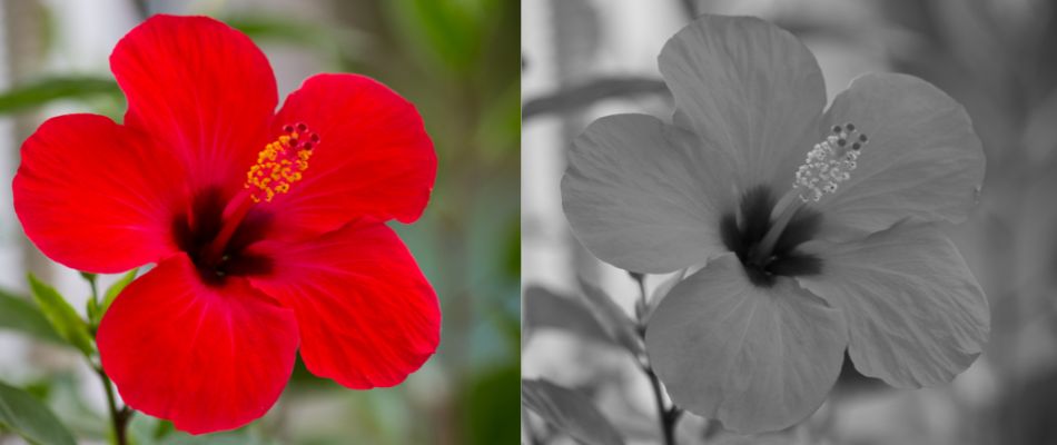
For example, in the image above we see a red Hibiscus flower on the left. To the right is the same image but in black and white. The red color looks quite a bit darker than what we would have thought it would be when seen in color. The saturated quality of the red makes the color appear lighter in value – but is in actuality much darker.
How awareness of color helps to understand value
Making yourself aware of important qualities in colors will help you a great deal when it comes to creating clear values. For example, in the color wheel, yellow tends to be rather light in value, while red and blue tend to be rather dark. Each color has a value. Of course, the values of colors change as you lighten and darken them and make them more or less saturated.

Color values of bright, saturated colors
Very strong and saturated colors tend to be darker in value than they appear. For example, in order to get a bright saturated red it needs to have quite a bit of pigment – which requires for it to be darker in value.
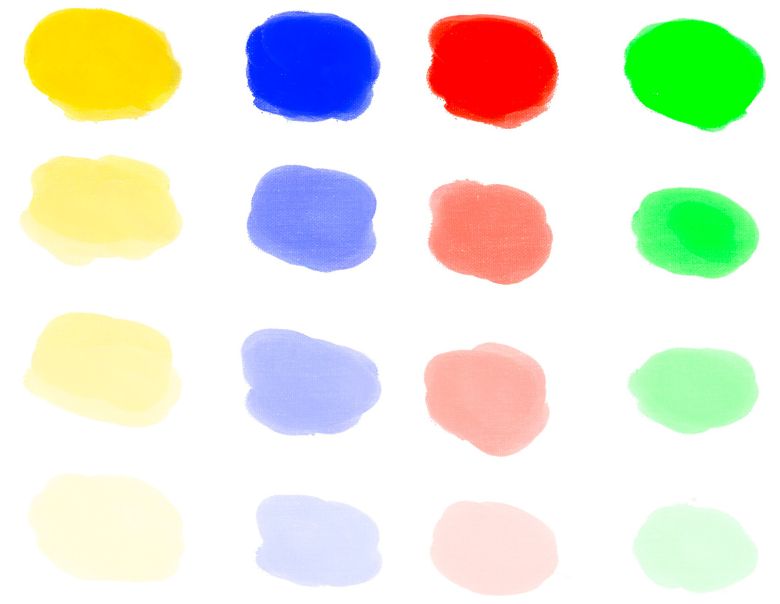
Notice in the image above how each of the colors become less saturated as they become lighter in value.
For example, the red color becomes LESS saturated and bright and turns into a lighter and less intense color as it becomes lighter in value.
Examples of clear color values in art
Artists working in various periods of history created value with color in different ways. However the through line that connects all painters is that they all focus on value over color to create a strong value structure in their work.
Matisse
For example, Matisse is considered part of the Fauvist movement. Which was a group of artists who focused on using strong colors.

In the painting above, a self portrait by the artist, we can see strong shades of green painted over the face. Although this isn’t a color we naturally see on a face, it works in the painting. This is because the value of the green color is the same value even if you used a more natural ‘skin color’.
Caravaggio
Caravaggio couldn’t be more different in how he creates value with color. His focus is on using more natural colors but he creates very strong and dynamic values.
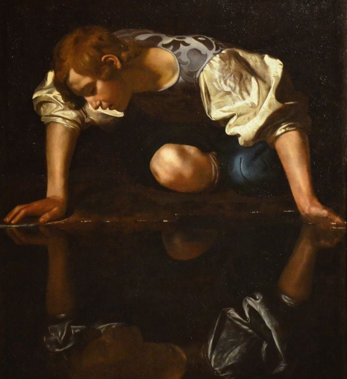
In the painting above we can see how his dark values are very dark while his light values are very light in value. So, he creates a very wide range of values with color.
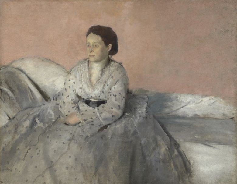
Degas
In this work by Degas below we see a much narrower range of values than the piece by Caravaggio. Degas creates value with color in a much softer and subtle way.
Despite the enormous differences that exist between artists and how they create value with color, they all share the same truth and reality regarding the value and color. That is, color needs to be seen through the lens of light and shadow. We always must first consider what value a color is before thinking of what kind of color it is.
How to apply values in color to your own painting
The best way to apply what you learned in this article is to practice. Work on establishing strong and clear values above all else. Even if you are advanced and have been painting for years – this is always relevant to your development as an artist. Leonardo Da Vinci continued to study light and create studies throughout his career.

Expose yourself to different kinds of lighting situations so that you feel comfortable interpreting a variety of light effects.
Use Value Studies
Creating value studies will never get old as they are an essential part of creating good work. It is necessary to incorporate it into your practice as a painter. You can use charcoal or a graphite pencil to create small quick value studies of your subject. If you prefer to use paint you can also create small value studies with black and white paint.

The purpose of a value study is for you to understand the basic large light and dark values in your work. This helps you to demystify what values the colors in your painting are. So you can create a strong value structure in your work.
Focus on Color Spots & Shapes of Value

Once you have a clear idea of the values in your painting work on breaking your subject matter down into color spots. Before you apply each color in your painting – ask yourself what value it is first.
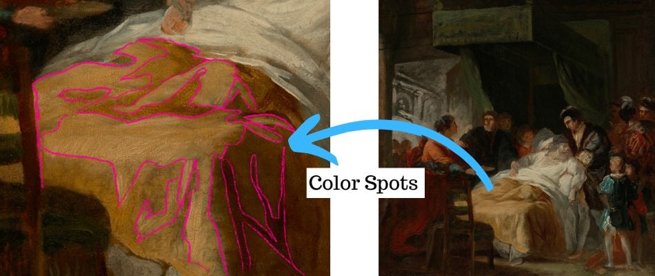
This way you can break the process down into manageable steps. Try to first see and paint large simplified spots of color. Once you build confidence and can create strong values with large spots of color, then move onto the smaller spots of color that exist within the larger spots of color.
Continue to paint and explore the world of color and value. It is a never ending learning process. Which is what makes painting difficult, but at the same time incredibly exciting as there is always something new to discover.


22 thoughts on “How to Establish Dynamic Color Values When Painting with Color”
Hello Elisabeth, this is a very interesting article on balancing Colour and Values in paintings. I’m retired now, and I’ve only recently discovered the world of colour, and I very much enjoy painting. Your article has opened my eyes to the importance of colour values in structuring a better painting. I’m very grateful to you for that- I need all the help I can get -. Your YouTube presentations are also very enlightening and beneficial. I am looking forward to painting more and learning more through you in the process.
With kind regards,
Joseph
Thank you so much for sharing that Joseph – and for your kind words about my articles and videos. I really appreciate it! Very glad that this article is helpful in shedding some more light on how color works.
Hi Elisabeth, thanks for bringing the important issue of value to our attention. I have not had a chance to put it to use yet, but excited to incorporate it in my painting procedures, I’m sure it will help.
Very glad this is helpful Dennis! Thank you for sharing that.
Hi Elizabeth – yes value is hard – having so much trouble with cast shadows – any help there would be great – did buy your colour course but for the value lot it will have to wait.
Margaret
Hi Margarget – please do send me images of your work! I would be more than happy to help guide you with values in your color. You can post them inside the course 🙂 It takes practice but you will get it. I also recently made a YouTube video on cast shadows that might be helpful – https://www.youtube.com/watch?v=BMpofoSvXpQ&t=4s
Thank you. I learned much. And i will praktisk.
Mvh Grethemor
Glad to hear you learned a lot from this!
There are many artists articles on Pinterest but I always find yours the most helpful. You have such a great way of making everything so clear and understandable.
Thank you so much Bernadette for your kind words. Am very glad to hear that!
Good evening thanks a lot
For everything.
Id like to ask you do you think it would help to prepare 3 different values of each colour we are going to use so we can choose before we put it on the canvas?
Good question. Personally, I do not pre-mix my values ahead of time as I always mix my values relative to what it is being put next to. However, if it is helpful you could pre mix three values and then adjust/ fine tune them when you put them on your canvas. As inevitably there will be some adjusting needed when you see them next to the colors/ values they are up against. I hope that is helpful!
Hi Elisabeth.
Thank you so much for this excellent post. I have been struggling with my painting for a while with all the difficulties; and only painting from photos. I had no idea what value in painting was all about. I am practicing more now before painting, all thanks to your help with all the emails I can now save to go back on.
The older painter? 😎
Hi Mike, You are so welcome! Happy to hear that my e-mails and information has been helpful for you. Glad that you are practicing value now before painting – it makes such a difference.
Hi Elisabeth.
I have been trying to save your latest posts to Pinterest; but won’t let me. Perhaps I now have too many. Could you please advise.
kind regards and many thanks.
Mike D
Hi Mike, I am sorry that it is being a little bit difficult. It might help to refresh the page (or closing and opening it) – sometimes that solves the issue! Otherwise, there shouldn’t be a problem as don’t think there is a limit on how many pins you can have.
I hope that helps!
Thank you, I have enjoyed all your mixing and related articles.
You are so welcome David, am very glad to hear that!
Collecting your UTube Articles in one place, I spotted this today.
Dailey coming to my email:I find this article as a member of this group.
Excellent as I consider color for my 3rd layer of my Duke Garden painting.
So glad to hear from you here Patricia! Wonderful, that you have gathered all of my Youtube videos and articles in one place. Glad you are working on the Duke Garden painting!
Some time ago I took a colored pencil class. The instructor said my picture lacked enough “Value”. I didn’t understand what she meant. I still struggle with what Value is. Your article has really helped me.
Thank you for sharing.
Hello Mary, Thank you for sharing! Am so glad to hear that this article was helpful. It is one of the most difficult aspects of color – but with practice it becomes much easier.