

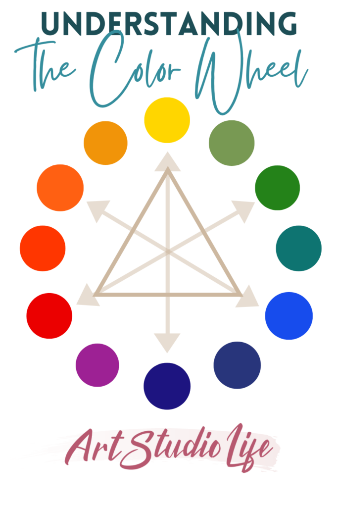
Almost everyone will immediately recognize a color wheel when they see one, however few understand the principals and the power it contains. As an artist, having a fundamental understanding of how and why colors work together is essential for you to be able to work seamlessly with color. And the visual representation the artists color wheel presents, along with it’s ability to work as a map of color relationships, is incredibly useful.
This article delves into the foundational principles of the color wheel for artists, exploring essential color groupings and the underlying theories that make them work. In addition, I will show you how to apply that knowledge to your painting. Learning these fundamental concepts, will help you grow your color mixing skills and give you a more foundational basis as an artist. So, let’s get started!
What is the artist color mixing wheel?
Now the precise definition of a color wheel, per Merriam Webster’s dictionary is: “a circular diagram of the spectrum used to show the relationships between the colors.” However, for artists the true power of a color wheel comes from understanding what these relationships mean.

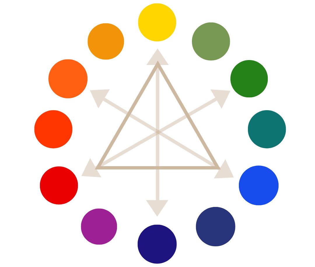
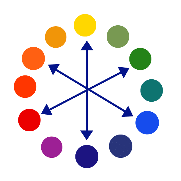
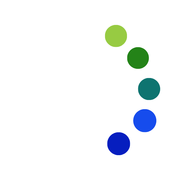
The artist color wheel above shows 12 colors. Starting from the top going clockwise the colors are: red, red-orange, orange, yellow-orange, yellow, yellow-green, green-yellow, green, green-blue, blue, blue-purple, purple, and pink.
The theory behind the color wheel
Once you understand the principles behind what the color wheel represents, it will purely serve as a visual reminder to yourself. You will not need to paint with it in your hand, however it can be helpful to have it hanging on your studio wall as a reference.
Now to understand the principals and theory behind the color wheel we need to look at the color pairings and relationships it contains. So, we’ll get started with first looking at the Primary Color Wheel!
Primary color wheel for artists
Now, primary colors are the most important colors in the color wheel and in the primary wheel diagram below, you can see how they form a triangle.
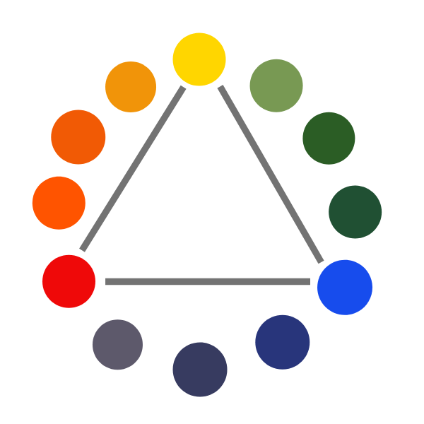
Primary colors are the most important because it is from these three colors that all colors can be mixed.
However, for a painter to mix all the colors they need from just primary colors would be quite difficult – because no tube of paint exists that is a pure form of blue, red and yellow. All colors contain some traces of other colors as well. Now, if you mix any two primary colors together you get–secondary colors!
Secondary colors in the color wheel
The secondary colors are orange, green, and purple. As you can see from the secondary wheel below, the secondary colors are in between the primary colors. This is so because you get secondary colors by mixing together two primary colors.
For example, if I mix together the primary colors yellow and red I get orange. And when mixing primary colors blue + yellow I get green. Last but not least, when mixing primary colors blue and red I get purple!
Now, for each of these secondary colors there is a complementary color!
Complementary colors within the color wheel
Each of the secondary colors is a complementary color with a primary color – and the opposite is also true – each of the primary colors is a complementary color with a secondary color.
When looking at the complementary color wheel above you will see that the secondary color purple is the complementary of yellow, and yellow is the complementary color of purple. Orange is the complementary color of blue and vice versa. And lastly, green is the complementary color of red, and red is the complementary color of green.
You will notice that all complementary colors are opposite each other on the complementary color wheel! So, when looking at a color wheel you can always know that complementary colors are opposite one another.
Complementary colors in action
When you put two complementary colors next to one another it makes them stand out more than they would on their own. For example, look at the image below of the blue square inside the orange square. Both colors stand out much more than they would if they were by themselves.

The same holds true for the complementary colors green + red and purple + yellow. Because they are completely opposite, they make each other stand out more.


So, if you ever want to emphasize something in a painting – then use two complementary colors next to one another. I have examples of how this applies to real paintings at the bottom of the article.
Where to find the use of the Color wheel in art
You will commonly find complementary color schemes in art because they work really well for a painting. Keep your eyes peeled next time you head to an art museum – you will be surprised at how many paintings use a complementary color wheel scheme.
Orange – blue complementary color scheme
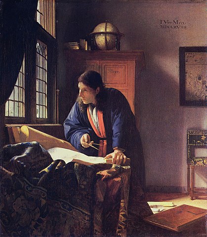
Vermeer’s painting ‘The Astronomer’ is an excellent example of how an orange/blue complementary color scheme can work in a painting. Of course, not ever single area of the painting is either blue or orange. However, the general overall theme for the colors in the painting are blue and orange.
Having a complementary color scheme in a painting works well because the colors (orange and blue in this case) make each other stand out more. This in turn makes the piece stand out to the viewer.
For example, our eyes immediately go to the bright orange trim on the astronomer’s robe first because it is set off by being next to its complementary color blue. Vermeer meant for the figure to be the point of focus – which works thanks to the complementary colors.
Tertiary colors in the artists color wheel
There are still more colors to talk about! Tertiary colors are also known as intermediate Colors. These colors fill in the gaps between the primary and secondary colors. As you can see in the tertiary color wheel below.

You can get a tertiary color/ intermediate color by mixing one primary color with one secondary color. So, if I mix the primary color yellow with the secondary color green I get the tertiary color yellow-green.
If you are working from life on a painting you will probably not use primary colors or secondary colors in your piece because they are very bright. Rather, it is more likely that you would use some softer colors like tertiary/ intermediate colors. Colors are much more natural when they are mixed.
The rule of complements ALSO applies to tertiary colors. Though the effect tends not to be as dramatic as a primary color mixed with a secondary color.

Notice that the complementary of each tertiary color is also opposite from it on the color wheel.
What are analogous colors in the color wheel?
Analogous colors definition
Analogous colors are groups of three colors that are next to each other on the color wheel. For example, notice in the color wheel below of how yellow, yellow-green and green are all next to one another. Therefore as a group they are analogous colors.
Analogous Colors examples

Analogous colors are often found in nature and are known to create harmonious designs that are pleasing to the eye. Below is a close up view of the analogous colors highlighted in the color wheel.

Extended analogous colors
There is also such thing as an extended analogous color palette – this would be a group of more than three analogous colors. Think of analogous colors as taking a slice of the color wheel – 3, 4 or at most 5 pieces that are grouped together
Above is an example of a group of five analogous colors taken from the color wheel. You can see that all the colors are related since they are grouped together.
Analogous Colors in Art
Now we can’t end the conversation about analogous colors without showing some real life examples from the art world!
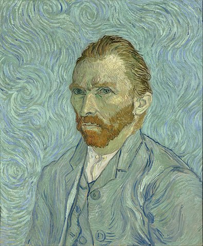
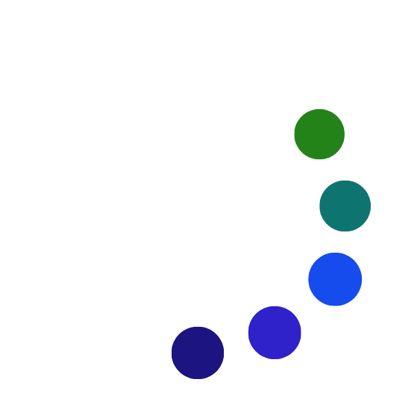
This Self Portrait by Vincent Van Gogh is made up of (for the most part) an analogous palette that has a lot of greens and blues – yellow green, green, blue green, blue, and purple blue. You can see the extended analogous palette that Van Gogh used below in his self portrait painting. It is made up of 5 colors and you can see why the colors in the Van Gogh painting are so harmonious.
Complementary colors with an analogous palette
Besides the Van Gogh self portrait having a very analogous palette it also has a splash of complementary colors! Van Gogh’s beard and hair is red and orange which are complementary colors for green and blue.
Having complementary color contrast helps to make a painting more dynamic as seen in the Van Gogh painting.
Split complementary colors in the color wheel
A split complementary color scheme is a variation of the complementary color scheme. It uses a color and then the two colors that are adjacent to the complementary colors.
Example of split complementary colors
For example, in the color wheel below you can see that the split complementary colors here are purple, orange-yellow, and yellow green. Orange-yellow and green-yellow are adjacent colors to yellow (the complementary color of purple).


Practical application of the color wheel
Having thorough knowledge of color theory and the color wheel is not absolutely necessary to become a great artist. However, knowing the basics of how color works is VERY helpful when it comes to color mixing and making decisions on a color scheme for a painting.
Apply what you learn in this article to your painting. To get more practical application in terms of color mixing of some of the concepts discussed here read the color mixing guide.
All of the concepts in this article are the same whether you work in watercolor, acrylic, oil paints, gouache or any other medium! The rules of color mixing are universal so you can apply it to anything you do. So, go and explore the world of color and have fun color mixing!


33 thoughts on “Understanding the Artist’s Color Wheel (and the Theory Behind it)”
Thank you so much for such a clear explanation of such a complex issue. I’m looking forward to mixing more colors in my paintings in the future.
You’re very welcome Paul, glad it was helpful!
It’s nice to see that you’ve included some real-life and practical examples, rather than just technical explanations!
Colours are daunting, yet it appears that you have the ability to keep your students calm and engaged. Thank you for the lesson!
Thank you for your kind words. You are so welcome! I like to include real life practical elements into explanations as I know it is what helped me the most when learning.
Dear Elisabet,
I am an amature artist of 81 years, my life is like a “paint pot” as mum used to say about me at the I time i knew in my soul.. I needed to be an artist to help broken people,but Mum said NO YOU WILL NOT GET RICH. My spirit was bruised in the end I did domestic work and painted when I could.
I would like to know how to paint fine MIST AND SEE THROUGH FOG. What colours do I use??
From Stacy Hardy
smh7ty3ttwo@gmail.com.au
Hello Stacy,
Thank you for sharing. The pathway to doing art can be a difficult one as many share their opinions that can impede at times. Am very glad that you are now painting and learning! It is absolutely never too late. When painting mist and fog it usually is cooler in temperature so I tend to use a decent amount of ultramarine blue and orange and white. However, I also mix in a little bit of purple and yellow as well as sometimes a little green and red. There are often some subtle color variations that need to be made. The most important thing to keep in mind when painting fog is that it is very subtle and typically quite light in value. So you might need to use quite a bit of white 🙂
Thank you Elisabeth for your clear guide with some all important examples…. I think I’m beginning to get it… at last. I have been relying on what I thought I understood but didn’t really! I am going to print it off and complete a little study to explore further. Many thanks for sharing your expertise.
Margaret
You are so welcome Margaret! Glad that this is helpful 🙂 and that you will be doing a study of it. Putting things into practice is the BEST way to gain a deeper understanding of something.
hi elizahbeth,
I thank you for the nice welcoming to this website I hope I can achieve and learn many new things from you and even now im already learning as I consume your colour guide
Thank you for your kind words, am happy that you are learning from the information here!
Hi Elisabeth.
Thank you so much for covering the color wheel again; my color mixing is not good so this will help me a lot. I do read all your posts over and over, and keep them for constant revue.
My thanks and best regards.
Mike D
You are so welcome Mike! Glad this will be helpful. It can often be overlooked, but going back to the basics can be one the most helpful ways to understand both simple and complex things much better.
Very good and helpful article. I’m a beginner painter and had no clue about colors. I read most of your articles and color mixing guide and it’s helping me enormously. Thank you very much.
Am so glad to hear that Iris, thank you for sharing!
Elisabeth
As a late beginner to painting, 80+, I have learned much from your articles. Thank you
I am painting the “Calanais Standing Stones” in northern Scotland and am having difficulty mixing the colors for gneiss rock. There is no provision here for an attachment, so I ask that you access some internet photos and advise your acrylic paint mixing recommendation.
Thank you
Bill
Hello Bill, I am so glad to hear that my articles have helped you with painting. Thank you for sharing about your current painting project – I have been to Scotland and loved my time there but have never heard of the “Calanais Standing Stones”! It is now definitely added to my travel list 🙂
Mixing colors for rocks can be tricky as they are muted and also required lots of subtle changes. I would think of the colors of the rocks in terms of cool and warm temperatures. A good base for mixing the colors you need is to use blue (ultramarine blue and or cobalt blue) and cadmium orange (or a mixed orange). When you mix blue and orange together you will get a nice greyish color. If it is too blue then mix more orange into it. If the greyish color needs to be even warmer than mix in some more orange. You can also warm it up more by mixing in a little bit of yellow. You will probably run into areas where the shades are more greenish – in this case mix a little bit of green into your grey color base (the blue and orange mixture). If the color ends up being too green then mix in some red. thinking of complementary colors will be very helpful for mixing up the colors you will need! An article on this topic will be coming up very soon.
I hope that helps!
This is an awesome article. I don’t know why I never saw it before. It was really informative and will help me very much in my future art work. Thank you. Louise
Good to hear form you Louise! Thank you for your comment – glad to hear this article was helpful!
Elisabeth,
Thank you kindly for your information. They are really helpful. I did not received your colour mixing guide despite having tried several times to get it. I hope I will have it.
Regards,
Frits
Hello Frits, You are very welcome! Glad it is helpful. I just sent you an e-mail with the color mixing starter’s guide 🙂
Hi Elisabeth, thank you for your information. I did not received your colour mixing guide despite having tried several times to get it. I hope I will have it. Thank you! Lolita
Thank you for reminding me of when I was in high school. I really forget what I just read.it was so ironic that I’m going back to painting,that’s what I wanted to do as a lifetime dream somewhere and got lost. I became appreciative again. thank you for Reminding me. All is well and will indeed 💕Adele
So glad to hear that! Thank you for sharing Adele! Am glad that the post brought back good memories.
Hi Elisabeth,
I just want thank you for this article. it was really helpful.
and thank you for all of information you share with us .
regards
Hello Nahid,
Thank you for sharing – I am glad that this article was helpful! It is my pleasure to share the information to help others learn.
Hi Elisabeth,
Thank you kindly for your information. They are really helpful. I did not received your colour mixing guide despite having tried several times to get it. I hope I will have it.
Thank you
Sarah
Hello Sarah, Thank you for your kind comment! I am glad that you enjoy the information on this blog. I just sent the color mixing guide to your e-mail – I hope you enjoy it!
Best Wishes,
Elisabeth
I have followed you for a while, Elisabeth, and really find your articles and information very helpful. I’m an intermediate oil painter. For some reason I haven’t received your colour mixing guide and have tried several times to get it. If you could get it to me I would really appreciate it. Thanks!
Hello Janet, Thank you! I am very happy to hear that you find my articles helpful and informative. Apologies that you have not received the color mixing guide – I will send that to you right away 🙂
Thanks Elisabeth this is a fantastic resource and will greatly assist me to mix colours. Thanks again for all your assistance.
regards
Warren
Thank you Warren! I am really glad to hear that you find it helpful!
Thanks so much for the Color Mixing guide and now this new email on mixing colors.So very helpful. Anxious to give it a try.
Hello Cathy, You are so welcome! I am very happy to hear that the information is helpful.