


Color is a fundamental element of painting, and it can significantly impact the emotional response of the viewer. The three dimensions of color; hue, chroma and value are particularly essential to understand and master.
In this article, we will explore how these aspects of color are used in painting, and we will provide examples of paintings that show each dimension in application.
What is Hue, Value, and Chroma?
It is first important to understand exactly what hue, value and chroma are. Hue is the color of something – whether that be orange, blue or green. Chroma is the intensity of that color – which means how bright (saturated) or how muted the color is. Value is how light or dark a color is.
Paintings with High Chroma and Large Range of Values
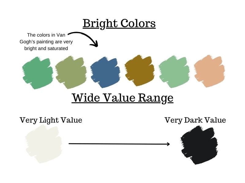
Some paintings have bold colors with bright and intense hues. Many of Vincent Van Gogh’s paintings are prime examples of this approach. Many of his paintings feature high chroma colors, combined with a wide range of values. This combination results in vivid, expressive works. His self portrait painting below is a great example of the use of very bright colors and a wide value range.

In the info-graph below, you can see the bright colors that appear in Van Gogh’s paintings. You can also see the range of the lightest value to the darkest value that exists in his work. The combination of very bright colors with a wide range of values has the potential to make dramatic paintings with rich colors.
Paintings with Low Chroma, High Value Range
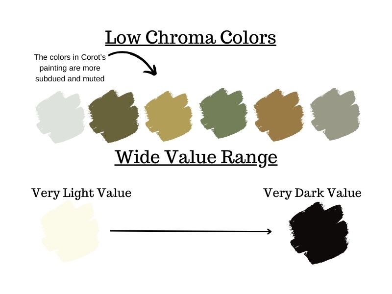
Some paintings are more subdued, utilizing low chroma colors but still encompassing a large range of values. Jean-Baptiste-Camille Corot often uses low chroma colors, creating a calming and peaceful ambiance. He achieved a harmonious effect by working with a high value range, often painting in a key that is higher on the value scale.

Exploring Colors with Low Chroma and Expansive Value Range
In the diagram below you can see with greater clarity how Corot’s colors in his paintings are lower in chroma. At the same time he also has a wide value range like Van Gogh. The more muted colors are based on what exists in nature and real life observation. Therefore, colors that are lower in chroma and more muted tend to make a painting more convincing and real. It also opens up the opportunity for great depth and nuance.
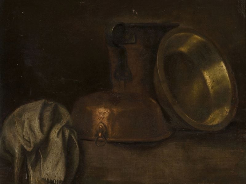
Examples of Low Chroma, Low Value Range Paintings
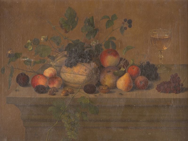
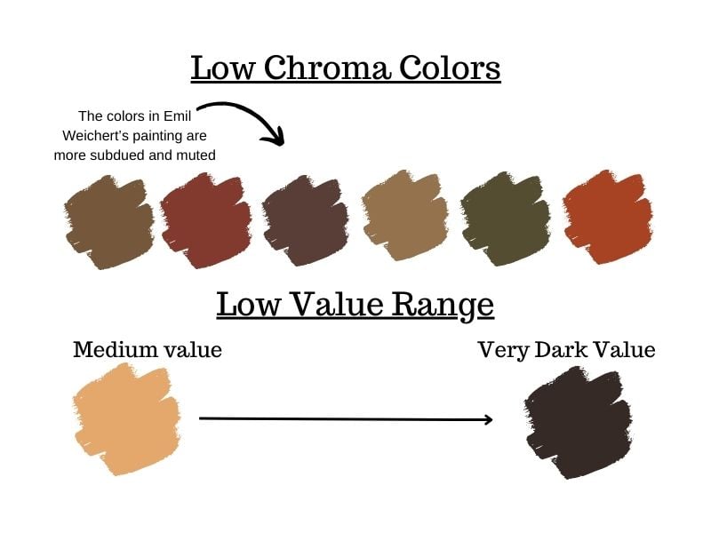
On the opposite end of the spectrum, some artists create paintings that feature a low chroma palette and employ a limited range of values. Below is an example of a painting by Austrian artist Emil Weichert. In this still life you can see how he uses muted, low chroma colors with values that are more at the lower end of the value scale. Meaning that the values are darker overall.
Exploring Colors with Low Chroma and a Low Value Range
Here you can see a sampling of the colors – which are mostly low chroma and not very saturated. However, it does have a decent range of a variety of colors. You can also see more clearly how the lightest value in the painting is not very light – but is more of a medium value color.
Paintings with Low Value, Low Chroma, and Low Range of Hue
For some artists, working with a color palette that is low in all three dimensions – value, chroma, and hue – can result in intriguing works. This painting by Martin Dichtl is a great example of this. Notice how the painting has a very limited range of color (hue) as well as low values and very low chroma.
There is a very limited range/ amount of colors present in the painting. You can see in the diagram below how the colors are mainly different versions of brown. In addition, as most of the colors are low in chroma they are very muted and subdued. The painting is also quite dark as the lightest value is not very light as seen in the diagram. This combination of colors and values is more rare. But it has been used by notable artists including Pablo Picasso.

Paintings with High Value Range, Mid Chroma
Finally, you can choose to use a high-value range but with mid-range chroma colors – resulting in a calming yet engaging effect. Piero della Francesca would often work in this color dimension. His paintings feature a soft and subtle range of colors and values, resulting in a unique and captivating perspective.

You can see below how the colors in Piero Della Francesca’s painting “Virgin and child enthroned with four angels” are all not overly bright but also not too muted. The result is that they are in between the two and therefore “mid chroma” colors.
Piero Della Francesca’s paintings also tend to be more at the higher end of the value scale. You can see this especially clearly if you compare this painting to those that are in the lower end of the value scale.

Choosing the Hue, Value and Chroma in Your Own Work
When it comes to painting, there should be a thoughtful decision made when it comes to the different color dimensions. Understanding how each dimension can create a different look and feel in your artwork is essential. Utilizing colors with both high chroma and a wide value range. Or, opting for an approach with higher values and low chroma, will have a great impact on what kind of message you’d like your painting to convey. Each color option carries its own benefits and should be used thoughtfully.
What kind of color dimensions you choose will definitely be influenced by the kind of subject matter you choose and the types of colors and values it has. However, you have a lot of freedom when it comes to interpreting your motif and subject matter. Consider all options, review them closely, and apply them to create more compelling works of art.
Learn More About Color with the Color Mixing Master Guide
If you want to go even deeper into how to work with and mix many different hues and values in color. You can get the help you need with my Color Mixing Master Guide pdf ebook, here.


10 thoughts on “Exploring the Three Dimensions of Color: Hue, Value and Chroma”
Thank you much for the valuable information.
You are very welcome! 🙂
Thank you for sharing this intriguing information!
You are so welcome Margaret! Glad it was informative
Very interesting really enjoyed reading this info…..thank you sooooo much
Kind regards
Jenny Claase ….south Africa
You are very welcome, very glad to hear 🙂
Hi
Have I understood right that low chroma are muted colours?
Tks
God bless
Joe
Yes, you are correct, low chroma tend to be muted colors
Very good article, and the demonstration using the different paintings really spelt the message out loud and clear. Thank you!
Glad this was so helpful and informative, thank you for sharing!