


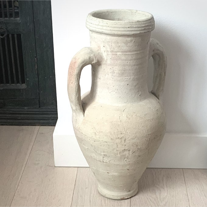
Painting still life that has a lot of light values and neutral shades of white can make for a beautiful and delicate painting. However, it can also be tricky since the differences between the different white shades is so minute!
It takes just a small amount of darker paint added to white to change the color completely. In order for a color to remain ‘white’ it needs to retain its very light value and not be darkened too much. On the other hand we can’t just paint a white still life subject with the white that comes out of our paint tube. As doing so, would not allow for the variations of different shades of white needed for a primarily white or light value painting.
In this tutorial, I’ll delve into a still life painting primarily made up of different shades of white. Along with guiding you through the steps for painting the still life itself. I will show you how to mix some of the different values and shades of white colors!
How to Sketch Out a Still Life Painting
To start, it is important to first sketch out your painting on your imprimatura painting surface.
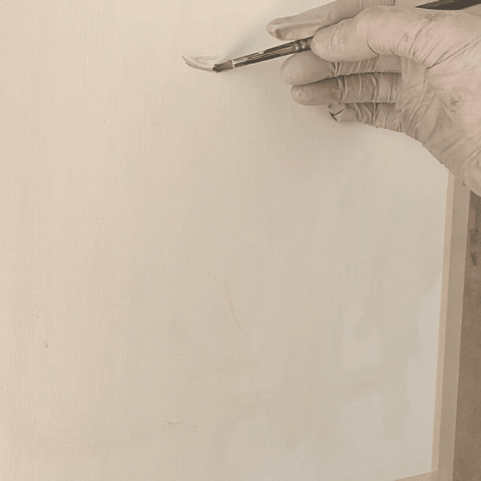
Just use a very small amount of neutral color paint (such as burnt umber mixed with ultramarine blue) to create your sketch. Your painting sketch does not need to be exact. Just enough for you to have an idea of your composition and where to place elements on your painting surface.
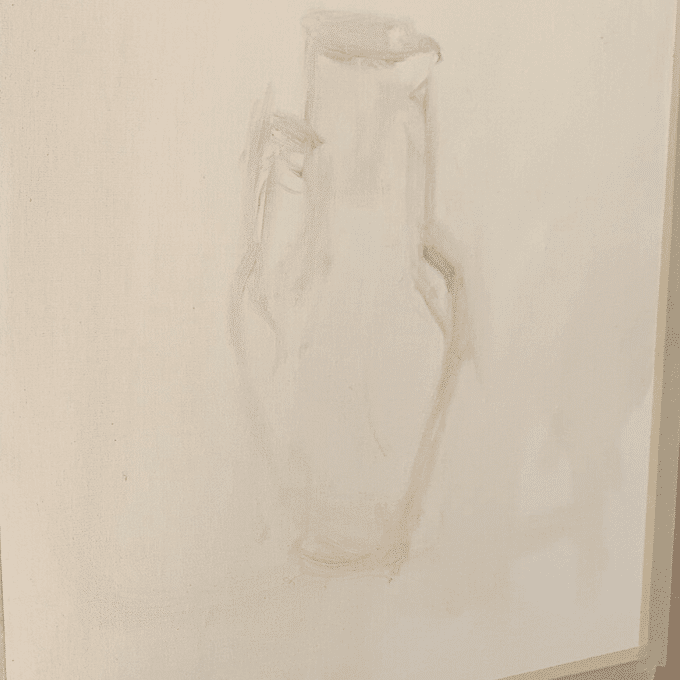
Below is the completed sketch for the still life painting. As you can see it is just a very rough sketch of what I will be painting. Naturally I will be adjusting and perfecting the measurements and drawing as I go through the painting.
How to Mix Your First Shades of White
For my first color I decide to mix the background area that is by the upper left side of the jug. I mix a very generous amount of white with a small amount of blue and cadmium orange. Since the color is cooler in temperature I make sure that my color leans a little more towards being bluish than orangey.
Remember to mix just a small amount of blue and orange with the white. A little goes a long way when it comes to mixing different shades of white colors. Orange and blue are complementary colors – which is why they are able to mute each other and are a great pairing for mixing a slightly darker white color.
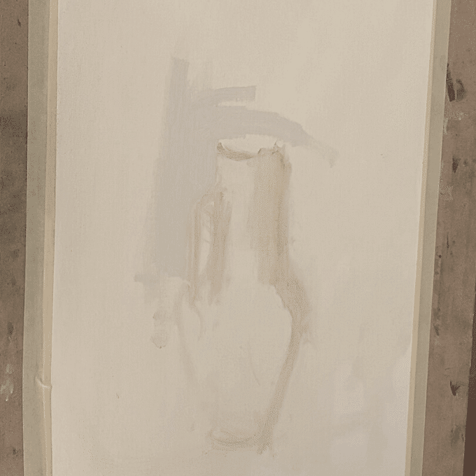
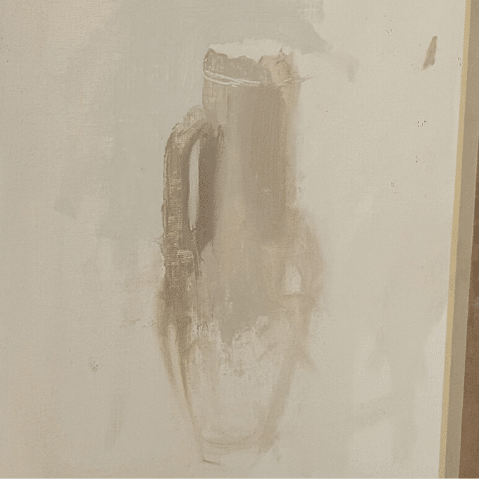
Notice in the image below that I now have three values on my painting. The light background, the body of the jug and then a shadow area on the left side. It is important to start your painting out with three values in the beginning. This helps you to establish a sense of light right from the beginning. Three values is the minimum amount of values needed to create a sense of light in your work.

In the image below you can see how the colors for this stage of the painting are mixed up. As mentioned above already the background color is mixed with white, ultramarine blue and cadmium orange.
One big thing you will see is that many of these whites use a lot of the same colors. What differentiates them is the amounts of certain colors that are mixed in.

Mixing Clear, Light and Dark Still Life Values
When painting still life you need to mix up clear light and dark Values. The same is true when painting a still life with many light value white colors. Not all whites will be the same value! It is common for us to just think of white as ‘light’ in value and never ‘dark’. Although it is true that white is lighter in value than other colors. It is still possible to have whites that are darker when compared to other white colors.
Look at the image above – it is very clear that there are different values of ‘whites’ there. One may not call some of the colors white if they were to stand on their own. However, since they are all together in the still life painting they look white.
Using Color Temperature for Painting Still Life
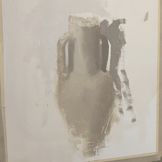
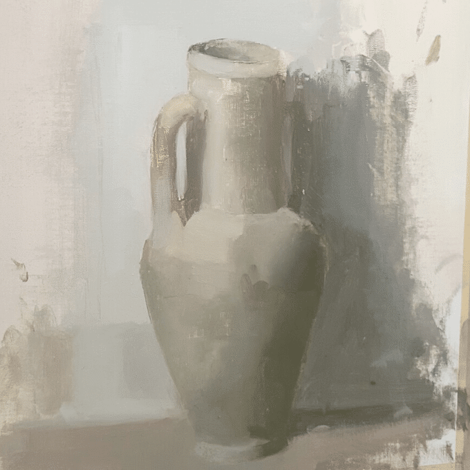
In the next stage of the still life painting we notice most of the body of the white jug is painted out. There are lots of different shades of white in place now. All of the changes are subtle but still create different shades of white.
Temperature is very important in painting especially when it comes to mixing light value colors such as whites. Often it can just be the change in temperature that differentiates one color from another.
For example, notice that the white shadow area on the top right part of the jug is cooler in temperature. The bottom right part of the jug by contrast is warmer in temperature. The values of both of these areas are nearly identical… Yet they are different because of the warm and cool color temperature differences.
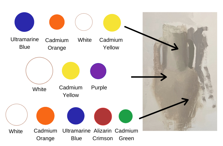
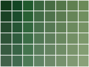
We can create these changes in color temperature simply by mixing the shades of white differently. Look at the chart image above. Notice the colors that are mixed together for the cooler white shadow on the right upper part of the jug.
For the white shadow color on the lower right part of the jug. You can mix in alizarin crimson and cadmium green (to mute the red alizarin crimson color a little bit). This reddish alizarin crimson color plays a major role in making the color warmer in temperature.
Painting the Still Life’s Background
When painting a still life it is best to paint your background and subject together at the same time. It is important for the subject to look like it naturally fits into the background. By not painting them together at the same time, your painting will be in danger of looking like a cutout.
Therefore, before I go too much further I paint in a background to support my subject. The right side of my background is naturally darker in value since that is the shadow part of the painting. For the left portion of the background, I mix a much lighter value that is also cooler in temperature. In fact it is so much cooler, that it looks like a bluish white when comparing it to the different shades of white on the jug.
How to Create Volume in a Still Life Painting

A still life painting becomes much more powerful and convincing when it has a strong sense of volume and space. Carefully observe your subject and the different color spots and temperature changes you see. This will go a long way in helping you to create a strong volumetric painting.

Also, pay attention to edges! Edges are crucial for creating volume in a still life painting. It is even more true when dealing with subtle colors such as whites! For example, you will notice in the image above and blow that the left side of the jug is a hard and sharp edge compared to the right side of the jug.
The right shadow side of the jug disappearing into the background area while the light left side stands out helps to make the form look more round in shape. Also, some of the color transitions that happen on the body of the jug help to form sharper edges that contribute to a sense of space in the painting.
Creating Dark Elements within a White Painting
When painting a still life that is very light in value it is good to have something in the painting that is dark in value. The dark element helps to act as an anchor. Otherwise, if everything in the painting is very light it could look washed out.
This is why I add a dark element to the left side of my still life painting as you can see in the image below. The dark color also helps brings more weight and interest to the still life painting.

As already mentioned one can mix up MANY different kinds of whites. In my still life painting the jug is a different white than the wall that it is against. It is good to put different whites next to one another as this helps to create a distinction between different areas.
For example you can see that the jug is much more of a warmer yellowy white than the wall. The wall is more of a cool bluish white. Notice the diagram below that shows how to mix up some of the cool colors on the wall.
The far left portion of the white wall is the lightest area and needs the most amount of white. By contrast, the right shadow areas of the wall are much darker so will need more blue and orange.
You’ll notice here that the wall is cooler than the still life itself. However, even though the wall is cooler in temperature in comparison to the jug. There is still a warm colored area on the wall, between the top and lower right side. So I mix in some alizarin crimson for the lower right shadow area. Giving it a bit of a purplish color, that is warmer than the bluer shadow area on top of it.

Completing the Still Life Painting
Take a step back from your painting when you feel that your still life painting might be near completion. Getting a different perspective can help to point out areas that need some attention.
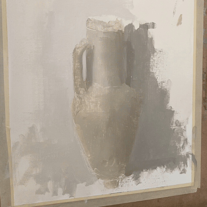
In the painting below you can see that the inner portion of the rim of the jug needs to be worked on. In addition the base of the jug needs some clarity.

Therefore, I paint the inner portion of the rim darker in value to show the shadow area. You can see the change in the image below.
Also, I work to create more clarity in the base portion of the jug. I do this, by making the edges of the still life more distinct and sharp. Using a light shadow line that is placed just beneath the jug. Placing such a shadow line beneath an object is NOT always appropriate when painting still life. However in this instance it works well.

The Fundamentals are Key in Painting Still Life
Pay attention to the fundamentals when painting still life. They will serve you well! Your still life being a successful painting correlates directly with how well you understand and execute the fundamentals. These principals of painting are what make a painting what it is – light and dark values, space, edges, color etc..
Continually make sure that your painting has a sense of light. If it does not, then work on fixing and adjusting it. Incorporate all the other fundamentals throughout the process of your painting by asking yourself questions and engaging with your work.
Want to remember this? Save the Painting Still Life Tutorial to your favorite Pinterest board!


39 thoughts on “Painting Still Life with Different Shades of White”
Hi Elisabeth.
I never tire of you excellent teaching; and this one is no exception. I have difficulty in mixing paint in general. I tend to add too much dark and have to add too much white to get near to what I want. I will now after this one, use white first and then darken with my chosen colors. I hope I am correct in doing this.
Thank you again so much.
Mike D
Thank you for your kind words Mike, am glad this article is helpful! It can be tricky to get a color in the right tonal range needed. When you are not mixing a very dark value color it can be helpful to start out with white and then add darker value colors to that. You might find yourself going a little back and forth – mixing in more white, and then darker values and then perhaps white again. It can sometimes take a little while before landing on the right value! But the more you do it, the faster you are able to know exactly how much of a light value or dark value color to use in a given moment.
Elisabeth, this was again a very interessting lesson in painting a still life.
Specially how to mix all the white tones.
Thank you for sharing this!
A lot of love fro The Netherlands!
You are so welcome Frits! Glad this was an interesting lesson to revisit.
Thank you for your excellent lesson on still life. Your explanations are clear and easy to understand and your thoroughness is greatly appreciated!
Thank you for your kind words San, am glad the information is helpful – thank you for sharing!
Very interesting description, I think I wil try to make somehow the same steps that were explained. It will help me to try painting more ofen, Thank you for email,
Valentin
You are so welcome Valentin!
I am a beginner as a film colorist. I was recently searching for knowledge online to get myself started then you appeared. I am already liking what you have shared, it is definitely where I need to start from. Thank you very much for sharing this invaluable knowledge for a beginner like myself to benefit from.
Opio
Thank you so much. I had a problem with mixing different whites
You are very welcome! I am glad this tutorial was helpful
Hi Elisabeth,
When your body needs iron, all of a sudden you crave a lentil dish. At my age I need colors and for that I copy landscapes.
I am amazed by the colors you used to achieve different shades of gray. Bravo!.
Hi Paul, Copying landscapes is a great practice! Thank you for your kinds words, I appreciate it.
I just started my first painting class and our very first project is a still life with 3 white pieces (metal, ceramic & porcelain) plus a napkin. Even after watching the instructor, I felt at a total loss. Then I found this amazing article. Thank you for giving me clarity on the approach I need to take, but also specific guidelines. I’m ready for my second attempt. Obviously it won’t be close to perfect, but it will be better, and I will be learning as I use these techniques. Thank you so much!
I am so pleased to hear that this article was helpful for you with figuring out painting the whites on your still life. You are so welcome! Painting white can be difficult – but once you train your eyes to notice the different kinds of white it becomes much more fun!
Thank you so very much. I primarily paint with watercolor, but much of what you teach can be applied to my work so I enjoy reading it.
Pam
Hi Pam, I am so glad that the information here is helpful for you! I always try to share with watercolorists that much of information on this site can be applied to watercolor painting – am glad that you have found it to be so!
This is the excellent tutorial! Thank you very much.
I am so glad this is helpful!
Brilliant article on a very complex subject. Thank you so much Elizabeth, appreciated. Cape Town, South Africa
Thank you for sharing Adele, so glad to hear that the article is helpful! You are very welcome 🙂
Hi Elizabeth thank you very much for a very explicit tutorial. I am about to embark on a black and white portrait. I presume the same principles will apply using your colours as a guide for the dark areas? I would appreciate your advice.
You are so welcome Joy! Am glad this was a helpful tutorial. That is great that you will be doing a black and white portrait. Yes, the darker colors I use in the tutorial would work for darker shadow areas in the portrait. It is helpful to note though that you won’t be creating really deep darks with the colors though – it is more of a higher key value range.
Prachtig Elisabeth, veel van geleerd.
Bedankt Liane!
This is so beautiful. Thank you for the step by step detailed explanation. It was very helpful.
Hi Smitha! I am happy to hear that – thank you for sharing 🙂
Thanks Elisabeth, this appeared at just the right time for me too! Must be something in the air…
Hi Jillian, Thank you for sharing! So glad that it was helpful 🙂
Iam from curacao i love painting . Paint with with and still life is good.i begin next week to paint this and i mail for you
Hi Shalimona, That is so great that you love painting! Wonderful that you do some still life painting.
Thank you for this. I much needed to see this. I’ve been diagnosed with light cataracts. In another year they can be taken seriously.
You are welcome! I am glad that it is helpful. I hope that everything goes well with your eyes!
Beautiful painting and lesson! I love your clear explanations. The diagrams showing the paint colors are especially helpful. Thank you!
Thank you Jill! I appreciate hearing that. Am glad that the article is helpful – you are welcome!
A dramatic and engaging painting, and an intelligent discussion that I will try to follow. The instruction to begin with three values really helps me. Thank you. — Marilyn Cleland, DeKalb Illinois
Hello Marilyn, Am very happy to hear that the instruction in the article is helpful!
I was recently having major problems with painting a white subject and trying to “make up” color variations (unsuccessfully). So when the student is ready the teacher will appear. Thanks for your time and commitment to share your experience. (still don’t understand temperature, but this is a big step).
Diana Rice
What a wonderful coincidence! Am very glad that this article came to you when you needed help with white color mixing 🙂 It can take time to get the hang of temperature – but you will get there with a little practice!