In painting, it is very important to create a convincing and real sense of light. A big part of achieving this is to simplify the light and dark values you see. Too many values in a painting can make it look cluttered and confusing to the viewers.
Therefore, it’s important to limit the number of values in a painting to make it look more appealing. In this article, I will walk you through how to simplify a still life subject using four distinct value groups. This is a great exercise for both the beginner and more advanced painter. Just as an athlete needs to keep their body in shape, as artists we need to constantly be training our eye to simplify what we see.
Exercise One: Simplifying What Your Eyes See

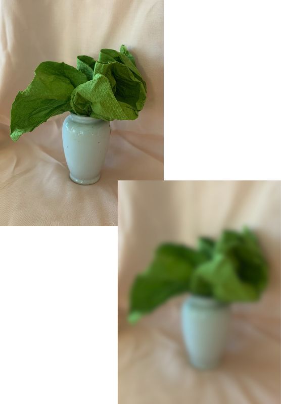
The images above are of the still life subject we will be using in this article. The first image above, shows a clear photo of the value subject. While the image beneath it, shows a blurred version of the subject–that helps to simplify the values a little more. You can achieve a similar effect, by squinting your eyes when looking at your painting object. Squinting your eyes helps a lot to be able to see the basic values of your subject matter more easily.
Using monochrome to help simplify painting with values
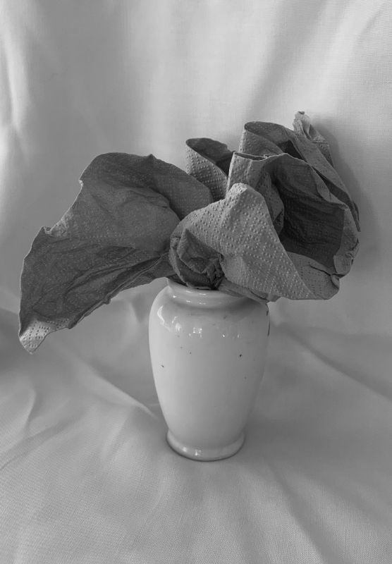
You can also view your painting subject in monochrome–either by creating a charcoal drawing study of it or placing a monochrome filter over a photo of your subject.

Find the initial three values
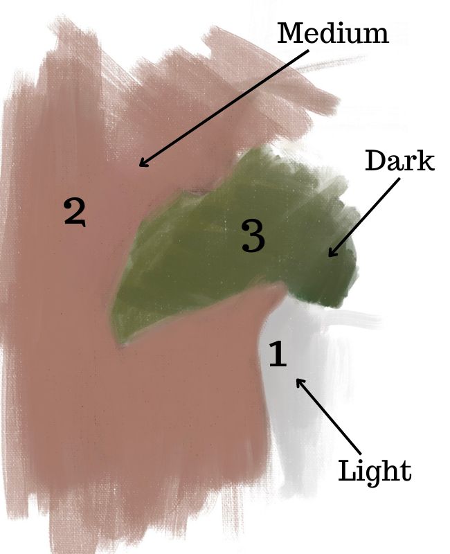
Before we get down our four values. We first capture the essential first 3 color values – light, medium and dark. These are the values we need in order to have a sense of light in our painting. It also makes the process simpler to figure out what the fourth value is.

Exercise Two: Creating a Four Value Painting
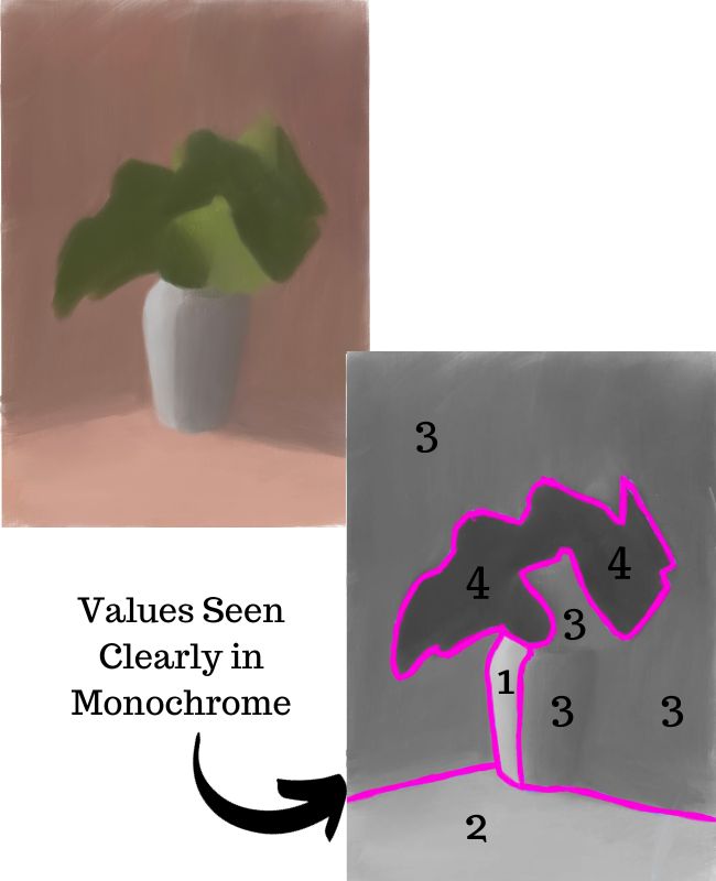
After our initial start to the painting, we expand and figure out all the basic areas of color and value. Notice below how some of the values are grouped together because of how similar in value they are. The light green (#3) is the same value as the left shadow side of the vase and the darker pink part of the background. You can see this clearly in the monochrome version of the painting.

An important part of creating a 4 value painting is to be able to see and notice which values are similar to one another. It is absolutely essential to group values together. Of course, there will be subtle differences in value inside a value grouping. However, part of learning how to see as an artist is training your eye to not get caught up in the details and instead look at the big picture values.
Simplifying color values in the painting
When limiting your values to four it can be easier to group them together by also simplifying your color. Notice below how there are only 6 different colors in the entire painting. Value 3 has three different colors, while value 1,2 and 4 each only have one color.

Simplifying your color helps you to focus more on the values in your painting and not get too distracted by the color. This is especially helpful if you are struggling with seeing values in color clearly. As you become more comfortable you can start to find the more subtle color shifts that exist inside each value grouping. You can still keep your painting at four color values and also break down the color spots more.
Applying color nuances in painting with four values
Below, is an example of a painting still with four values, yet applying subtle color shifts within the four different value areas. After all, just because you are only operating with four different values, doesn’t necessarily mean that you need to keep your painting so simple. In the end this is an exercise–so as you begin to master simplifying with four values, don’t be afraid to explore more.

There is an enormous amount you can do in a painting with just four values. I encourage you to explore the different subtle color shifts that happen inside certain value groupings. You will be surprised at how much subtlety you can capture in color shifts while at the same time keeping your values simplified.
Exercise Three: Moving Beyond Painting with Four Values
However, when you have 4 clear values in a painting, you can also expand upon that and add a wider value range by finding deeper shadows and or lighter highlights.
Painting with 6 values and more

For example, in the painting above we see just that. The shadows are a little bit darker in value, while we have some lighter value highlights. In addition, we also have some subtle color shifts within the painting. We see at least 6 values in the painting.
However, no matter how many values you want to create in your work, it is absolutely vital to have a clear value structure in your art and painting. The best way to be able to create that clarity is to understand how to break down your subject into four values. If you can’t do this, then you won’t be able to create clear values when you add more. This is why it is best to first start simple.
Want to remember this? Save How to Create a Painting with 4 Values to your favorite Pinterest board!


20 thoughts on “Painting in Four Values: 3 Key Exercises for Painting with Values”
Hi,
I enjoyed reading the article, and I intend to use it as an exercise by folowing step by step,
Very glad to hear that Valentin! Thank you for sharing
Hi Elisabeth.
As always such good advice and instructions. I have been reading some of your previous posts to give me more help with watercolour. This is very helpful for me; I will have to go over it a few times though before I can understand it fully.
Many thanks and kind regards.
Mike D
Thank you for your kind words Mike, I appreciate it! Am glad this one is helpful for you with watercolor painting – it really does help to break the values down.
Thank you so much Elizabeth!!! I never learned this way of checking out values and it was a huge success
when i tried it on a watercolor whale. Looking forward to developing this skill. It makes such a difference.
You are very welcome Brenda! I am so glad to hear that it was very helpful and successful when you applied it to a watercolor painting. It really is a wonderful way to establish strong foundations in color and value.
Elisabeth, I have been reading all of you blogs, for some time. My latest thing is trying this norton Thing. Now I will try the value study to go along with it. My printer will give me monochrome and crey. You can really see the difference. I will be in tock Meneesouch with you more. Thanks so Much, Chuck
Hello Chuck, Thank you for being a faithful reader of my blogs – I appreciate it. Am glad that you will use your printer to capture the monochrome values of your subject – it is very helpful!
Love the idea of Training The Eye… thank you!
Glad to hear that! You are so welcome! 🙂
Thank you I really enjoyed reading you tutorial, I will read it again in order for it to sink in.
Kind Regards
Jenny Claase South Africa
That is a good idea – going over it multiple times helps to understand it better. So glad you enjoyed this!
Thank you so much Elizabeth. Getting clear tones in mono is fairly simple but I find translating the same tones into colour much more difficult. Your exercise will really help me.
So glad to hear this will help you – thank you for sharing that. It is very true that translating value into color is difficult. But taking it step by step like this helps to train your eye to translate the values of color more readily.
wow! That is really clear and very helpful. I hope to be able to apply this to my Pastel painting. Thank you!
Thank you for sharing Jennifer! Glad this is clear and helpful. It can definitely be applied to pastel painting
Very good explanation
Thank you for your kind words – am glad this is helpful 🙂
Very good information. Thank you.
You are very welcome Wiida!