


Have you ever admired a pearl and the way it reflects light, giving off a lustrous and pure glow? You can replicate this captivating allure in your artwork by harnessing the subtle beauty of pearlescent colors. These enchanting hues combine seamlessly, to form an iridescent and pearl-like appearance. It’s worth noting however, that pearlescent colors are distinct from shimmering metallic paints. You can achieve a pearlescent painting effect (and colors) by mixing paint colors commonly found on an artist’s palette.
In this article, we’ll explore pearlescent colors: what they are, how they’re used, and tips for creating your own color mixtures. In addition, I’ll guide you through the fundamentals and how to make your painting radiate with a captivating pearlescent effect! So, let’s get started by first breaking-down what makes a color pearlescent.
What are pearlescent colors?
Pearlescent colors are the opposite of muddy looking colors, as they tend to be very clean and have a jewel like appearance. At the same time, they can’t be named as a specific color as they are unnamable. They aren’t ‘blue’, ‘green’, or ‘purple’ but are a complex mix of quite a few colors put together. It is possible though for a pearlescent color to lean towards a red, pink, blue or another color.
At this point you may be confused! We will dive in further so you can visually see what pearlescent color hues look like
Examples of pearlescent paintings

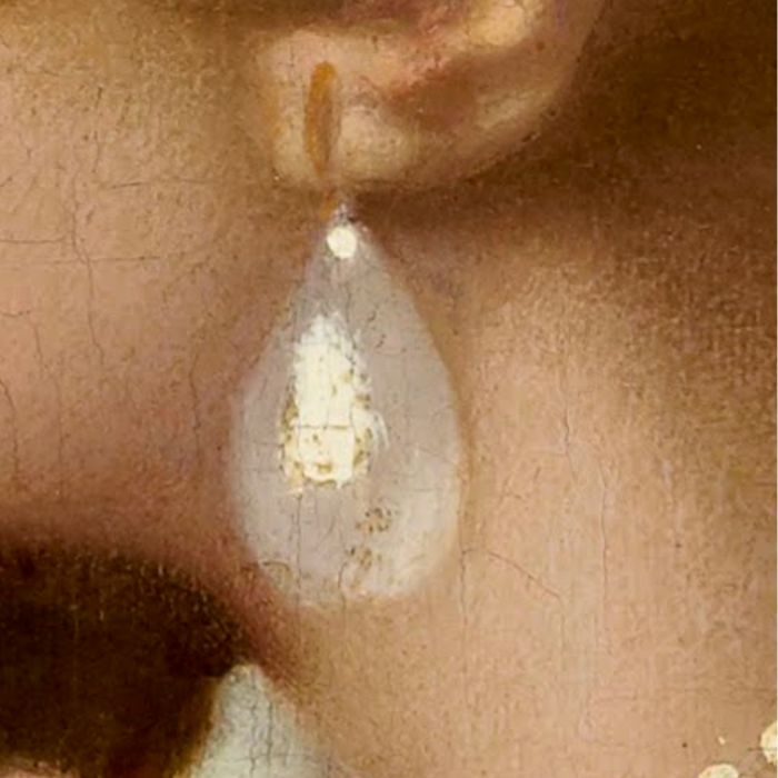
The Vermeer painting, “Study of a Young Woman”, is a great example of a painting using pearlescent color hues. In this painting, the girl’s skin appears to glow with a pearly luster. The delicate shift in colors, from a luxurious white to a slightly cool blue or peach, creates this pearl-like effect.
Muted Pearlescent Color Mixutres
In the image below you can see some of the colors in the Vermeer portrait painting. Some of the pearlescent hues are quite similar to one another. And all of them don’t necessarily look pearlescent on their own when taken out of context from the painting. However, when placed next to other color mixtures they form an incredible pearlescent color harmony.
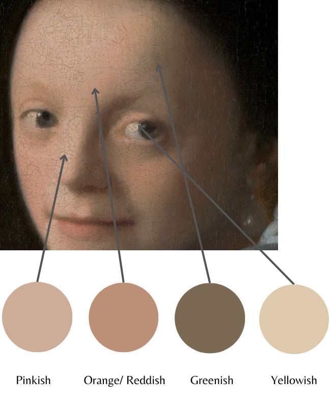
This is why the color spots that you place together is always incredibly important. The colors in your painting won’t work in isolation on their own. They can only function for their purpose, if the colors placed next to them support that purpose. In the case of Vermeer’s portrait, the purpose of the color scheme is to create a pearlescent color harmony. Which the artist achieves masterfully.
How to mix and create pearlescent colors
To achieve pearlescent colors in your art, you’ll need to master subtle color transitions and create muted, yet vibrant mixtures. As seen in the painting example above, a painting can achieve a lustrous and pearl-like effect using relatively muted colors.
Color Theory Behind Pearlescent colors
If you understand some important aspects of color theory, you will have a much easier creating your own pearlescent colors.
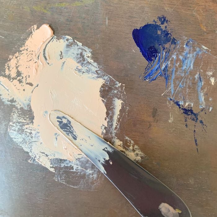
Blending complementary colors together, you can create muted, yet dynamic and interesting hues. When combining a little bit of blue to a very light value orange/ peach color mixture. You get a nice pearly cool peach shade. It is essential to experiment with different color combinations to find the right balance in creating pearlescent tones that work well together.
How to make your painting look pearlescent
Pearlescent colors can be used in your own work in an extraordinarily wide variety of ways. In fact, it is good to often aim for pearlescent hues no matter what type of subject matter you work with. As they are colors with great clarity, the opposite of muddy. They will also make your colors harmonize together in a very special way that elevates your work significantly.
Pearlescent tones are just as relevant with portrait paintings as they are with still life or landscape. As creating a pearlescent painting is about creating a certain type of luminosity that extends beyond very light value colorful muted tones.

Use Light Value Pearlescent Tones
When using pearlescent colors in your painting, it is good to focus on the subtleties and nuances of the color values that exist. Look very hard and closely at your subject and get a strong feeling of what colors should be placed next to one another. This requires you to think beyond color and incorporate color temperature, value and the kind of color harmony you see.
When working with very light value pearlescent tones, you need to be extra sensitive to subtle color shifts – as very small changes in color actually have a big effect. This is what makes high key paintings difficult!

It is helpful to place a small amount of your mixture on its intended spot to see if it is too dark or not. The more you work with very high key paintings, the more attune and sensitive you will become to extremely subtle shifts in color temperature and value.
Pearlescent colors bring a unique dimension to art that evokes a sense of light, purity, and iridescence. Used properly, these colors can be stunning and completely change the mood and essence of a painting.
By focusing on color transitions, tinting and shading, color theory, and surface texture, you can create a pearlescent effect. Whether it be through creating a gentle white hue or a pale blue tone. Incorporating this effect can add another dimension to your work that will take you to another level. So go forth and explore the beauty of pearlescent colors in your art!


4 thoughts on “What Pearlescent Colors in Painting Are and How to Use Them”
Hi Elizabeth.
Thank you so much for this one; it is especially good for my paint mixing as I tend to be too heavy when mixing and not finishing my paintings too well. I will learn from this one.
Best regards.
Mike D
Hi Mike, very glad this one is helpful for you! It can be easy to get heavy handed with mixing. Those subtle mixtures can often be the most difficult!
Hello
Learned something new. Thanks.
Glad to hear that Joe! Thank you for sharing.