

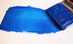
The primary colors are fundamental colors artists rely on. These hues, are distinct because they cannot be created by mixing other colors. Although there are exceptions, which I discuss in detail in this article, these three colors hold immense importance in the world of painting. So, let’s get started with breaking down–what the primary colors are!
What are the primary colors?
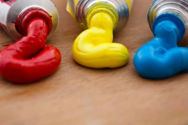
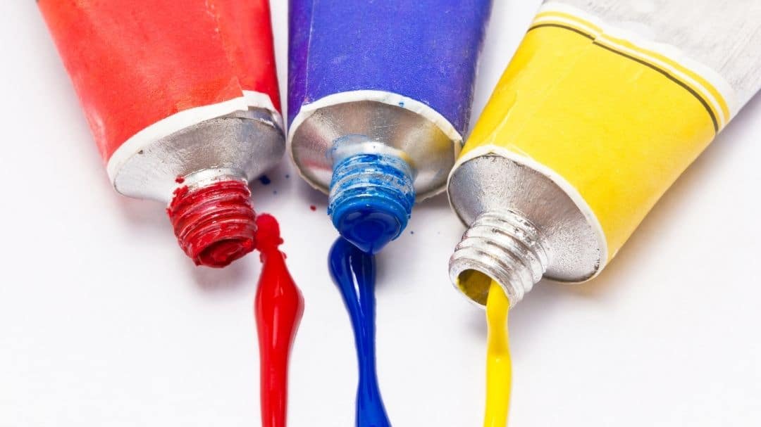
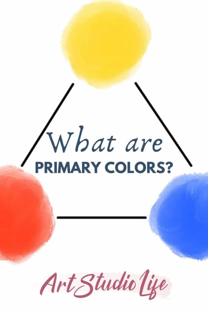
The primary colors in art (and used for painting) are yellow, blue and red. They also happen to be the most important colors on the artist’s palette! These primaries cannot be mixed up from any other colors – which is what makes them different from others. There are a few exceptions however which I cover here in this article.
How are the primary colors in art used?
Primary colors are fundamental to the world of art, serving as the building blocks for creating a vast array of hues. Artists use these colors as a foundation to create a wide spectrum of colors by blending and mixing them in various ratios. By manipulating the primary paint colors, artists can evoke different moods, convey emotions, and bring their artistic vision to life on the canvas.
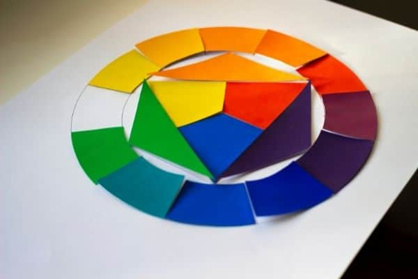
First, it is important to understand the building blocks. So, let’s take a look at the primary color wheel to understand what colors we can mix and how!
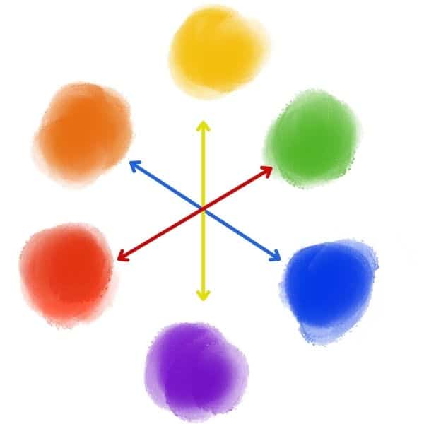
Primary color wheel
The primary colors form a triangle in the color wheel as you can see in the images below.
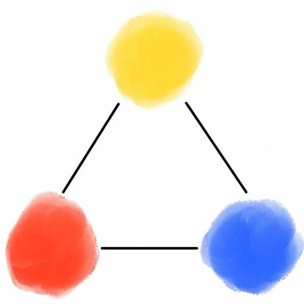
Their central position in the color wheel, shows just how important they are in relation to all the other colors. In fact, we cannot mix any of the other colors without them!
What colors you can mix using primary colors
Primary colours in art are fundamental hues that form the basis of all other colors. By mixing these primary colors together, a wide range of vibrant and beautiful secondary and tertiary colors can be created.
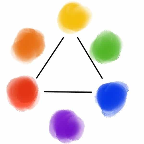
For example, by combining red and blue, one can achieve shades of purple. By mixing yellow and blue, various shades of green can be obtained. Similarly, mixing red and yellow produces different shades of orange.
These color combinations, also referred to as secondary colors, offer endless possibilities for artistic expression and creative endeavors.
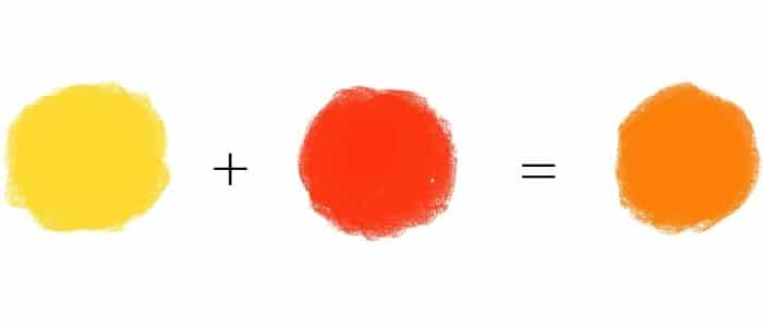
How to make orange using primary colors
When you mix yellow and red together you get the secondary color orange! Notice on the color wheel how orange is in between red and yellow.
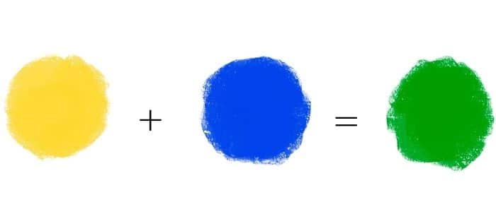
How to make green
Mixing the primaries, yellow and blue together, will give you the color green! Again, the secondary color green is in between the two primary colors blue and yellow.
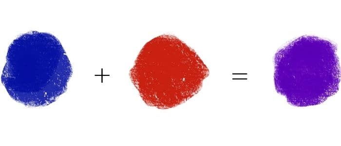
Mixing purple from primary colors
Lastly, you can mix a purple color, by combining red and blue together. However, the uses for primary colors doesn’t stop there!
How to mix primary colors with secondary colors
Primary colors have a central role when it comes to complementary colors. When mixing together primary and complementary colors, they can cancel each other out.
For example, take a look at the color wheel above. You will notice that yellow is across from purple, blue is across from orange and red is across from green. All of those colors that are directly across from one another are complementary pairs!
Primary Color Blue and Secondary Color Orange
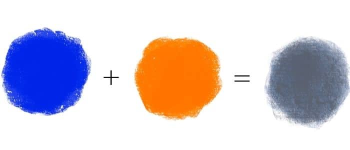
Because of complementary colors you are able to use primary paint colors to mix up muted colors. For example, when you mix the complementary colors blue and orange together you get a more muted color. In the above chart we mix a little bit of orange with blue to get a muted blue.
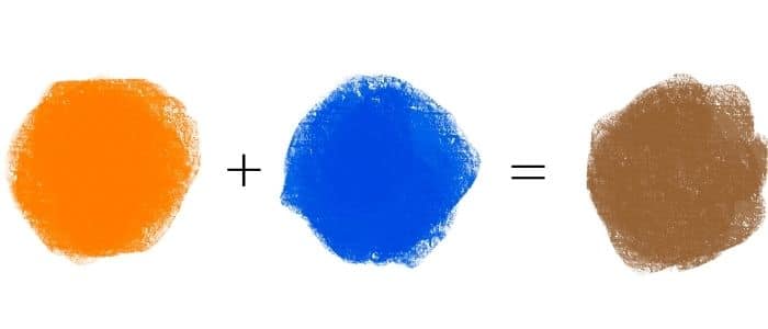
The opposite is also true! In the chart below, we mix a little bit of blue with orange to get a muted orange color.
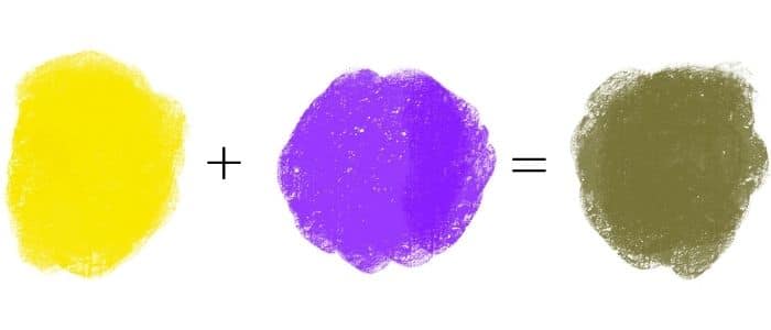
Primary Paint Color Yellow and Complementary Color Purple
The same principles hold true for the complementary color pair yellow and purple. If you mix the primary color yellow with a little bit of purple then you get a muted yellow!
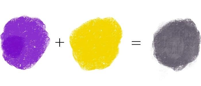
Conversely, if you mix a little bit of yellow with a larger amount of purple then you will end up with a muted purple color.
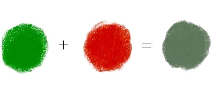
Primary Color Red and Complementary Color Green
Lastly, when we add a little bit of green to the primary color red then we will end up with a muted red because green and red are complementary colors.
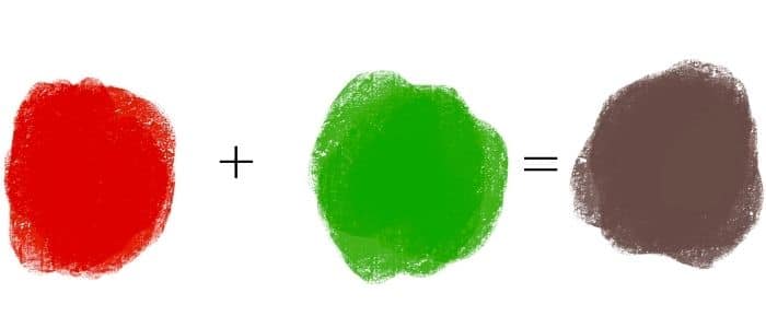
As always with complementary colors the opposite is also true. When a little bit of the primary color red is mixed into green we then end up with a muted green color.
With complementary colors it is possible to mix up a color that would be is in between the two colors. You would just need to mix an equal amount and strength of each color to reach a muted color that is in between the two.
Different definitions of primary colors
Ultimately, understanding the basics about primary colours in art and the theory behind them, helps you with color mixing. However, once you know the basics you will not need to look at a color wheel or recite to yourself which colors are ‘primary colors’.
That is because when you are in the midst of a painting and mixing up colors you don’t need to think about color theory – only the practical aspects of color mixing. So, understanding more about color helps you with what is ultimately one of the most important parts of painting – color mixing.
CMYK Primary Colors and Painting
That said, it is worth being aware of a growing debate around which colors are the primary colors. Many say that red, blue and yellow are the primaries (as also taught in this article) while others believe that cyan, magenta and yellow are the true primaries. So, which is right?
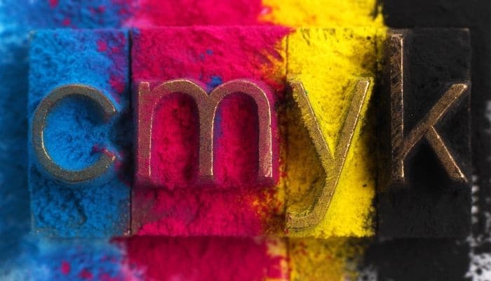
The answer isn’t so black and white unfortunately! Cyan, magenta and yellow are often referred to as ‘printing primaries’ as printing machines use these colors as their primary colors (along with black) to create all of their images. These are also referred to as CMYK.
So, why don’t we use cyan, magenta and yellow as primary colors in painting? Well you could use these colors as your primary colors, along with black and white and you would be able to mix an array of different colors. However, you would be limiting yourself a great deal…

See, CMYK colors are the primary colors that are used for printing and in the printing process colors are laid on top of one another. While in painting we physically mix our paints together instead of creating layers. Therefore, we have a LOT more options when it comes to creating different colors than a printer does.
Expanding beyond primary paint colors
So, don’t abandon the red, yellow and blue primary colors and replace them with for cyan, magenta and yellow. However, it might be worthwhile to add cyan and magenta to your palette along with your other colors and experiment with how much you can broaden your color mixing.
When it comes to mixing colors our goal should never be to mix the exact same color that we see because this is impossible for us to do! There are far more colors and values in our world than what we could ever hope to replicate with our very small range of paints. Our goal instead is to get accurate color relationships and mix colors that relate to one another in the same way as we see them.

If you were to just focus on each individual color and try to mix the same color you see, then your painting won’t be as cohesive as when the colors are all worked on together as a group instead of individually.
Why can’t I mix my own primary colors?
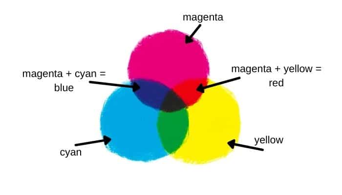
This is a really great question! First off, red and blue actually CAN be mixed from different colors. Remember the colors cyan, magenta, and yellow – also known as CMY? Well, when you mix cyan and magenta together you get a blue color. To create a red you can mix magenta and yellow together.
So, technically the real primary colors are cyan, magenta, and yellow. If you have ever been frustrated about not being able to mix a very vibrant purple with red and blue it is probably because mixing magenta with blue or cyan will produce a very vibrant purple.
The significance of identifying the true primary colors for our purposes is relatively unimportant. While comprehending the authentic color theory may assist in challenging color mixing scenarios, the truth is that the utilization of magenta or cyan is exceedingly rare. In reality, the primary colors blue, red, and yellow will provide nearly everything you require (which coincidentally aligns with the primaries used by the old masters). Embracing this understanding will prove beneficial in your artistic endeavors.
Yellow stands alone next to blue and red in that it cannot be mixed from any other color(s). You could create a yellowish like color – but it would never be a bright real yellow color.
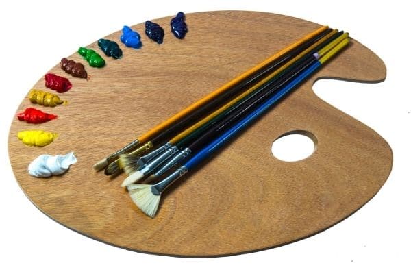
Primary colors on the painter’s palette
You absolutely have to have primary paint colors on your palette. However as mentioned earlier, you should have more than just the primaries but you will at the very least need to have white and black in addition to the primary colors. It is more ideal to mix your own black, but if you want to limit yourself then you can just use a regular ivory black (or mars black).
I recommend to expand your palette to include an array of earth tone colors as well as some cadmiums. My personal painting palette is as follows:
- white
- cadmium lemon yellow
- cadmium yellow
- yellow ochre
- cadmium orange
- cadmium red
- alizarin crimson
- cadmium green
- veronese green
- pthalo green
- ultramarine blue
- cobalt blue
- burnt umber
- burnt sienna
You do not need this many colors on your palette – especially if you are starting out! You can instead use a limited palette. The important take away is to not limit yourself to just having primary colors on your palette.
Limits of primary colors
As demonstrated earlier, secondary colors can be effortlessly created by blending primary colors. For instance, the combination of red and yellow yields a vibrant orange, while mixing blue and yellow produces a refreshing green, and red and blue unite to form a regal purple. Nevertheless, it is important to note that there are limitations to the range of secondary colors that can be achieved solely by using primary colors.
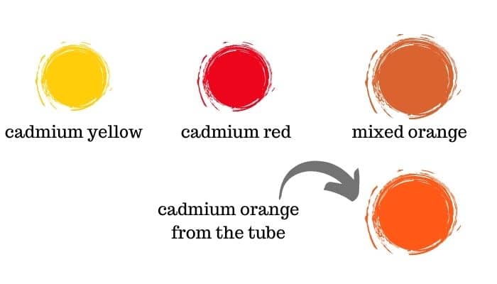
We will take a look at orange specifically and how mixing cadmium yellow and cadmium red together can create a different shade of orange than pure cadmium orange. For example, you can see in the image below that the orange mixture of cadmium yellow and cadmium red, is not quite as bright and saturated as the cadmium orange color straight from the tube.
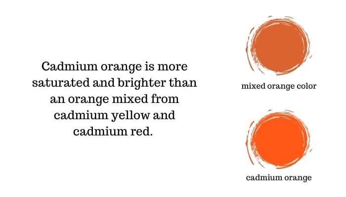
Cadmium orange is simply a brighter and more saturated color than one you can mix. Which can be very useful when you are needing to mix up slightly brighter colors.
The same situation happens when you compare a green mixed with cadmium yellow and ultramarine blue, versus cadmium green straight from the tube. The intensity of green you get in a cadmium green (especially from Williamsburg paints) is unparalleled.
This does NOT mean that you need to go out and buy paint tubes for every color. Rather, it serves to show that the primary colors we get in our paint tubes have limits. Although you don’t have to have a cadmium green or cadmium orange on your palette. It can be very helpful and will allow you to potentially mix up better color relationships for your painting.
Applying primary colors to your painting
All of this information applies to other paint mediums. So, the primary oil paint colors are the same as the primary colors in acrylic paint, watercolor and so on.
Now that you’ve discovered the art of mixing various colors using just the primary colors, grab your palette and unleash your creativity! Experiment with combining the primaries to create a stunning array of secondary colors.
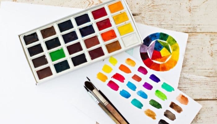
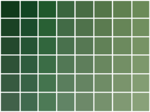
Also don’t forget to experiment with the numerous shades of the primaries that you can mix:
In addition-–learn how to mix all of the colors you need for your art and painting, with the help of my 150+page, Color Mixing Master Guide ebook!

To further enhance your color palette, explore the technique of muting colors by using complementary shades. This deepens your understanding of color theory and elevates your painting skills to new heights, enabling you to express yourself on a whole new level.
Let me know how your color mixing goes in the comment section below!


10 thoughts on “What are Primary Colors? Here’s How to Use them in Your Painting”
Hi, first thank you for all of the information you provide it’s very helpful. I’ve been subscribed for several months and I’ve yet been able to get the free color mixing guide, I’ve checked and rechecked my mail , spam etc and nothing.
HI Bianca! Apologies that you have not received it yet! I just sent you an e-mail with the guide attached 🙂 Enjoy! Am so glad that you have been finding all the information provided helpful.
eu também ainda não recebi o guia de mistura de cores gratuito.
Just sent you the guide to your e-mail! 🙂
You are a blessing in my life. You have made color mixing so simple to follow. I will now use your methods and practice everyday till I get the concept down. Thank you for everything you share with us.
Jazz
You are so welcome Jazz! Thank you for sharing – I am really glad that the methods and lessons are helpful!
Thanks Elizabeth, a very succinct summary of basic colour principles. As a landscape/seascape painter with a little experience, I find the “greying” of primaries essential. Bob, Australia
Hello Bob, Thank you for sharing! I am really glad that the principles shared here are helpful. Yes, the greying of primaries is very important and useful – especially in landscape and seascape painting.
I am so very thankful for every bit of information you share. It means the world to me. Thank you.
Hi Bet, You are so very welcome! I am glad that the information is helpful!