


Creating a solid understanding of values is one of the most important things you will learn in painting. Therefore, it is good to take your time in developing your understanding of the value scale and your ability to work with just 4 or 5 values. However, once you have mastered the ability to create a clear and solid value structure with 5 values or less then it is good to start expanding.
Here I show you how to broaden your value range considerably by looking at a value scale. Doing this allows you to add a whole new dimension to your canvas—by working with not just a few, but up to nine values.
Starting in Black and White: The Monochrome (Value Scale) Mandate
If you really want to ‘see’ your painting in terms of value, start in monochrome. Drawing in black and white is empowering. It forces you to rely on form and shadow where color doesn’t distract. This invaluable exercise helps you to work with a more expanded value range without the confusion that color brings.
A monochrome underpainting serves as your blueprint, mapping the journey ahead. The gradients of gray provide structure, the pattern for what is to come. It’s the secret weapon that not only guides your hand but grounds your painting with a foundation of depth.
Building the Foundation: Simple Spots of Color
Now that we understand the value structure of our subject in shades of gray, it’s time to bring color into play. Begin by laying down large and simple spots of color on your canvas. This jumpstarts the process of defining areas of light and dark but also initiates the color harmony, and the color story of your piece.
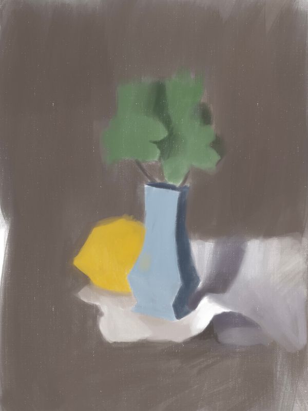
Start with 3 values
In the image below, you can see how to divide a painting into three main values – light medium and dark. This is a great way to start a painting. The simpler you make it for yourself in the beginning, the easier it will be to create a compelling a strong sense of light.

I like to call this stage the “first statement”. In this initial phase you are working to keep things clear and uncluttered at the outset. You’re not yet committing to intricate details; you’re merely building a solid foundation that you will be able to build on top of. It is absolutely crucial to be able to see the large areas of color and value right from the beginning. If you do not, then you will never be able to successfully create more detail.
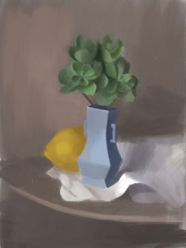
Refinement: Smaller Spots of Color
With the large areas of color in place, it’s time to refine. Now we can start to gradually break down these broad strokes into smaller spots of color. This starts the process of creating more subtle shifts in value and color.
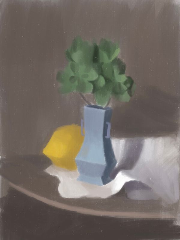
Second Statement (6 Value Scale)
So, here we work on expanding our 3 value grouping to 6 values. In this process you will look at the color and value changes that are within your large color spots. For example, in the first statement the light section of the blue vase is just one color/ value. However in our second statement with 6 values it is now divided into 2 values.
We aren’t going all out yet and finding ALL of the small subtle changes that exist. But we are working on retaining the big picture sense of light in the piece while working on refining the values and colors at the same time

These details add another layer of complexity, guiding your focus and enhancing the narrative of your painting. It’s these variations of light and dark, these subtle shifts in value, that captivate the eye further.
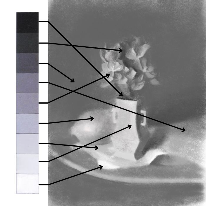
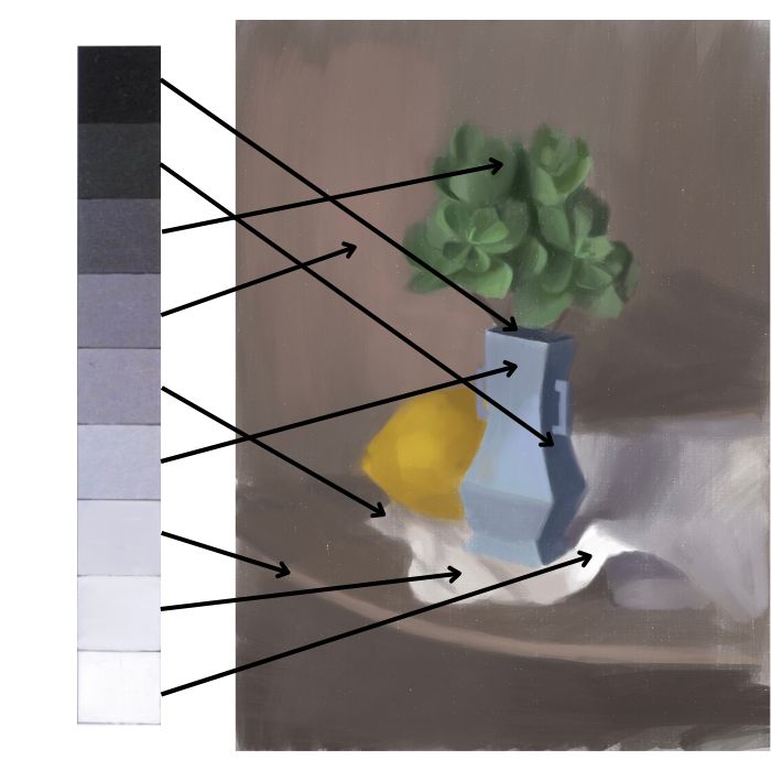
Wrapping Up with the 9 Value Scale
Now we’re at the final stretch—bringing your painting to a full spectrum of 9 values. Here you will further subdivide and find more value changes within the spots of color. This is an exciting stage of getting to dig into your painting more and being more specific with your subject.
Below we can see the 9 value scale present in the painting!
Always Think in Shapes of Value
Going through this process helps you to sensitize your eyes further to the subtle changes in value that are happening, while at the same time retaining the big picture sense of light. I can’t stress how key this is! The biggest mistake many artists make is jumping ahead into details, but then they lose the overall impact/ sense of light in their painting. So, it is absolutely critical that you force yourself to retain a clear value structure while you break down your values.

In order to keep yourself in this place it is necessary to continually think of your subject matter in terms of shapes of value. As you find more subtle value changes – see them as shapes. This helps you to remain objective in how you see as an artist and keep a strong value structure.
Practice and Patience Make Picture-Perfect
Working up to 9 values isn’t just about changing numbers; it’s about transforming the way you paint. It’s a process of constant learning, practice, and a lot of squinting to see where those hidden contrasts lie. Forcing yourself to go through the process of first starting with 3 values and large spots of color and then working your way up allows you to build invaluable skills.
This process isn’t about creating one beautiful painting for you to admire. Rather, it is to transform how you paint and see so that you can grow to create whole bodies of work that are beyond what you could have imagined.
Want to remember this? Save the Value Scale Painting Guide to your favorite Pinterest board!


10 thoughts on “Value Scale: How to Elevate Your Painting with 9 Values”
Thank you! Very helpfull for me too! Kay Stockholm
Very glad to hear that Kay, thank you for sharing!
Voy a ponerlo en práctica, muchas gracias Elisabeth
Eres muy bienvenida!
Thanks Elisabeth, this has been helpful!
You are so welcome Allan!
Very interesting article. Maybe i should try to see black and white before starting the colours. Thank you!
Yes, it is very helpful to first do a black and white sketch before starting with color. This makes figuring out the values much easier!
Thank you for this article. It came right in time as I’m learning about value scale at the moment. It gave me better understanding of the idea.
You are welcome Elena! Glad this is helpful 🙂